Push it good: Notifications and their role in product UX


Every product team aspires to create a platform with delightful UX design and a slick UI that wows users – and they’d be fools (or at least very strange) not to.
Jakob Nielsen’s legendary ‘10 Usability Heuristics for User Interface Design’, which they’re very likely to be familiar with, puts ‘visibility of system status’ in the top spot. He specifies that:
The system should always keep users informed about what is going on, through appropriate feedback within a reasonable time.
So it’s natural that UX/UI design teams put a great deal of planning and work into the in-app notifications that provide that feedback within their product.
Confirmations, alerts, status indicators, all the UI elements that happen within the platform to show it’s doing what users expect of it, are painstakingly mapped out from the very beginning.
But what about when users aren’t directly tapping buttons and pulling sliders within your UI?
The notifications people receive outside of your product are a massive part of its overall user experience, and their strategy deserves just the same amount of care and attention.
Get them right, and users needn’t ever directly open your application to be engaged, delighted and active.
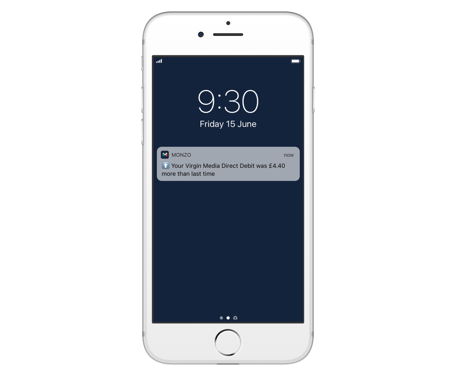
I can’t remember the last time I typed “ebay.co.uk” into the browser, but my bank balance certainly shows that their timely offerings of things I might like hit the spot!
Types of notification
When we say ‘notifications’ in this article we’re going to mean the two obvious ways products communicate with users outside of their platform (so putting aside in-app notifications) – push notifications and emails.
That’s not to say there aren’t others though: As one example, it could be argued that a timely piece of social media remarketing is a form of notification.
We’ve all experienced a tempting discount code for the thing we were just talking about popping up on Facebook or Instagram, and the simultaneous feeling of creeped out but intrigued, right?
As the digital ecosystem gets ever smarter there are bound to be even more ways to remind, prompt, inform and ultimately retain users with great notification UX.
For now though, let’s overview those key two…
Push notifications
70% of people find push notifications useful
70%
Push notifications
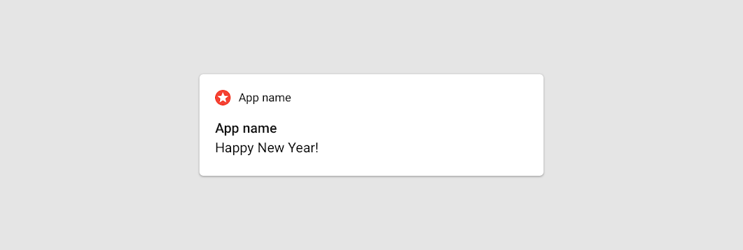
Everyone’s pretty accustomed to the little banners, badges and alerts that slide and pop onto our lockscreens and desktop corners. From Amazon to Zoom, the products we use are all at it.
The most important features of this notification type is that content is displayed:
- Regardless of whether or not the application is open
- Irrespective of the device or browser being used.
Push notification messaging is necessarily brief (typically 30-40 characters for mobile devices, slightly more for desktop), so needs to get to the point quickly. They have immense potential and – done right – meet with high approval.
- Email marketing platform e-goi’s research states that a whopping 70% of users find push notifications useful.
- A/B testing giant VWO puts the click rate from browser-based push notifications at 4-8 times that of email – and these figures may be on the low side if anything.
Daily email use
99% of people check their inbox every day
99%
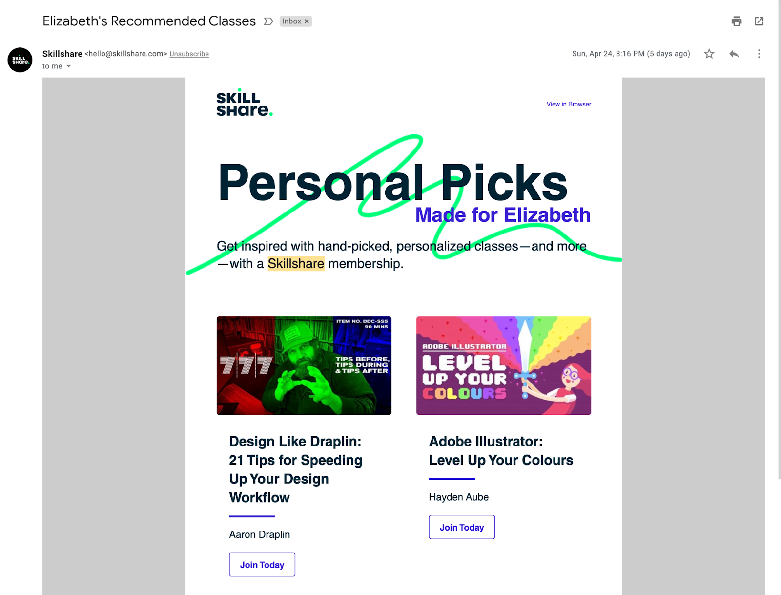
99% of people with an email account check their inbox every day, according to HubSpot. Not even the best-loved product on earth can claim a fraction of that level of engagement, so meeting users where they already are – right there in their inbox – should be a no brainer.
You’d be surprised, too, at how much can be achieved with a smart, timely email.
From the utilitarian necessities like password changes and security alerts to segmented offers and deepening understanding, email is a powerful ally to a product team.
Go with the flow - designing onboarding that works
We take a look at three common onboarding flows and how to ace them ⭐️
Notification UX risks
When a product gets their notification strategy wrong, users can feel like they’re being bombarded with irrelevant, impersonal interruptions.
At best they instantly dismiss and tune them out – leading to critical information being missed thanks to your product ‘crying wolf’- and at worst they delete the offending platform altogether.
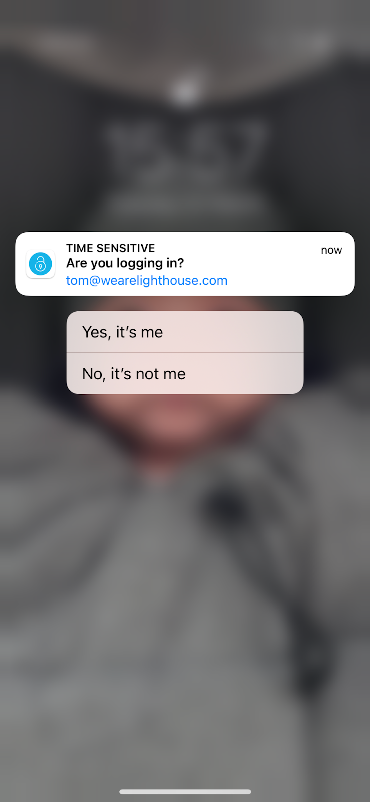
Is something like this even worth looking at my phone for? Material Design rightly cautions against sending notifications which provide no direct value to users.
Notification best practice
We asked the Lighthouse team about their best and worst notification experiences over lunch last week.
The resulting session turned more into a ‘hall of shame’ than a feelgood sharing of best practices, with significantly more rants than raves.
This certainly serves to illustrate that when your notification strategy misses the mark, you can be sure users will talk about it!
There were some gems that came out of it though, and some common themes that cropped up across the board. Let’s take a look at our favourites…
Want to sense check your product’s notification setup?
Our UX audits can highlight problem areas across all aspects of your application ready for improvement and rollout 🤘
Related Posts
 Article
Ever worked with someone who couldn’t innovate their way out of a paper bag? Or maybe a leader who gets overexcited about the latest trend from a conference, completely detached from what your customers actually need? Or your product roadmap? We’ve been there.
 Article
Wireframes are all about hierarchy. No digital product or website exists without an underlying structure that dictates the importance of every piece of information.
