Go with the flow – designing onboarding that works


What’s the most important metric for a product team to keep tabs on?
Ask anyone with a product that’s gained some level of traction, and they’ll give you the same answer – conversion rates.
Conversions, those moments when users complete a desired task, can be a few different things depending on what an organisation has defined as valuable to them.
When a user opens an email, that’s a conversion. A click on an ad is a conversion. Picking up the phone to give your business a call is a conversion if that’s what’s important to you.
But at the top of the pile for digital products is the conversion whereby someone signs up, parts with their cash (where applicable), understands the platform and then keeps engaging for weeks, months and years to follow.
A regular, engaged user is worth their weight in gold to a product team.
Now at this point it’s fair to say that for pretty much any use case imaginable there will be multiple platforms available. It’s also a fact that human attention spans have never been shorter, and expectations of digital experiences are particularly high.
The power of one paying customer and four places to find them
Finding your core niche audience and serving these users really well is the leanest way to grow a product or turn a service into a real digital offering.
As a result, it’s incredibly important for the journey a user takes to grasp what you’re doing, realise it solves their problem and start engaging (and hopefully paying!) to utilise the best possible UX.
That’s why strong onboarding flows have become a key part of modern applications. We’re all onboarded regularly, but when the process is done well it’s something barely noticeable that moves us from curious to hooked in a few seconds.
User Onboard, the spiritual home of all things onboarding, describes it like this: The process of radically increasing the likelihood that new users become successful when adopting your product.
No pressure on the UX team then, hey!
Whilst we’re on the subject, If you’re keen to see in depth analysis of how a bunch of popular web apps handle onboarding flows then we highly recommend checking out User Onboard’s ‘teardowns’ section.
In this article we’re going to take a look at three similar-but-different onboarding flows, all of which point at the end goal of a user who understands the product and is raring to get going with it.
Flow #1 – Filling in the blanks
One of the most common – and most important – user onboarding flows is the initial sign up process itself, where the starting point is account creation.
If the end of this flow constitutes your first conversion and interaction with the product, then it’s vital that the flow doesn’t dry up. If it fails, then you don’t have a new user.
The golden rule here is that the longer the flow, the less likely people are to complete it. The balance is always collecting enough essential information now vs putting off completion.
That’s why a tool with the best chance of success is one that collects just the essentials at this stage, then uses in-application prompts, emails and other techniques to collect more data later on. Many even gamify this process, to great effect.
You may well have seen the “your profile is X% complete” around and been prompted to reach the goal of a 100% badge of honour.
As Neil Patel explains, humans are hardwired to respond well to such indications of progress:
As people, we are driven to
1) Have goals; and then
2) Accomplish goals.
We inherently feel good about achieving something.
Account-free onboarding with FitQuid
Getting users engaged straight away meant they’d begin earning rewards in the app in no time, which in turn boosted their engagement.
First class flows 🙌

#1 The Times
No-one loves a paywall, but most of us accept them as a necessary evil.
The Times reel us in to sign up with a taster of the content we want to read, giving users the incentive to create their account swiftly and get back to their reading.
A free month – so even if we find the article in full a complete let down once it’s revealed, we don’t feel short changed – is a nice touch.
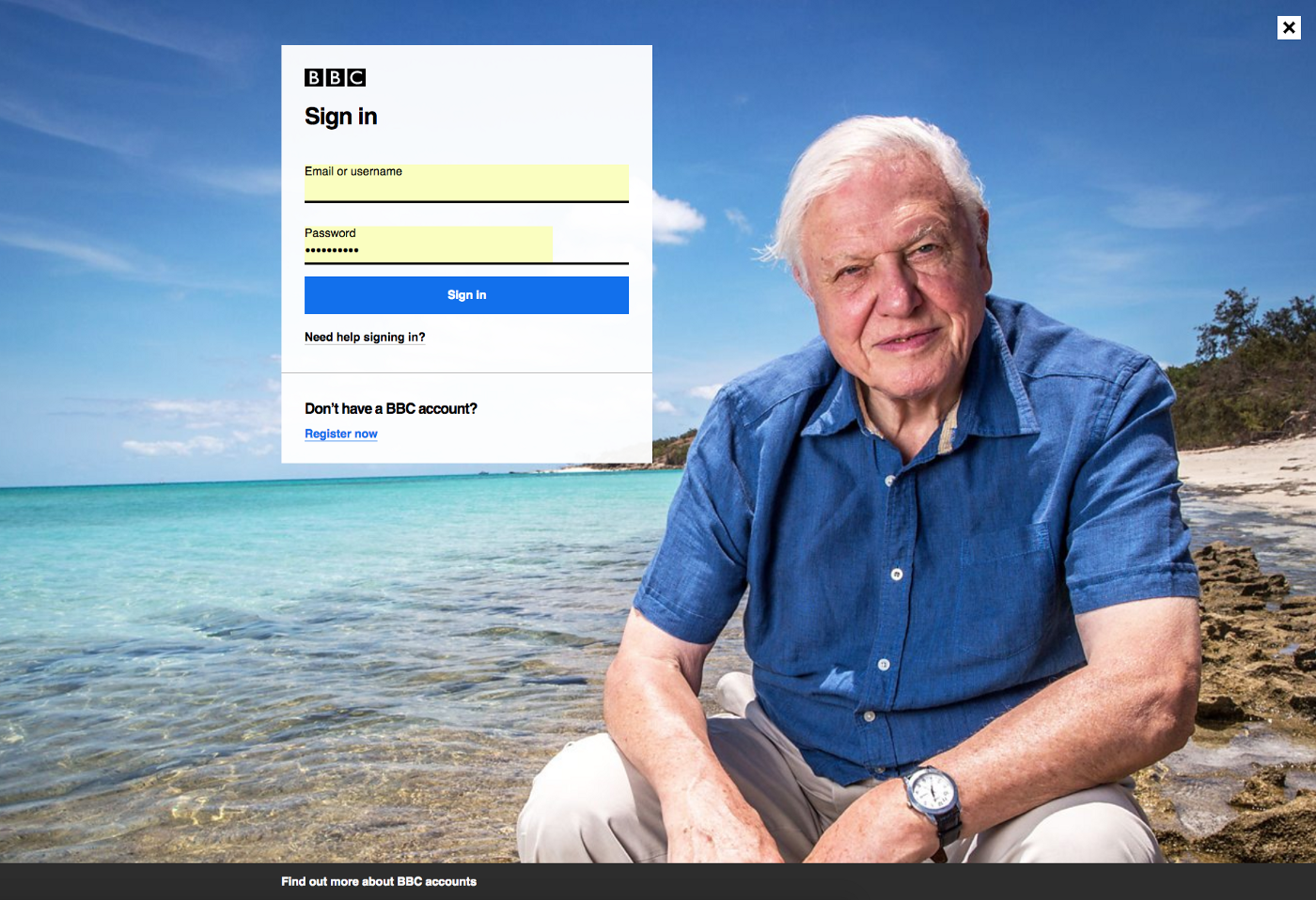
#2 iPlayer
When you know your users are keen to get straight to the content, and especially when it’s something they’re not accustomed to having to log in for, it’s vital not to frustrate them.
How better to give off a calming vibe than with instantly recognisable presenter and Grandpa of the nation Sir David Attenborough? Helping users into a favorable emotional state makes them much less likely to abandon the unexpected step of signing up.
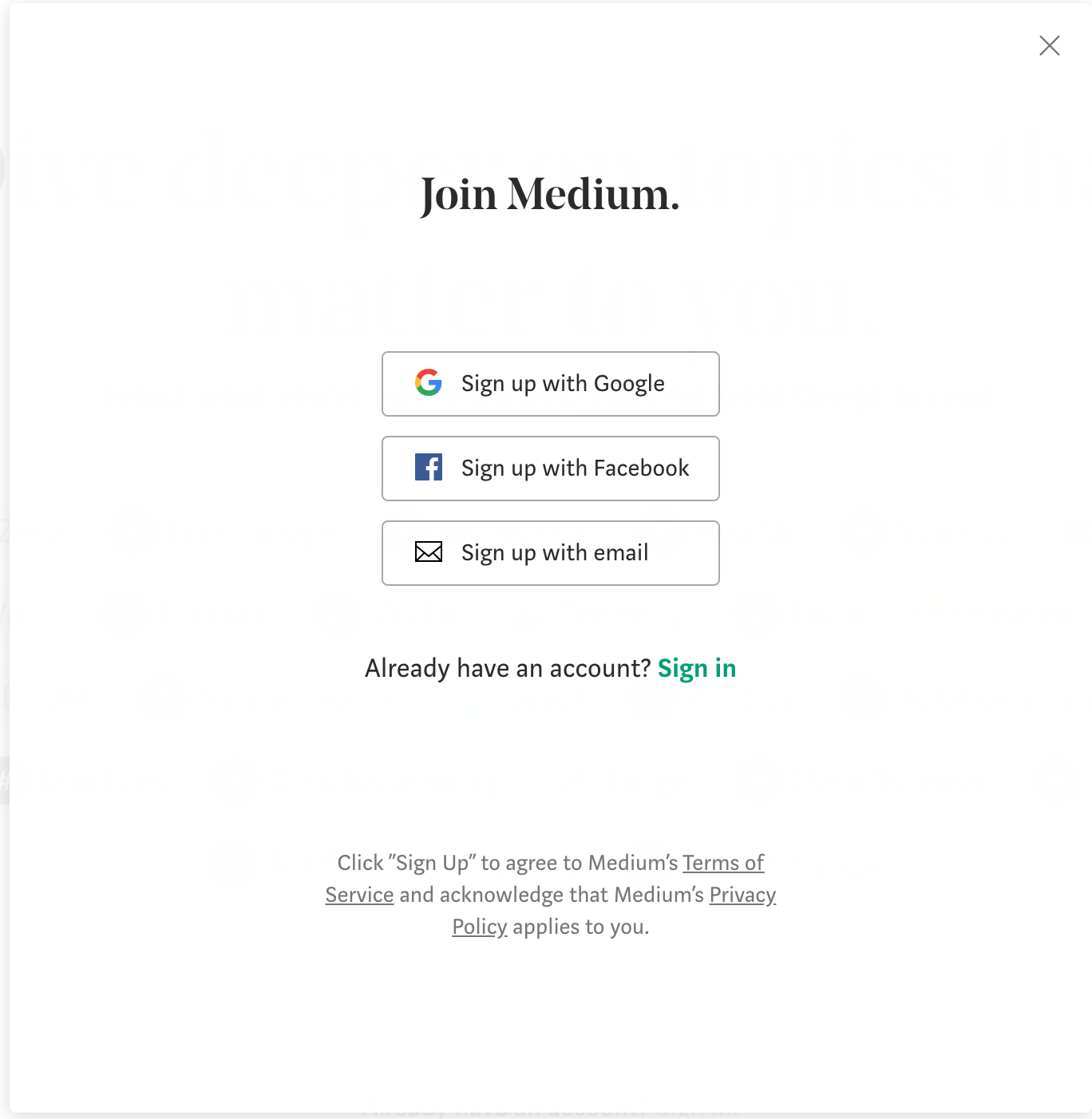
#3 Medium
Social sign-ups are in many ways the ultimate frustration saver.
Medium keep it ultra simple, directing users to a platform they’re most likely to be logged in with already first. And if they don’t have a google or facebook account, the signup process kicks in over there instead.
Sneaky, Medium, very sneaky.
Flow #2 – Getting to the prize
Another super common flow takes place on sites selling or comparing products (insurance is a great example). In order to show a meaningful, personalised result the application often needs to know quite a lot about users.

Migrate’s onboarding UX needed our input. A small improvement made a big difference to the business.
This is particularly problematic as a) we don’t always have the answers and b) we’re generally in a ‘doing a chore’, transactional mode when we sit down to interact with this type of digital product.
Not many people find searching for the best breakdown cover fun, and nor do they expect to enter into a lasting relationship with the tool they use for it. They just want to uncover the information they’re looking for and move on.
We’ve all been there, doing a home insurance quote when we’re asked whether our locks conform to certain regulations or are told we need to upload a particular misplaced document before we can move on. It’s very annoying!
These sorts of flows are there to get us through pages of boring forms, answering questions that we just want out of the way. The best of them allow you to intelligently skip entire sections that they work out aren’t suitable for you, as well as save and return to complete at a later date.
Without this, drop off rates would be massive.
First class flows 🙌
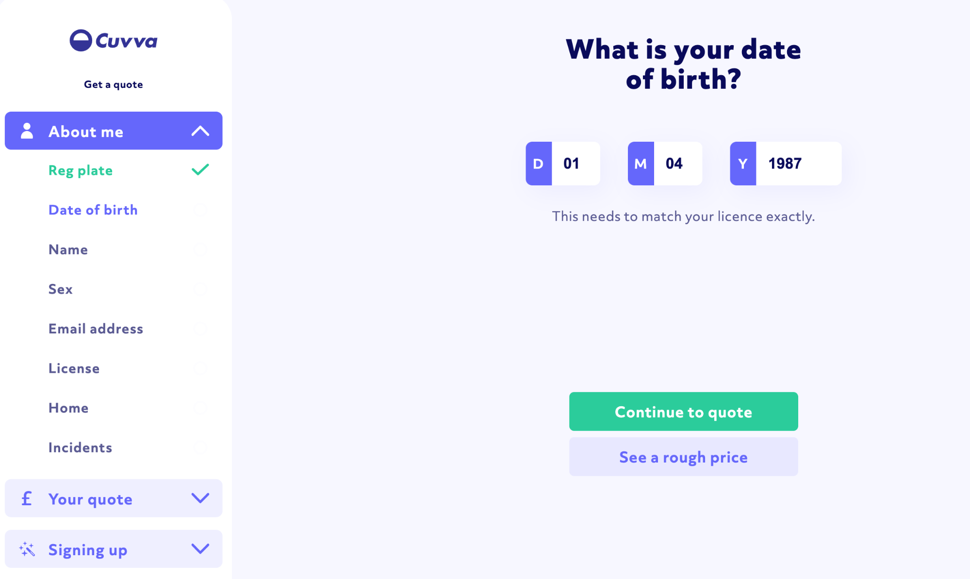
#1 Cuvva
Cuvva, who bill themselves as ‘car insurance the way it should be’ have mastered this flow.
Not only do they provide a handy checklist to see at a glance how the process is going, they allow users to skip ahead with their ‘see a rough price’ button.
If the ballpark figure isn’t as expected, no need to continue along the whole journey. So clever!
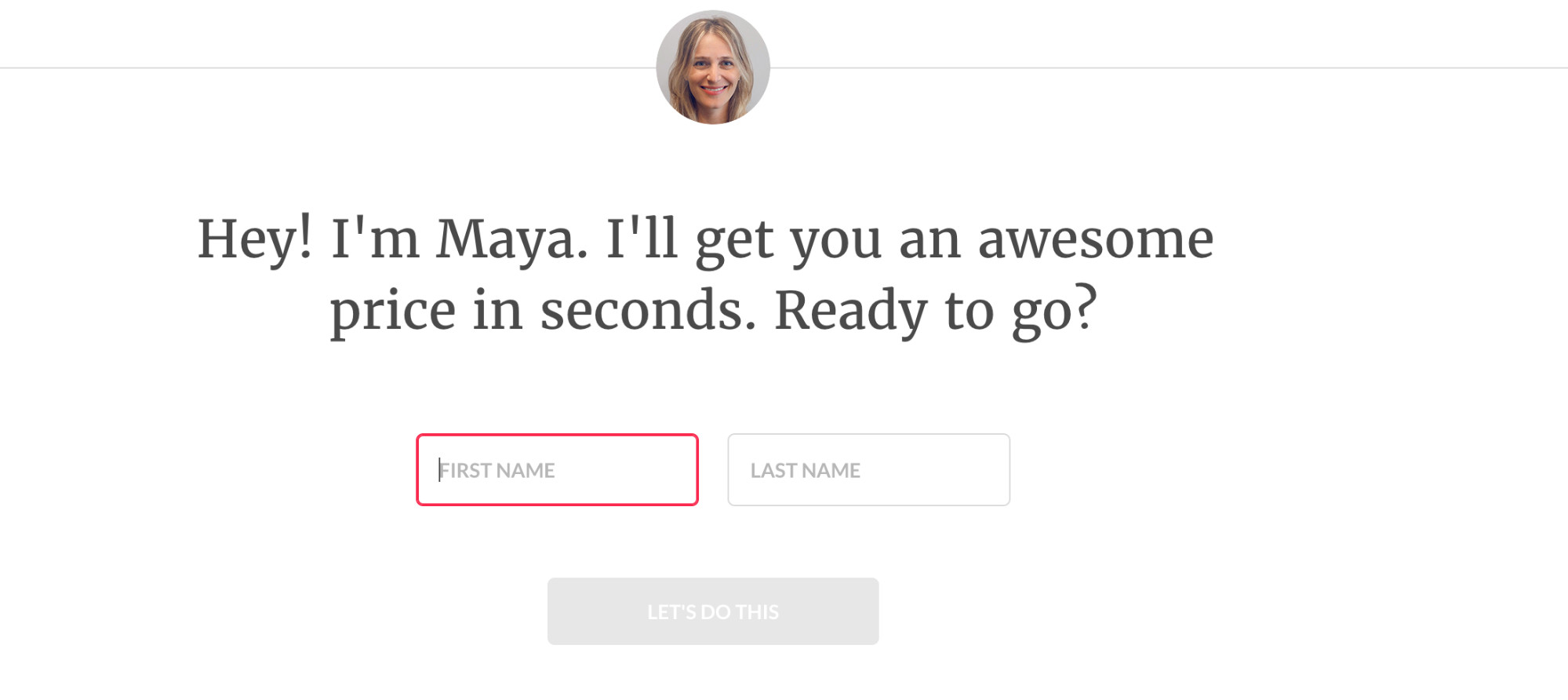
#2 Lemonade
Lemonade is another insurance industry disrupter, this time specialising in home insurance. They mark themselves out as different from the off by introducing a ‘real person’ (and an approachable-looking female one at that) to guide users.
Couple that with a total absence of dropdown forms or confusing jargon, instead using fun microinteractions and emoji-like illustrations, and this is one friendly flow.
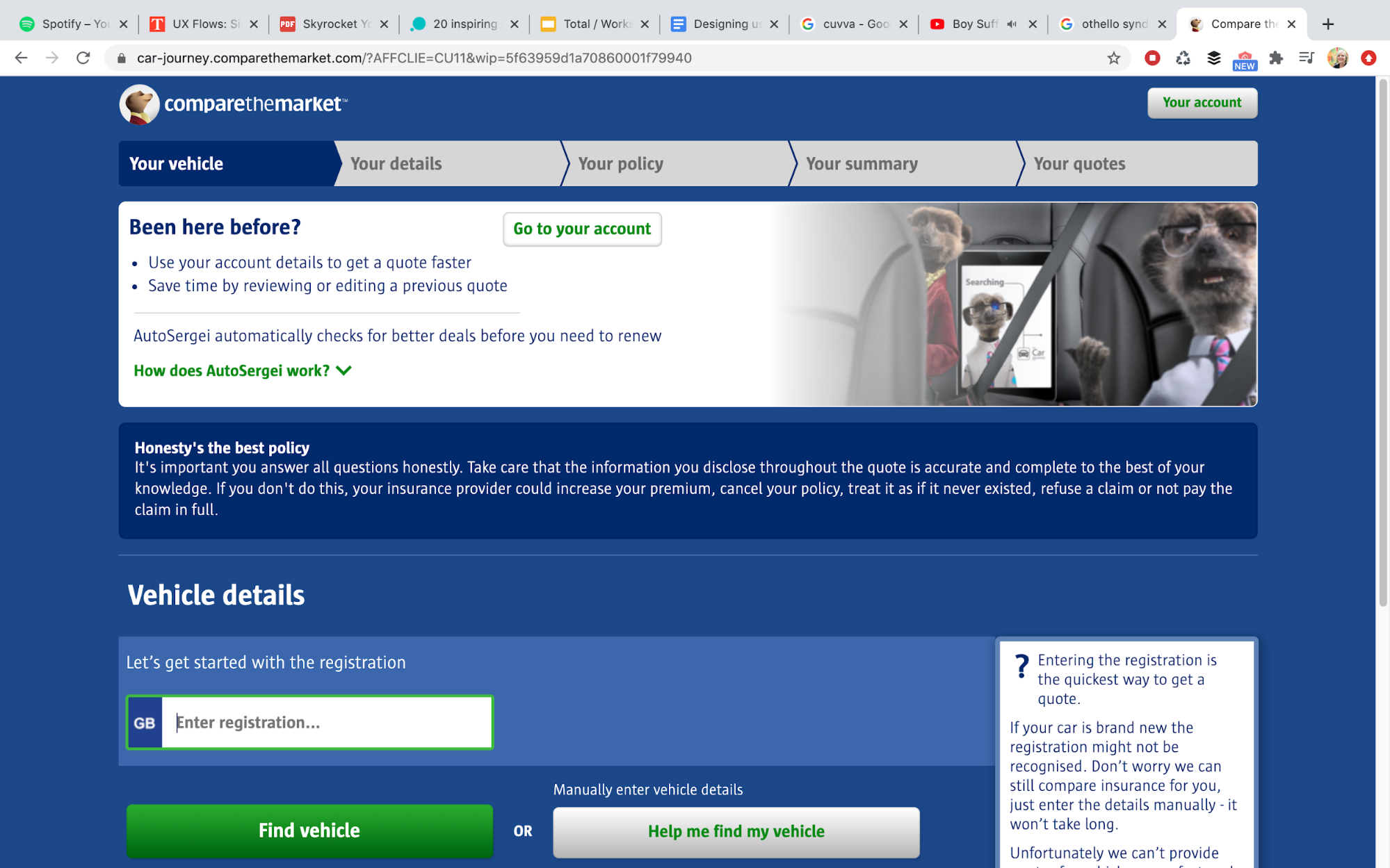

#3 Compare the Market
Ok, so it maybe isn’t the most gorgeous looking site, but – meerkats aside – veteran comparison tool Compare the Market is all about speeding things up for users.
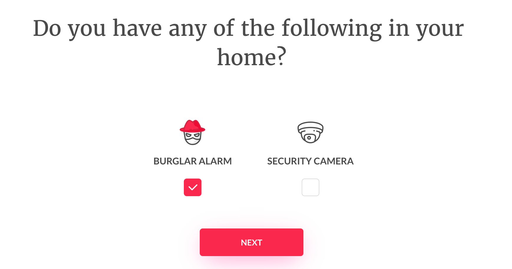
From auto-filling the tricky questions about their car (you can’t honestly tell me you know what brand of alarm you’ve got?) to placing the option to pick up where you left off front and centre on the home page, this tool is designed for convenience.
Flow #3 – Learning the tool
This is a flow that can be used at a variety of points, whether it’s the first time someone’s using your product or you’ve just released a brand new set of features. There may be a level of complexity within your system that your customer needs to understand.
For existing account holders, this is all about disseminating information in a way that doesn’t feel like reading the instruction manual. With a deeper understanding and appreciation of the tool comes better engagement, which is what we’re all aiming for really.
There’s no point having a million registered users if they all take one look at the dashboard and don’t grasp the possibilities of the tool!
If any of these sound familiar, you’ll need to build in a flow that shows users around.
- Your product uses gestures that may not be intuitive.
- You’ve redesigned something and need to explain the changes.
- User testing has thrown up mixed results, and there’s a chance people are overlooking a feature of your product that you think they should know about.
- You don’t want to leave your users alone whilst they take their first steps in something new. Instead you’re keen to explain the key features and action.
There are a ton of clever ways for products to show users around their features, from overlay videos to highlighting key actions in-page and explaining each one step-by-step.
As with the other flows we’ve discussed, you don’t want to overload the user with information at this point. Let them go at their own pace and retrace their steps if they need to.
The method you choose and what you highlight should all be down to where there is complexity or a lack of understanding from the customer.
Remember though, that even the best onboarding can’t make up for poor UX decisions. If you’re finding this flow having to do an undue amount of heavy lifting, it’s probably time to take a hard look at your product features.
First class flows 🙌
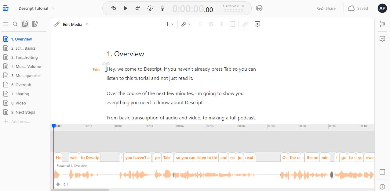
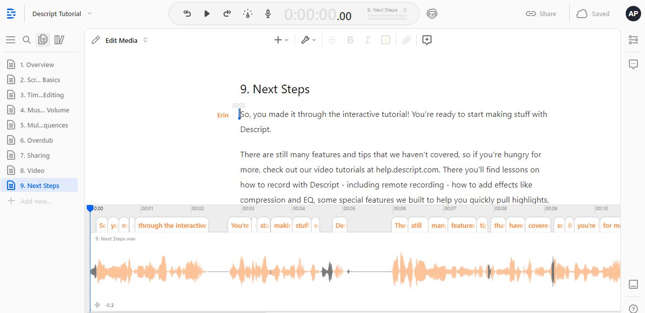
#1 Descript
Innovative audio editing tool Descript provides a masterclass in ‘self service’ onboarding. Almost without them noticing, users are getting to grips with editing text to edit audio – a concept which is far easier to show than tell!
Eight tutorial exercises give them all the skills they need to use even the most complex features, leaving them with the reassurance that help is still on hand as they venture even further into the application.
We’ve just started using Descipt ourselves and we love it!
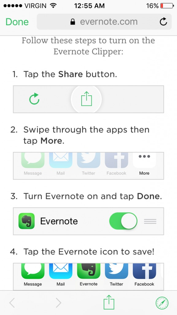
#2 Evernote
When a tool is mainly going to be used on mobile, if a key functionality is too complex to show users around rapidly, it’s probably too complex full stop.
Evernote get it spot-on with a four step, image filled tutorial. It’s a straightforward product, so a straightforward tutorial that helps users realise they’ll use it a lot is perfect.
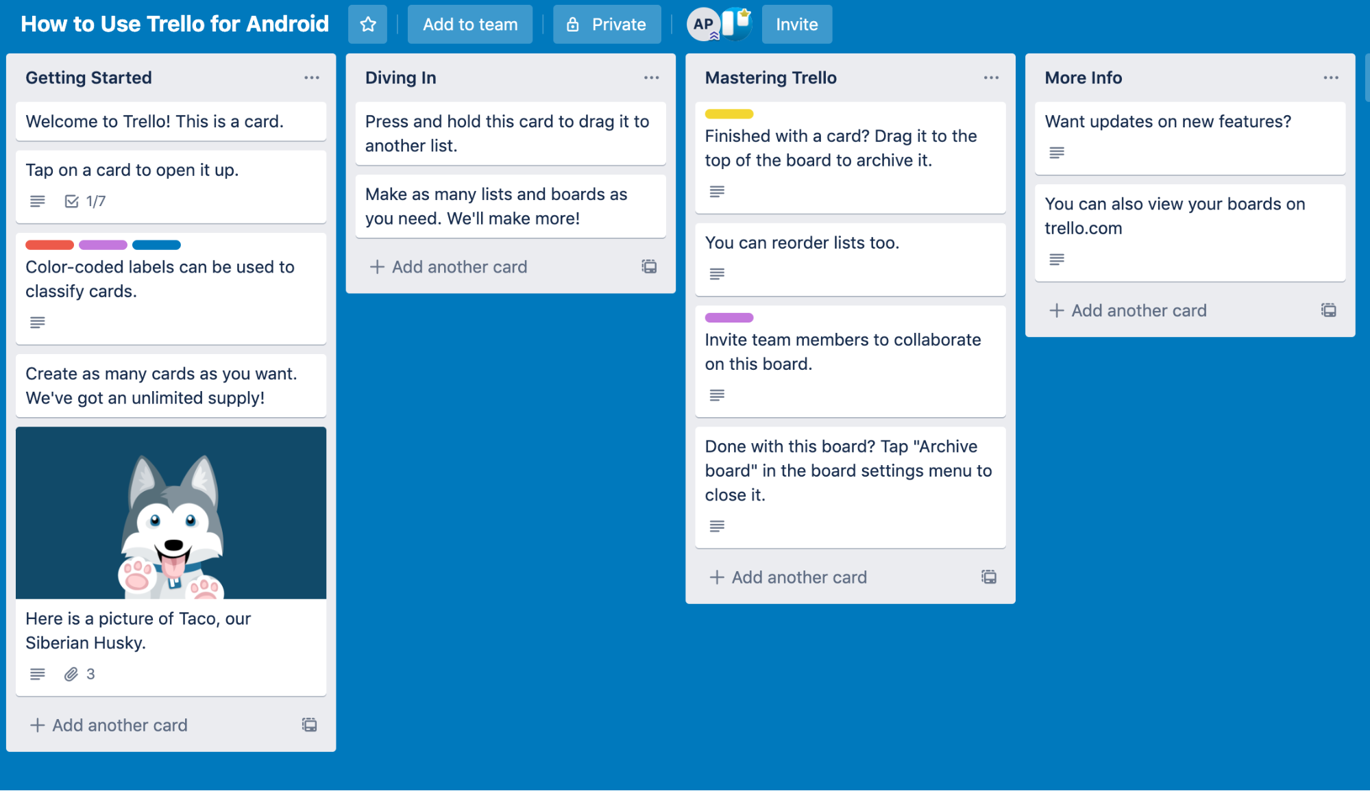
#3 Trello
Incredibly popular and eternally consistent, list making tool Trello embodies simplicity in onboarding. Whilst more and more people signing up these days will be familiar with Kanban,Trello assumes nothing. They use the tool to explain the tool – pretty cool!
Conclusion
Shocking fact for you – the average app loses 77% of its daily active users within 3 days of installation (According to Silicon Valley insider Andrew Chen). You could have the most useful tool in the world, but seemingly small errors in the flows users take getting started and getting to know it could be having disastrous effects.
If you can nail your onboarding, users will be confident about what to do to get what they’re looking for.
Strengthening confidence and trust doesn’t just help new users, it helps conversion and retention figures and makes loyal customers into powerful advocates for your product.
Related Posts
 Article
User experience design firms help businesses create intuitive, effective digital products. This guide explains what they do, the services they offer, and how to choose the right UX partner.
Article
Most teams think skipping product design saves time. In reality, it creates more problems later. Here’s why design is critical to building products that actually work.