Company

Startup, 8+ employees

Energy

B2B/B2C

UK
The business
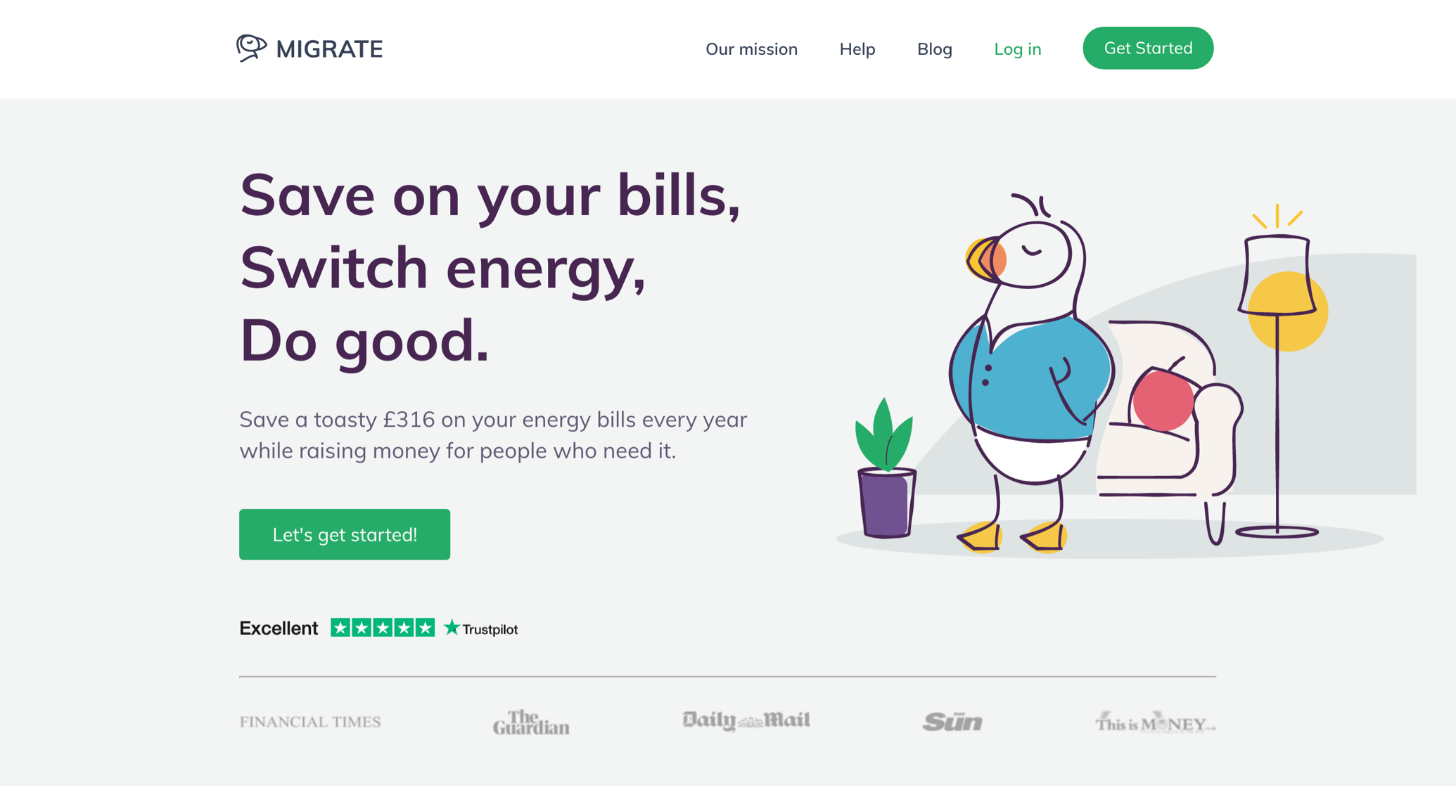
Migrate is a price comparison site with a difference. Not only does it ensure users have the best energy deal, switching them if necessary for free, it also uses revenue from energy suppliers to combat fuel poverty. A fantastic mission, but suffering from UX/UI design problems that were holding it back.
Different teams had been responsible for different areas, and there was a lack of cohesion.
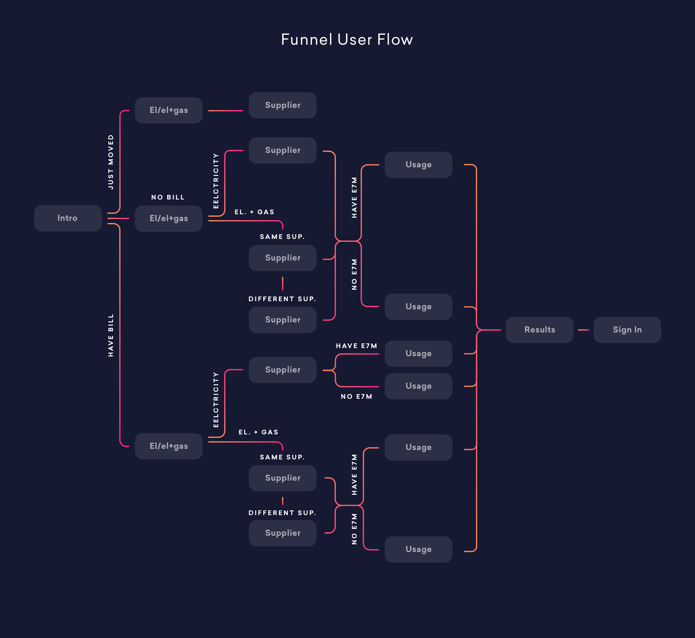
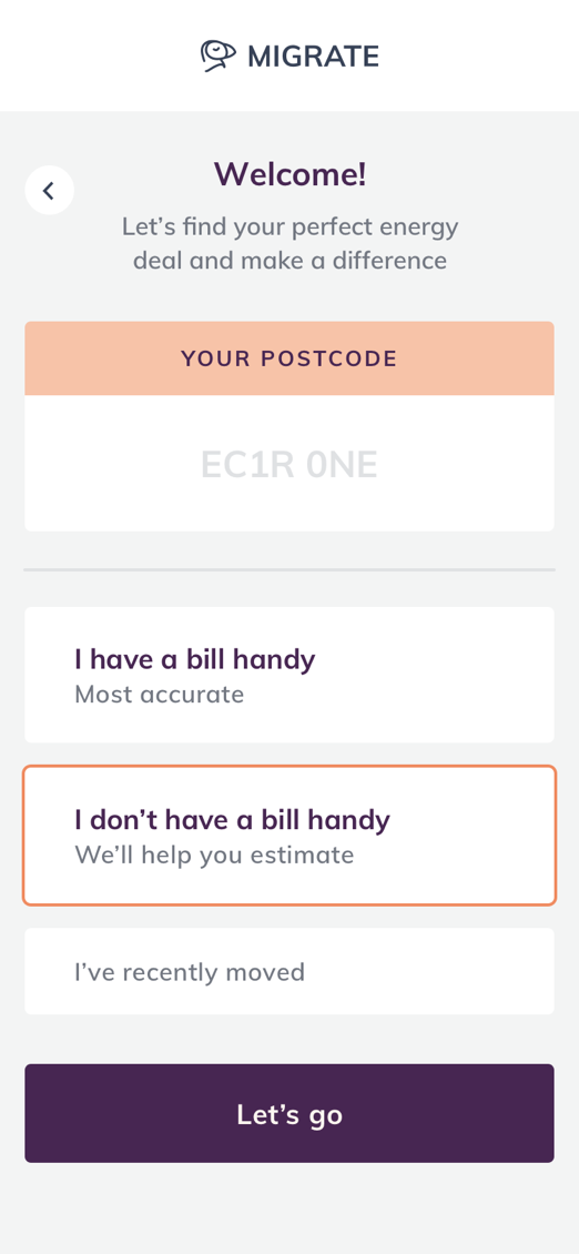
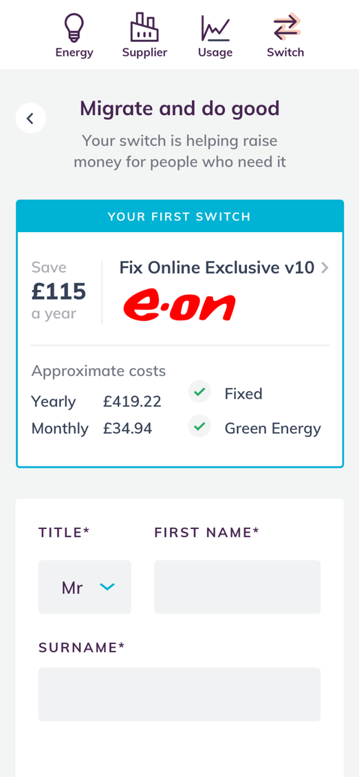
The onboarding UX was an area that particularly needed our input. Things weren’t working at all well, and even a small improvement in such a key area would make a big difference to the business overall.
Before making a significant marketing investment, the Migrate team wanted to iron our these issues.
As well as a B2C focus on individual users, Migrate also has a B2B function, as it’s used by councils who onboard multiple users. We had to ensure both use cases were considered.
UI design overhaul
Our first job was to compare Migrate to other products in the same space, and learn best practice from those doing it well.
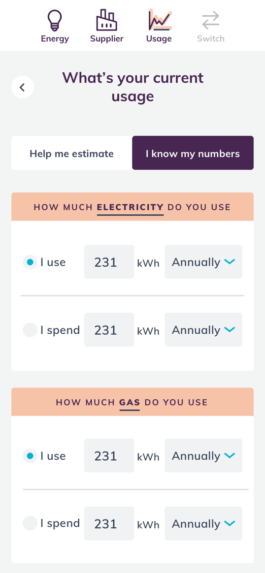
This helped informed our revisions to the flow taken by new users, and enabled us to speed up the UX, trimming it of unnecessary and confusing elements.
We also made it simpler for users to make ethical – not just price based – choices by improving the ability to compare between ‘big name’ and green suppliers at the end of the journey.
UI design and illustration
Migrate already had a strong brand in place in the form of a Puffin character.
We built upon this with new, hand-drawn illustrations to restyle him with block colours adding a friendly feel, treating other images on the site to match and creating brand assets for use across all touchpoints.
Rebranding meant the central brand was now in line, and the site pulled together visually.
Collaborating to meet the deadline
The project was fast-moving, going from our initial UX design work to launch in just a month.
To deliver the rapid turnaround needed we worked closely with Migrate’s in-house dev team. We kept buildability in mind throughout, and provided them with prototypes and detailed design documentation so there were no surprises.
A good team working together can do great things in a short period of time!