User onboarding flows are a hot topic in the UX design world.
Getting people quickly and painlessly engaged, finding their way through and loving a platform is something that we rightly give a lot of attention to.
Go with the flow - designing onboarding that works
Good onboarding is barely noticeable but moves us from curious to hooked in seconds.
But when was the last time you thought about the other end of the flow? Offboarding is an important but often overlooked part of the user journey.
What is offboarding UX?
Put simply, offboarding is the process by which users are guided to delete, deactivate or pause their account and stop using a product.
When you’ve put blood, sweat and tears into attracting users and showing how perfectly you can solve their problem, it can feel like a personal smack in the face that they want to leave.
You’re going to need to get over that.
Churn is real and it’s normal for people to genuinely not need whatever it is you offer anymore, be it a SaaS platform their company has outgrown or an audio editing tool for a podcast they no longer record.
Don’t leave me!
It can be tempting to deploy dark patterns in your offboarding flow, clinging on to users by making it too time-consuming, confusing or guilt-inducing for them to leave.
Tactics on our list of shame include:
- Making pages about unsubscribing hard to find.
- Forcing users to phone and speak to someone or have a drawn-out webchat.
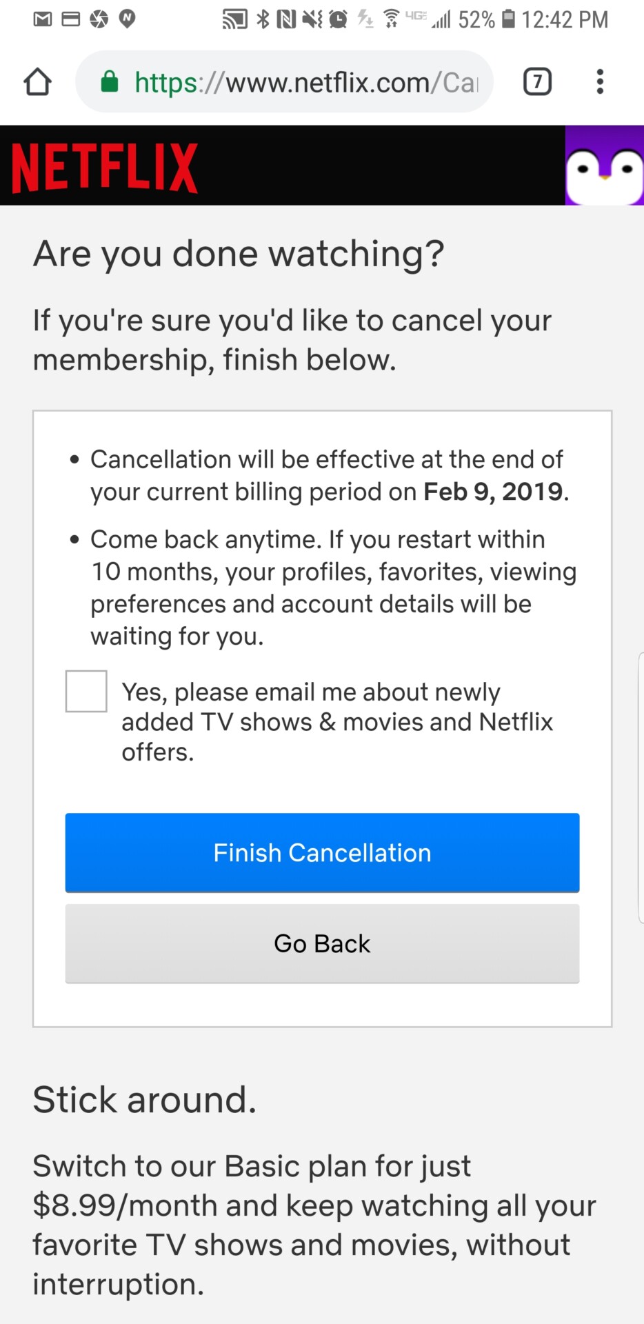
- Emphasising a ‘no, I’ve changed my mind, I want to stay’ button to draw attention away from a small, dull ‘unsubscribe’ one.
- Facebook’s favourite, emotional blackmail, with a parade of contacts who’ll apparently be sad if you leave.

Oh, the guilt…

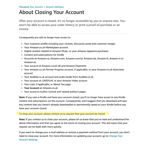
Amazon wouldn’t dream of having such a vague and unhelpful CTA in such an unappealing wall of text on any other part of their site.
Hopefully you don’t need us to tell you that such tactics are a seriously bad idea.
Users who really want to leave will find a way to do so.
When they leave your product with a lasting impression of frustration or of being tricked and manipulated though, they are extremely unlikely to return if they encounter the problem you solve again in the future.
And if it’s a truly awful experience, they won’t keep quiet about it either.
What is good offboarding UX?
Enough of the negative stuff, let’s take a look at why good offboarding UX matters so much.
Firstly, if users who want to leave have a positive experience with a product at that point, they’re more likely to be won back in the future.
This is a big deal since re-engaging lapsed customers who already know what a platform is all about is generally recognised as far easier than generating fresh new users.
Users who want to leave also represent an immense learning opportunity. Any product team worth its salt should be constantly listening to users, hearing their pains and using feedback to inform the product’s roadmap.
Behold...
the priority spade
How should busy product teams decide what to tackle next? With our new invention the Priority Spade™️ of course!
If people are leaving because your product isn’t meeting their needs but you’re just letting them go without finding out exactly what the problem is, and whether the same issue is cropping up repeatedly, you’re missing out on the chance to improve.
That’s just madness.
There is also massive scope to retain them and turn ‘goodbye forever’ into ‘hello again’ with the right offboarding flow.
Depending on which studies you read and what industry you’re in, acquiring a new user is somewhere between five to twenty five times more expensive than retaining an existing one.
Keeping any waverers onboard in a positive way is good business sense- we’ll dig into this a bit more below.
5 actionable offboarding tips
Offer options and flexibility 🤔
Rather than deleting everything forever, giving users the chance to pause, downgrade to a free/cheaper plan with less functionality or deactivate without losing their data can be softer options.
Many users will plump for these, given the chance. Win-win.

