The pains (and gains) of managing a multi-brand UI design system


Our work with Digital Charging Solutions (who run the ChargeNow brand) sees us maintain an extensive UI design system for use across their suite of apps and websites.
It’s a big job and requires plenty of man-hours paired with an agile, iterative approach to handle the needs of a young business scaling up.
On top of this, the company has started expanding by offering a white label service to global car brands who want to take advantage of DCS’s existing network of electric vehicle charging stations rather than build their own.
It’s a great way for them to grow at pace but brings with it some UX design head-scratchers, as you might expect. Here are some of the challenges we’ve come across so far.
A seamless brand experience
Each brand has their own strict brand guidelines which must be adhered to in the products that DCS deliver for them.
Each time a new partner purchases the white label solution, the design system has to work across an additional touchpoint and deliver a seamless, instantly recognisable experience for each brand’s customers.

Think about the scale of what’s involved.
- A design system flexible enough to allow for each brand’s different styling, colours, typography and icons…
- …that fits in with both their existing websites and apps…
- …but at the same time is able to fit into DCS’s theme.

Icon design issues
You might be surprised to learn that most design systems don’t come out of the box with an icon for a Rapid DC 50kw electric charging plug. Or any type of plug, for that matter.


Global brands spend months (if not years!) developing their icon sets, but we needed to come up with matching versions of all these extra assets in a way that can translate into a standardised context.
No pressure, hey!

Colour palette matching
Something as seemingly simple as the colour scheme isn’t always straightforward either.
Many brand systems have enough colour choices to make transition easy to manage, but some simply don’t have the colour palette to deliver the nuance contained in a complex user interface.
Hammering brand colours into an existing interface can be a challenge. By creating a set of reusable swatches and designating the primary, secondary and tertiary colours to be used in specified contexts we’re able to take away the guesswork from the dev team.

Maintenance and extendability
Think the hard part’s over now? Don’t forget we’ve then got to maintain every version of the system. Yikes.
This part is less about being a good UX designer, and more about being the strategic architect of a system that allows flexibility and extendability.
Some of the ways we’re able to achieve this are to introduce a strict naming convention for everything in the system, and an extensive library of components to be reused across all the sprawling Sketch files.
As a UX design agency with years of development experience , we drew on our knowledge of planning modular codebases and naming conventions from popular front-end frameworks to mirror best practice that would be familiar with development teams.
We needed a system that could be as automated as possible. Using Abstract we are also able to track the history of our changes and collaborate as a team on the whole project.
Trust us, version control is an absolute lifesaver for something this complex.
The gains
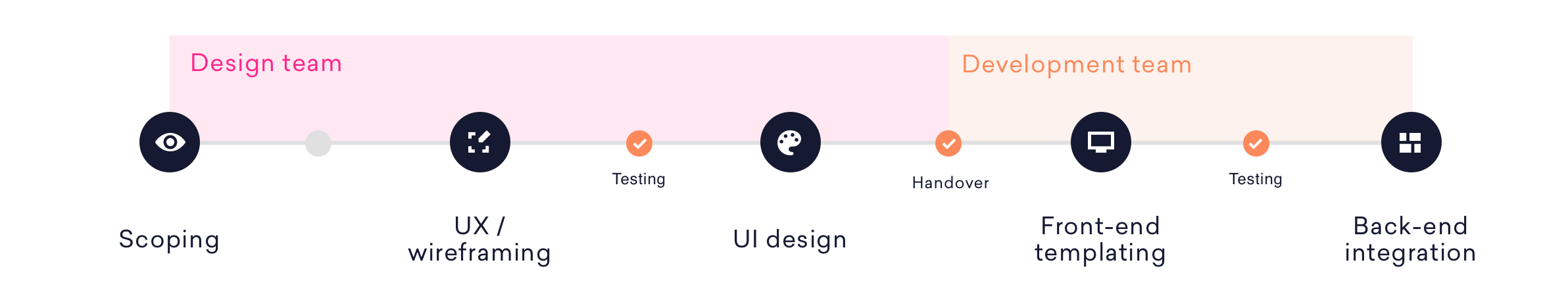
Usually the planning of front-end templating systems is done after UI designs are handed over to the development team. In this case the structure put in place directly influenced the templating strategy, naming and overall coherence.
It meant a truly modular system and a vastly improved way of communicating and collaborating with the front-end team.
Adding new features also became simpler. Rolling out a new component or template in the master system to the partner brands could almost be entirely automated, something that could have been a time consuming process before this work was put in place.
Even feature requests from partners that currently weren’t a part of the existing products became simpler. The workflow went both ways. A feature created (and paid for) by a brand could automatically be pushed out to other partners with far less effort than in previous iterations of the product. 
Conclusion
Investment in a documented, structured design system will undoubtedly provide long-term payoffs. It’s the only way to sensibly maintain a consistent design language across your own products and those that you deliver for your partners.
Investment made now will give you:
- A speedier release cycle.
- Improved communication between collaborating UX design and development teams.
- A quicker way to adapt and change digital products.
- Automated processes for partner rollout.
Contact
Design systems are beneficial for products of all sizes – you don’t need to be as big as DCS! Talk to us about how we can help with yours. 
Related Posts
 Article
Ever worked with someone who couldn’t innovate their way out of a paper bag? Or maybe a leader who gets overexcited about the latest trend from a conference, completely detached from what your customers actually need? Or your product roadmap? We’ve been there.

 Article
Wireframes are all about hierarchy. No digital product or website exists without an underlying structure that dictates the importance of every piece of information.

