We've created extensible UI design systems for...
A complete UI design system
A complete design system informs every part of a digital application, and works across all touch points. You could view it as an extension to your brand guidelines, building on top of them to ensure a cohesive and consistent experience in absolutely every respect.
Each element or component used for each screen may have various states based on the current user interaction, on the size of the device being used to access the product or other factors. Each and every one must be documented.
Your design system is the single source of truth which documents everything that makes up the screens of your product.

The pains (and gains) of managing a multi-brand UI design system
Everything we know about managing UX and UI design across multiple white labelled websites and apps.
Why is a design system important?
At Lighthouse, our UI design phases always work towards the creation of an underlying design system.
That design system acts as a reusable tool that cuts down the need for ongoing UI design, and massively speeds up the development process.
Your developers can move directly from wireframes to finished templates, eliminating guesswork or the need to refer back to designers for guidance when it comes to implementation.

In the longer term, a design system means that iteration is simplified, with future features and sections of the application needing far less design time to implement.
Future release cycles will be able to move straight from wireframes into development, only needing UI design where new layouts and patterns don’t currently exist in the system. Even in such circumstances, conventions set by the design system will make the design process a breeze.
We are often approached by clients seeking who feel their application lacks cohesion. This generally occurs when design decisions have been made by engineering teams, as a design system was not in place.
Leaving the design decisions to the people who are skilled in that area and allowing developers to focus on their own skill set is always a good idea!
What do design systems include?
Styleguide
The foundations of your system that define and underpin everything that follows:
E.g. typography, colours, grids and spacing
Elements
Individual pieces of the interface. Each will often have several states based on how a user can interact with them.
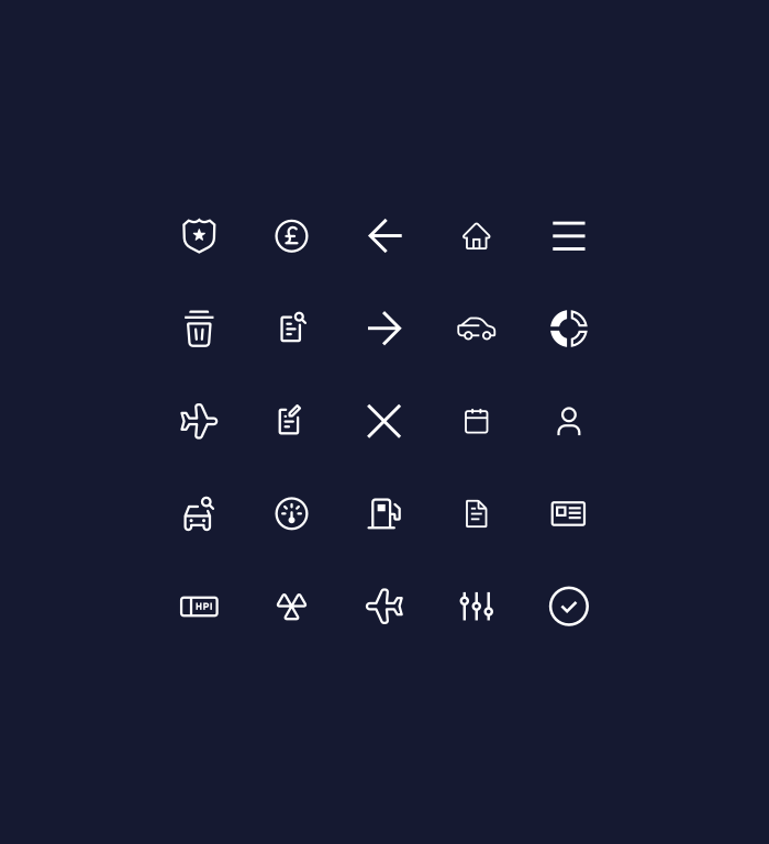
E.g. links, buttons, icons, tables

Components
Sets of elements combined to make up reusable bits of UI. These will often also have states of use based on common interaction and different layouts based on varying screen sizes.
E.g. Navigation and menus, forms, search bars
It’s not just huge, complex products that benefit from a UI design system – coherent, consistent experiences are vital for applications of all sizes.
Consistent product design: there's more than meets the eye
We explain why consistent design is a good idea, think about different types of consistency and encounter some unexpected controversy along the way.