A UK-wide retail network
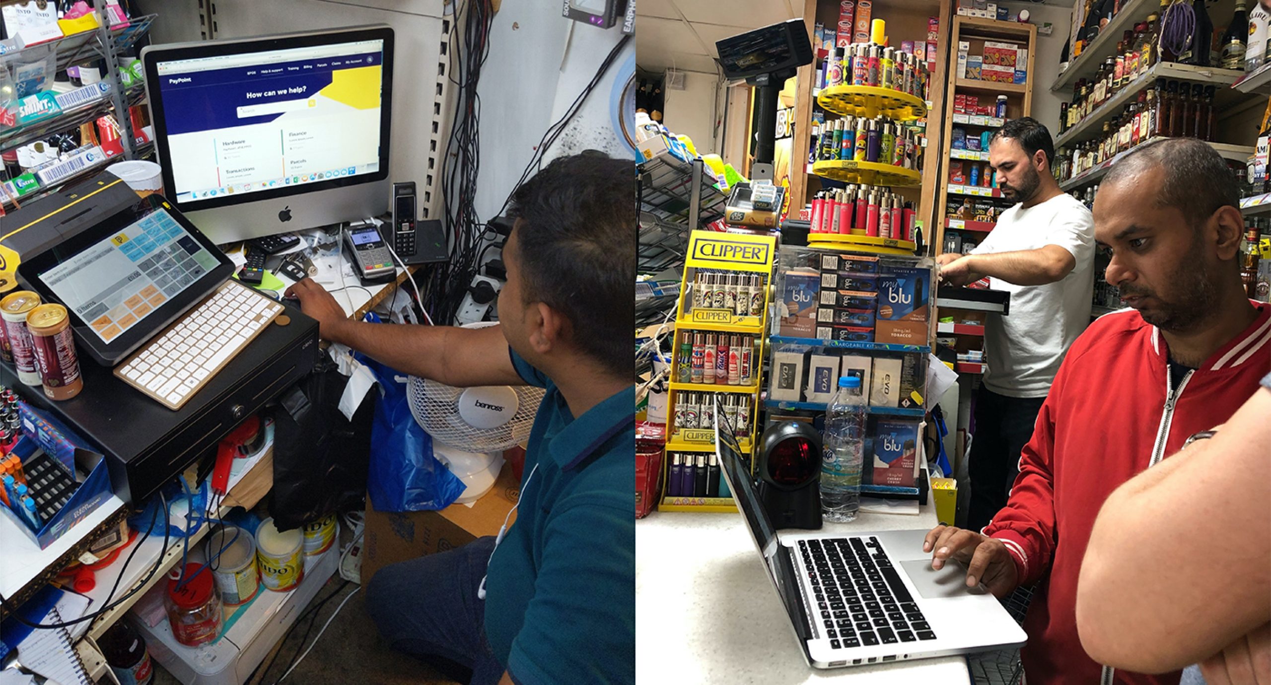
PayPoint operates a network of over 27,500 stores across the UK, putting it at the heart of many local communities. It partners with small businesses to offer a range of footfall-driving services – you’ve probably used it for parcel collection, bill payment or to withdraw cash at one point or another.
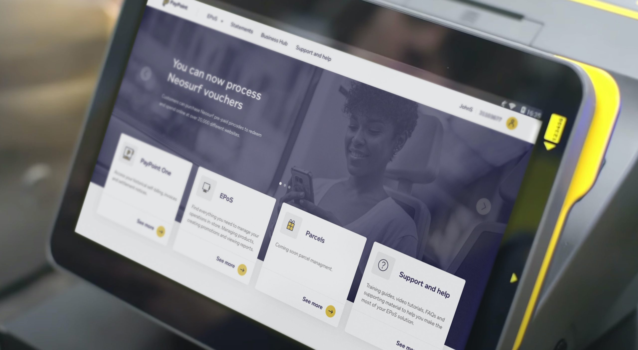
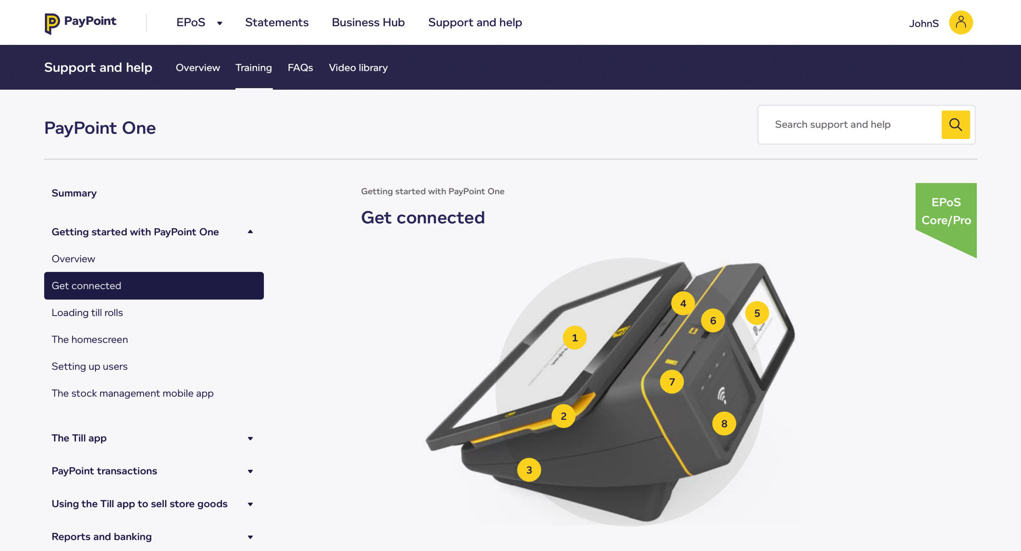
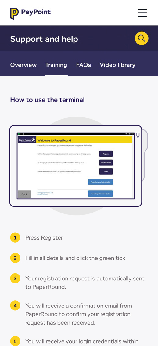
Retailers use the PayPoint One terminal in their stores to process sales, manage stock, create promotions and run lots of other day-to-day tasks. PayPoint wanted to make the solution as intuitive and simple to use as possible for the retailer so sought help in improving the UX.
We were called in to help refine the user journeys and develop a completely new UI library to help retailers use this business critical tool.
A complex digital tool
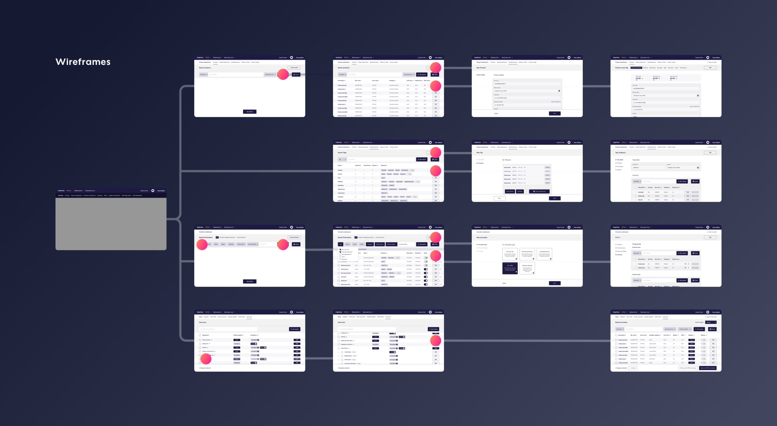
It probably won’t surprise you to learn that a system that helps retailers run every aspect of their shop is a complex beast. With the tool having grown organically over time it contained a number of unique design patterns and workarounds that weren’t too intuitive to the uninitiated.
It was our job to hit the ground running, learning quickly and grasping what was important for retailers, as well as the problems they faced using the platform.
We worked with the in-house experts to undertake a screen by screen exploration of the issues. Feedback came from retailers themselves, and from other teams on the frontline of the product who were best placed to help- as well as a deep dive into the platform’s analytics.
How the platform was used across different devices was of particular interest to us. Primarily used on the terminal, the application was also available online and had mobile usage, which presented multiple use cases for us to consider.
Prioritising for delivery
A major factor in the project was making sure that changes made to the platform didn’t create months of work for the development team. It’s all too easy to rip apart an interface creating a backlog that makes a relaunch impossible.
Lighthouse podcast
Our top tips for getting design and dev teams working in harmony.
By prioritising screens and features based on factors including technical complexity, value to the retailer and value to the business, we rapidly delivered value to consumers, stakeholders and the development team.”
The handover of our work to the developers was made easier through direct communication and well documented design assets.
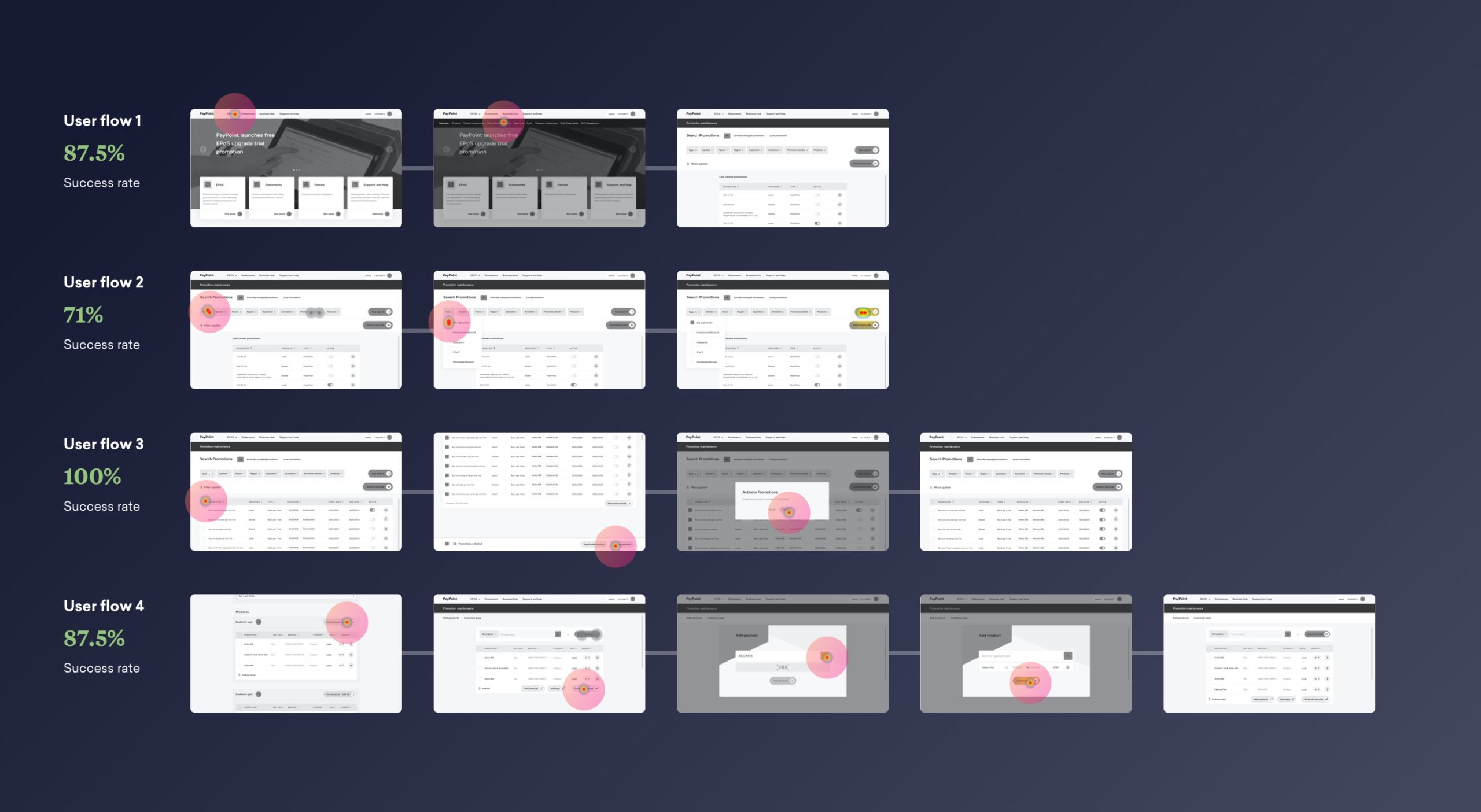
User testing
With such a business critical tool it was incredibly important to show that our changes didn’t cause confusion before moving to development, so it was vital to test the platform with retailers.
We needed to make sure that they grasped the new concepts and could still work their way through the most important everyday tasks.
We ran online testing via Maze and also took prototypes out into shops around London. Results were overwhelmingly positive but did bring out unexpected issues that were improved in our upcoming sprints.
It’s really important to have a simple to use system – the retailer’s focus needs to be on the customer buying a pint of milk rather than on working out what button to press next.
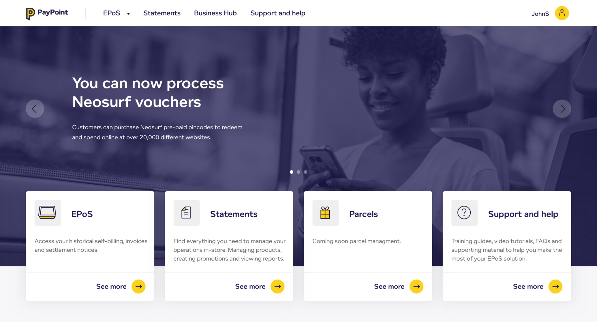
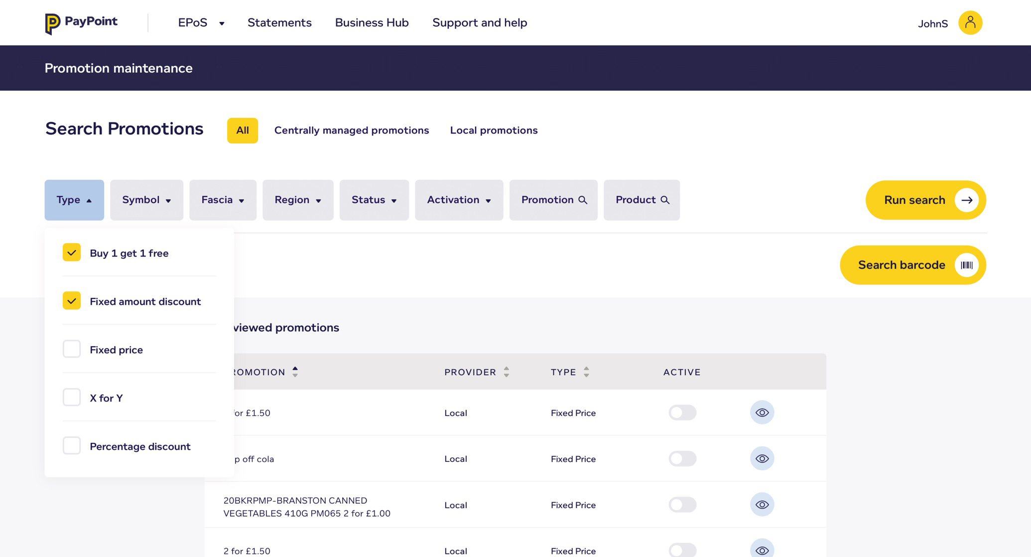
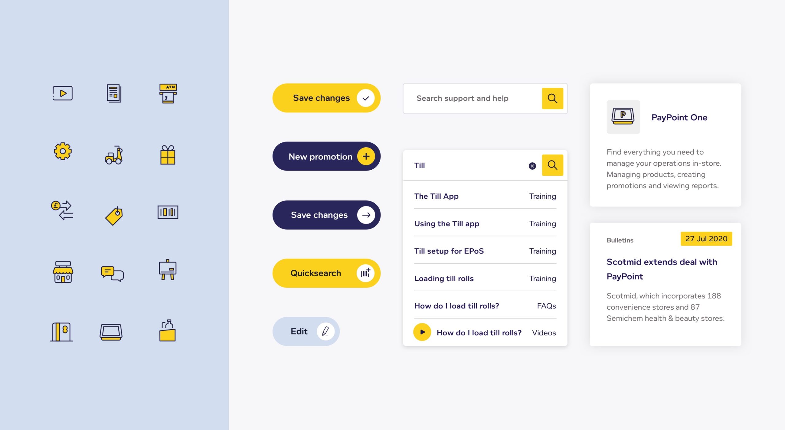
UI design system
The old interface had been designed by devs and was based on an ageing version of Bootstrap with a lack of consistency across screens. With our revised UX in place, our next task was creating an extensive UI kit for use across the entire application.
From simple reworkings of existing UI patterns right up to creating a complete icon set, we designed and documented every element in the application. Adding detail around animation, user interaction and responsiveness gave the dev team an asset they could use to build a modular front-end system.
We had to design with the tech in mind. The terminal runs an older operating system so we had to design in-page elements that would render with no performance issues, something that was common in the existing system.
Project management
Keeping this sort of project on track and everyone updated is a challenge in itself. We wanted to make sure that we were constantly delivering implementable work and keeping momentum going so ran an agile process keeping to fortnightly sprints.
With regular feedback meetings in place and rules around speed of response from both sides we were able to present and sign off work quickly. Result!
In order to keep stakeholders who aren’t involved in the day-to-day running of the project up to date we also built a set of documented assets that could be viewed independently. This enabled them to see progress and give feedback.
We were keen to get valuable feedback from the wider team and our approach ensured that this was provided regularly and on time – no last minute surprises.
Blog post
When it comes to re-working complex products, breaking things down and adopting an agile approach de-risks the process.
Read more