Company

£150m+ income

7000+ employees

Charity

B2C

London
Anyone who’s been through the parenting journey knows that it’s fraught with confusion, anxiety and endless surprises.
New parents have this all to look forward to and an overwhelming amount of info to wade through.
Friends, websites, books, social networks. Some helpful, some very far from it. (Granny may have the best of intentions but her ‘back in my day…’ advice is frankly a bit scary! 👵🏻)
Action for Children, a charity focused on improving young people’s lives in the UK, saw an opportunity to launch a platform that helped cut through the noise. They wanted to offer parents of small children a helpful resource to put their mind at ease when entering one of the most demanding times in their lives.
We came on board to take concepts generated internally, validate these and then design the end product.
Nothing can prepare you for the lack of sleep and weight of responsibility that the birth of a child can bring. However…
Market validation with user research
Action for Children didn’t want the platform to just reiterate what others were saying, take a negative tone, or cause parents any more confusion than they were already feeling.
It was really important to research what was out there so we could understand what was effective and what was falling wide of the mark.
We started with the people who matter the most, parents of young kids. Running sessions in nurseries we explored where people currently seek help and what they had found useful (or the opposite) about it.
We compared use of digital tools with non-digital ones and talked in depth about the times when help was most needed and the context that surrounded it.
Something unexpected can happen at any point with a young child so this was not as simple as many other use cases we come across.
We’d assumed that people wanted a mobile tool not a desktop one, but quickly realised that both were important in very different circumstances.
A trusted partner
One question we needed to answer was why this platform deserved to exist alongside other established competitors in the market and how it would differentiate itself.
Our research showed that there was a gap for a tool that offered non-judgemental, impartial advice in a manner that was friendly and non-technical.
Users rated guidance given by organisations like the NHS, but the content was impenetrable at times. On the other hand, places like Mumsnet contain a lot of helpful input which can get lost in a sea of conflicting opinions from faceless people (as well as a lot of negativity).
Action for Children’s new platform needed to build trust quickly, reference sources that could show evidence and make people feel positive about the range of choices available to them.
The product’s aim was never to leave people questioning their parenting style.
Blog post
Why do users trust some brands more than others? We learned loads by listening to parents.
Read more
Testing for optimum content
It was clear that content would play a major role in the success of the platform.
But we needed to get clear how people wanted to consume the content and what the optimum format for it was.
We created multiple prototypes showing different article lengths and formats and ran tests alongside tree testing for different ways of navigating through the content to find the quickest ways for people to find content.
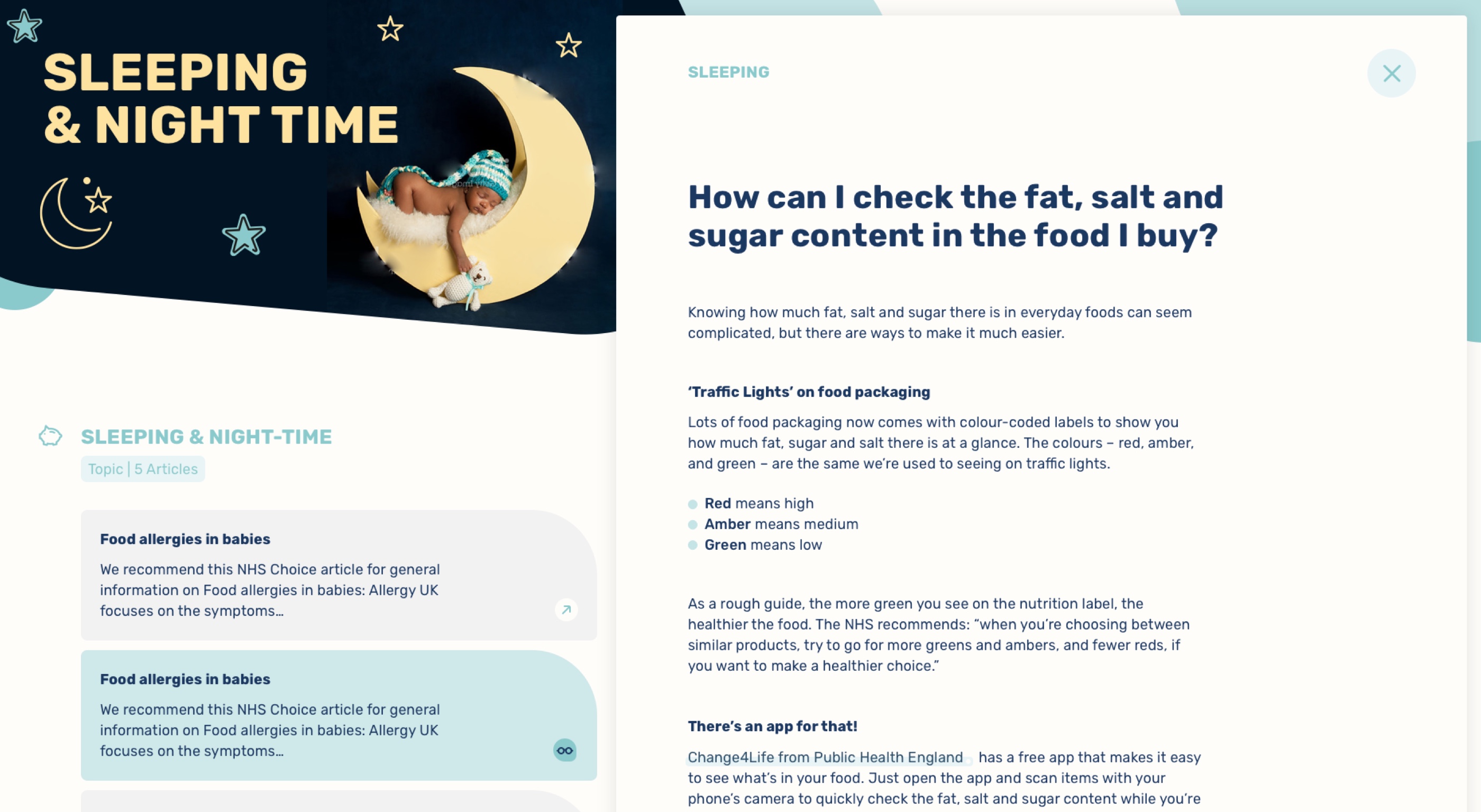
With our optimum article length set – quick enough to read in 5 – 8 mins, short paragraphs and simple language – we were ready to brief the content team while we got to designing.
Blog post
Find out all about how testing real content with real parents helped us design the right thing 📖
Read more
Pulling it all together
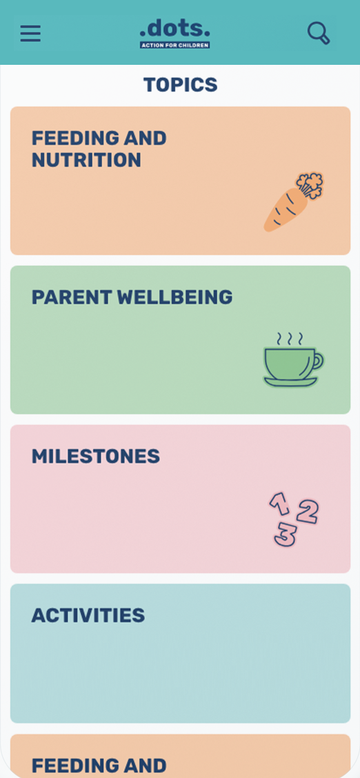
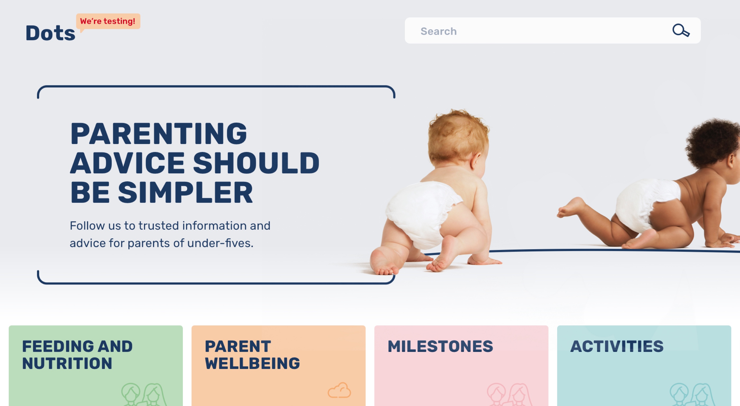
The design brief was to keep the site colourful and playful so we put together a design system that included a friendly colour palette, fun icons and a range of type options.
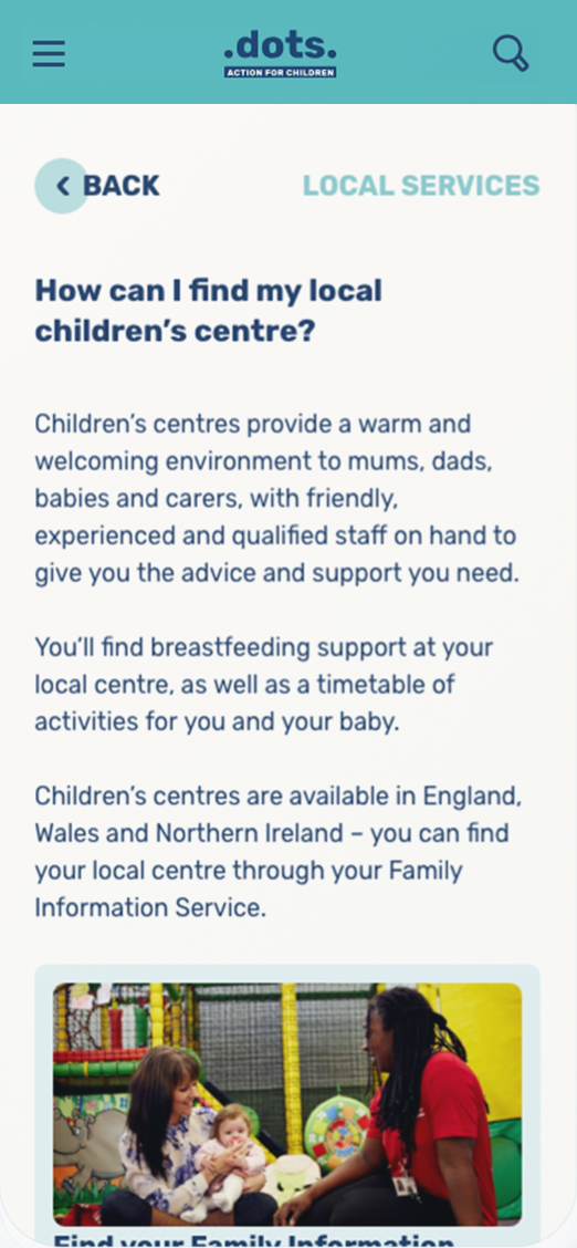
Weaving the Action for Children brand in allowed us to add an extra layer of trust and also give people support with the central services that the charity provides


