Reworking the user
experience of a video education platform
Company
80+ Employees
Education
B2B
London, UK
Team
1
Product strategist
2
UX / UI designers
1
Front-end developer
Digital Theatre+ is the world’s leading educational platform for the study of performing arts and dramatic texts. It specialises in providing lesson plans and video teaching resources for secondary and higher education in the UK and USA.
As part of a push to focus the platform on the educators using it, we came on board to help with the complex task of reworking the way the content they consume was presented.
Lighthouse immediately gave us confidence they were the right choice to support our business in one of the biggest projects we’ve ever undertaken.
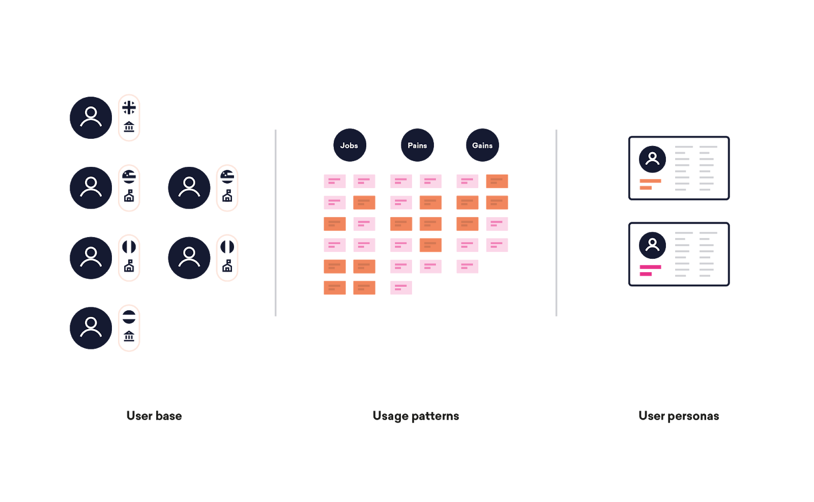
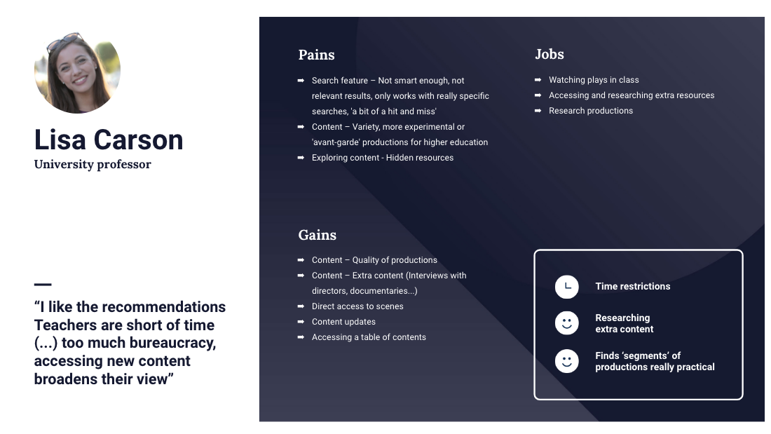
UX personas
Our first challenge revolved around breaking down customer personas and how each wanted to consume content.
DT+’s internal operations were organised around many different customer subsets. These multiple customer types are key to how they sell to customers and manage their accounts.
However, from a UX design perspective treating them all separately would have involved a degree of complexity, extra time and cost that we always try to avoid.
We started out interviewing customers, assessing their needs as we went along. Quickly the responses revealed that we could simplify this thinking and treat them as two personas, saving resources and leading us rapidly to the next steps of the project.
Consistent user experience
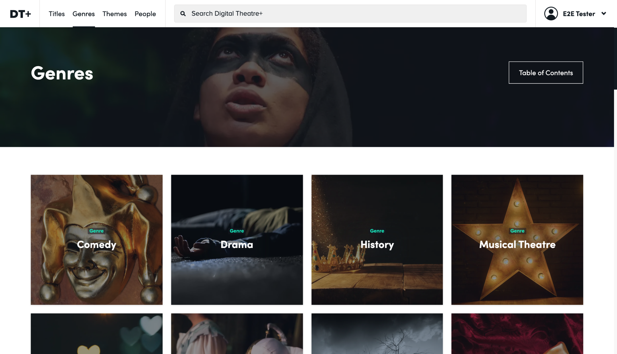
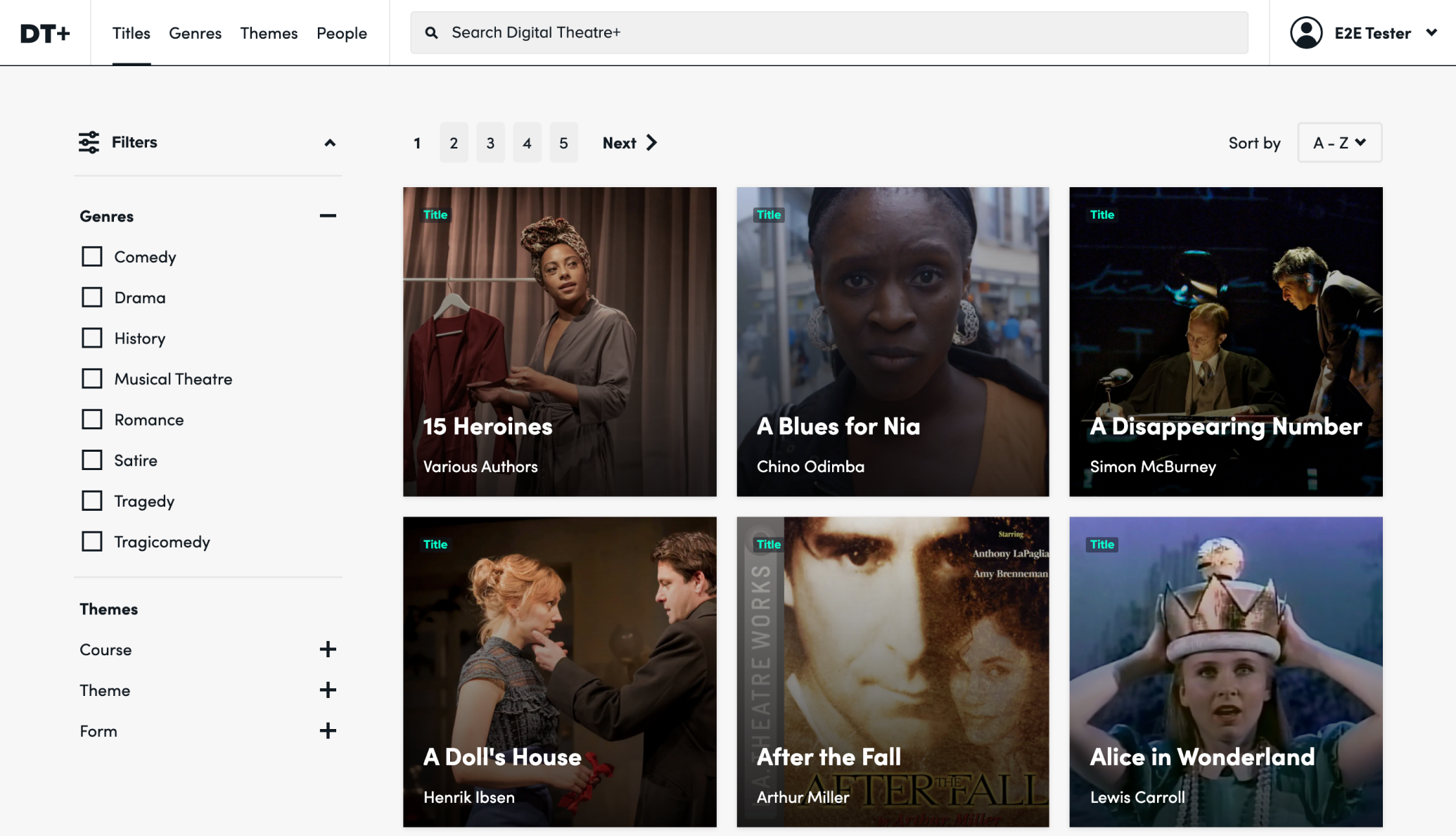
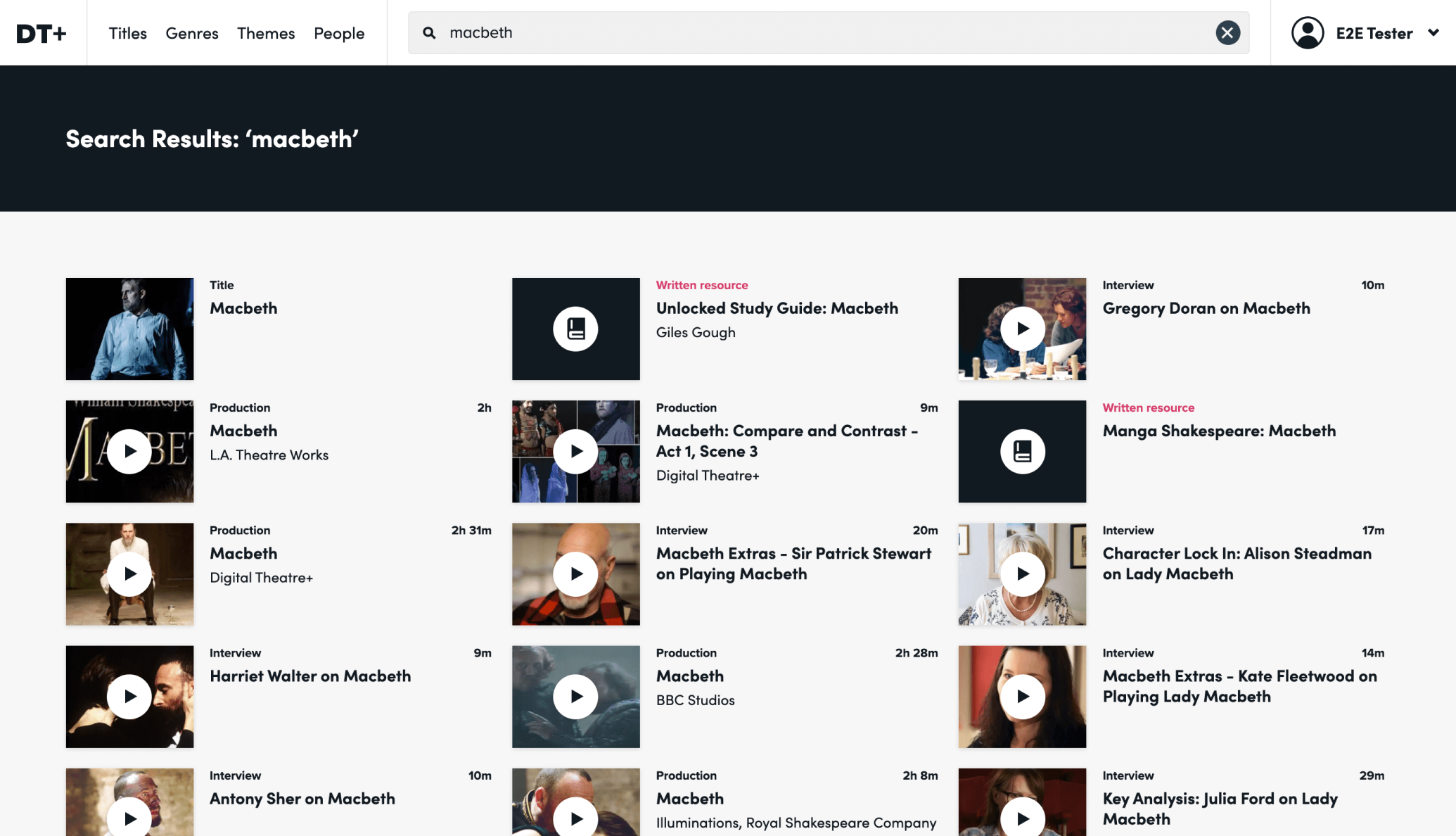
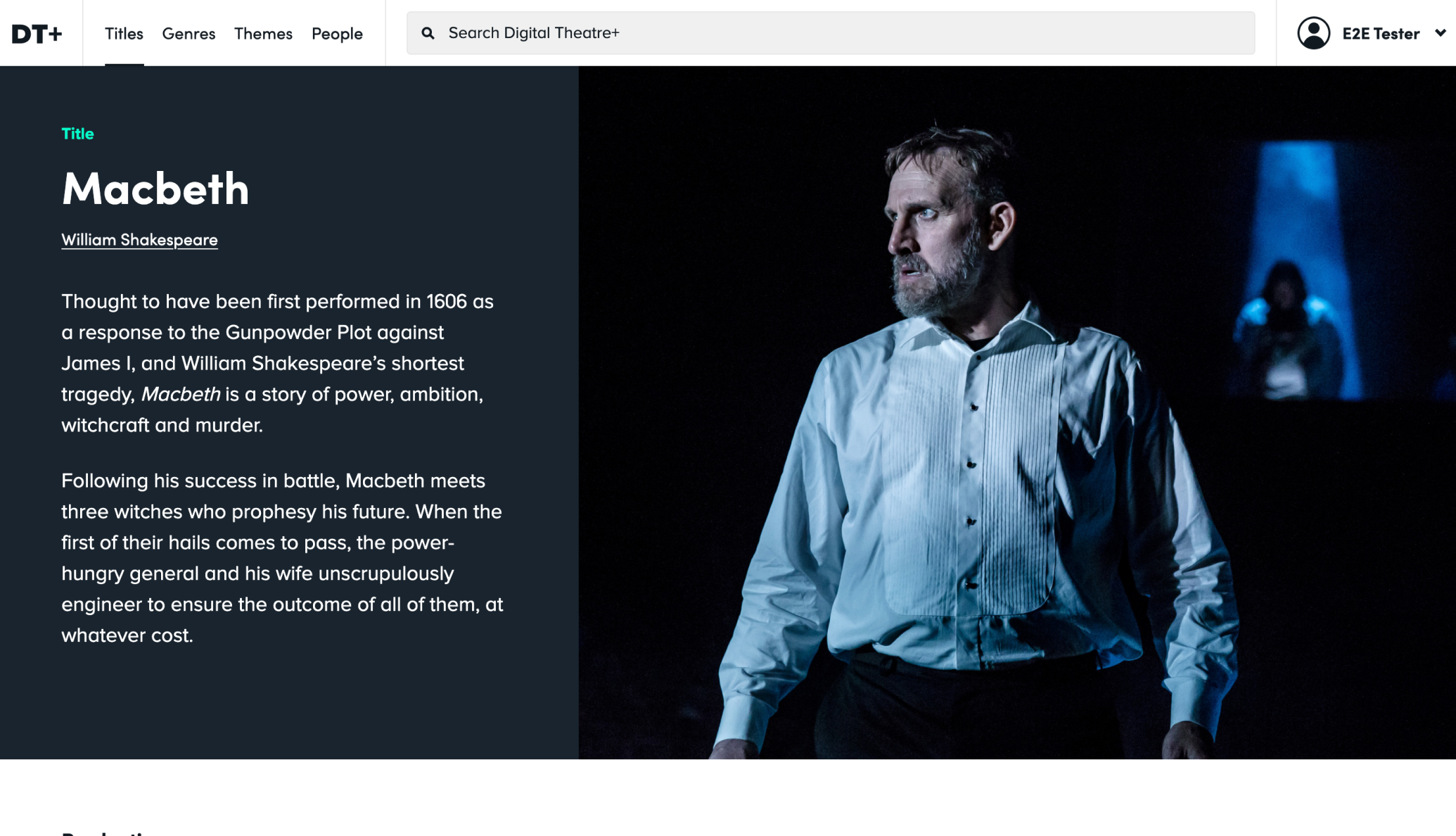
DT+’s interface had to work for all sorts of plays. From Shakespeare to modern classics, it was essential that users experienced a consistent structure when searching for productions.
We needed to create a balance between predicting and presenting what people are likely to be searching for and showing off the impressive breadth and the depth of quality content.
We made sure that people weren’t scrolling endlessly trying to find the right links and that the platform balanced both plays and teaching resources.
User testing
We took our revised routes through the platform to users from across the secondary and higher education sector.
Success rates for the tasks we asked them to perform with our clickable prototype were high, with a majority of participants easily able to perform searches, find given productions, genres and resources. Feedback was also very positive:
This is fantastic! If I searched for Macbeth with a student I could walk through the material and look for specifically what we needed. This is just a wonderful content organization plan.
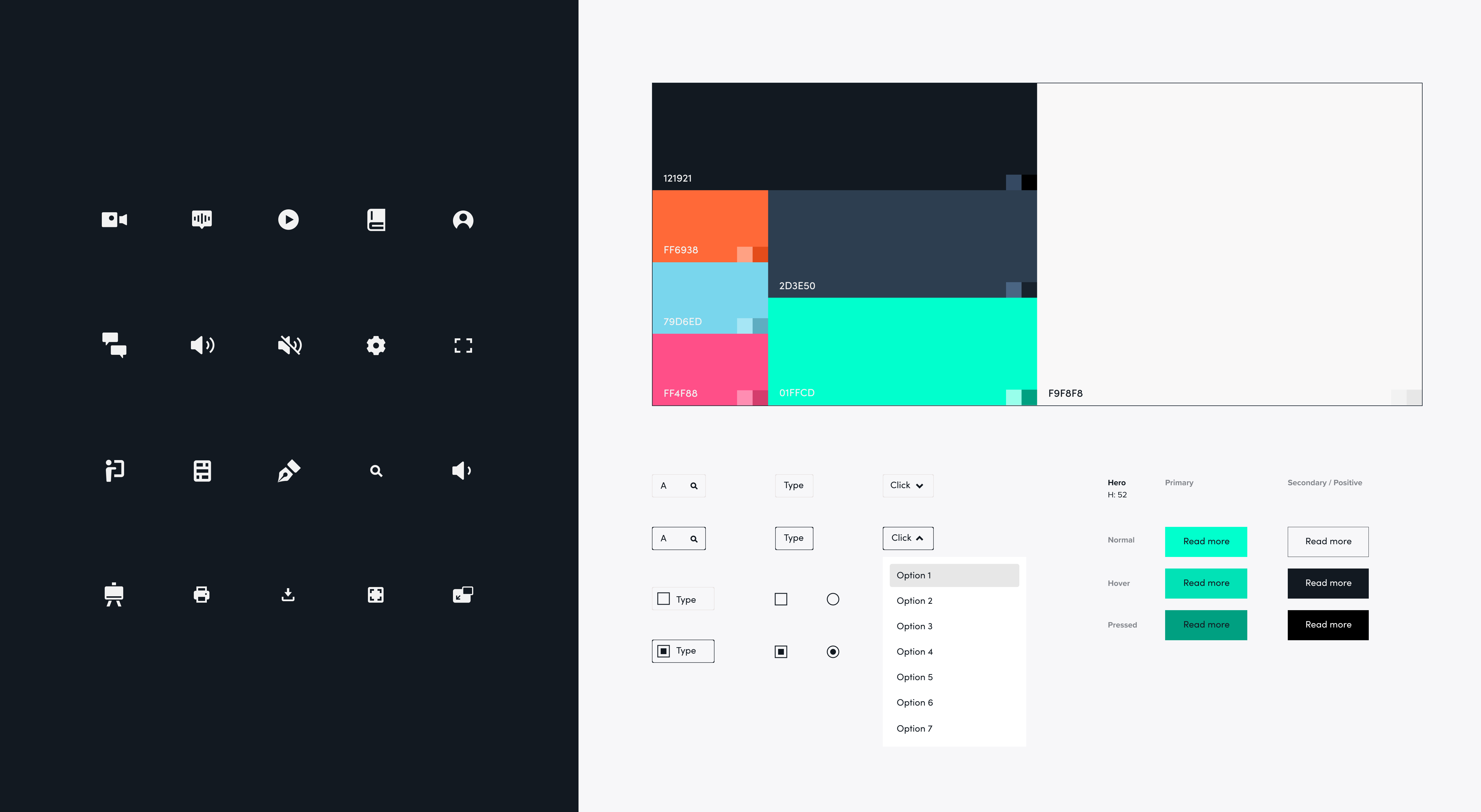
End to end design system
After creating an experience that could surface the content in the right way, we needed to bring a fresh look and feel to the platform.
We created a complete design system detailing all the elements and components across all screen sizes. On top of this we rolled out an entire front-end templating framework for the in-house engineers to use to put the application together.
The development phase saw us collaborating closely to make sure the end product was polished and perfect.
During the second phase, a front-end web developer (although this massively understates this person’s ability and talents) was embedded in our team.
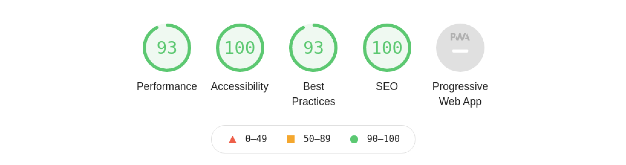
Accessibility
Our team was involved in developing an improved product that catered to all.
With a keen focus on accessibility, one of the main changes in this area was adapting the website to screen readers and updating their accessibility statement. This allowed them to expand their customer base and work with more educational centers.
From moving images that can cause motion sickness to the colour palette used, we have to think about accessibility from start to finish.
DT+’s vision and knowledgeable team meant we could hit the ground running when we got to work and achieve big changes relatively quickly.
We’ve remained embedded within their team, providing a safe pair of hands to support them as they grow. When long-term relationships between agencies and companies are formed, they create more room for big ideas.
Lighthouse acts as a partner who wants to achieve mutual success for both our companies. We can’t ask for more.
Post launch
The DT+ sales team have reported excellent feedback from educators on the changes we’ve made.
They find the platform easier to use overall, particularly surfacing content relevant to their classes, with a more intuitive interface and ‘less cluttered and more efficient’ design.
It’s great to hear that our work on the ‘Themes’ and ‘Genres’ sections are particularly generating ‘wow moments’ for DT+ users.