Access all areas – Designing experiences for everyone


The power of the Web is in its universality. Access by everyone regardless of disability is an essential aspect.
Unless you’re stuck somewhere in the early 90s when it comes to digital (hey, give us a go on your SNES 🎮), working with TimBL’s cornerstone of ‘access by everyone’ in mind is really nothing new.
However, there’s a strangely lingering UX design myth that says designing for maximal accessibility is somehow cumbersome. The myth would have you believe designers privately find it overly restrictive, difficult and don’t consider it that important when it comes to the average digital product.
Do visuals need to be high contrast with loud borders, lacking in subtlety and finesse to be part of an accessible product? Well, we certainly don’t think so.
A UX designer who’s worth their salt shouldn’t view accessibility as a restriction to creativity, but rather a set of design constraints, just as budgets, timelines and brand guidelines are. Boundaries like this help us to make the right thing for the people who’re going to use it, and make our work better, not worse.
In this article we bust the myth by getting to grips with the benefits of accessible design, then outline some main areas to focus on when ensuring accessibility.
Accessibility vs. usability
Hold on a minute… does accessibility just mean usability? Isn’t a usable product just an accessible one by definition?
Well, sort of, but there are some important distinctions. Font of all knowledge Interaction Design Foundation describes usability like this:
Usability is concerned with whether designs are effective, efficient and satisfying to use.
So yes, there’s an overlap, but accessibility goes a bit further. It means that all users should be able to access an equivalent experience no matter how they’re encountering your product.
It’s easy to immediately think of visual or motor disabilities when we think about accessibility, but we must give equal weight to multiple, co-existing conditions and to permanent, temporary or situational disabilities. There are a seriously vast array of possibilities that could affect how someone uses a digital product.
Avinash Kaur illustrates it brilliantly when she says:
…having only one arm is a permanent condition, having an injured arm is temporary, and holding a baby in one arm is situational — in each case the user is able to complete tasks with only one hand.
Why does accessibility matter so much?
Hopefully you agree that designing for accessibility is the right thing to do in and of itself, and that disabled people shouldn’t be expected to put up with substandard experiences.
There are also legal implications to having an inaccessible product. Remember the hot water Dominos got into when their iOS app and desktop site both failed to provide “full and equal enjoyment” of its services to a blind user?
They not only broke the law, but the publicity surrounding their reluctance to make the necessary changes, choosing to fight a costly legal battle instead, left a bad taste in many mouths.
Putting aside our moral and legal obligations, the fact is that accessibility considerations help everyone have a better experience with a digital product.
- Accessibility features like captions on videos for people with hearing impairments help users who can hear to watch videos on the train with their phones muted.
- Setting alt text correctly means that sighted users with poor internet connections as well as visually impaired users are able to make sense of the images that they can’t see.
- ‘Prefers-reduced-motion’ (the CSS feature used to detect if the user requests that the system minimize the amount of non-essential motion it uses) is good for both people who don’t want to get motion sick and people trying to make their iPhone battery last longer.
When we create with accessibility in mind, we create products that have a way better chance of being enjoyable to the widest possible audience, and that can only be a positive.
Four top considerations for accessible design
Contrast for clarity
If users can’t make out the content on your application, they’re almost certainly not going to be able to make sense of it. Would you use a digital product where you couldn’t read the information it was trying to give you? Of course not.
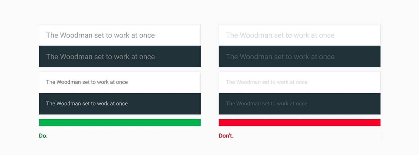
Image credit: Accessibility for Teams by Google
As you probably know, contrast is measured by comparing the luminance of a foreground and background color. For smaller text, current guidance is a minimum ratio of 4.5:1 is . For larger text, this ratio can be adjusted to 3:1.
Happily, there are plenty of ways to avoid having to manually check contrast ratios when designing, or even worse, finding out the entire colour palette you’ve worked with needs to be changed.
Take a look at Stark (Sketch, Figma and XD), Cluse (Sketch) or Able (Figma) to bake correct contrast into your workflow.
Careful with colour
A related consideration is how we use colour.
It’s really important that colour isn’t used
a) to convey meaning or
b) as the only means of referring to an object.
People with partial sight, colour blindness or colour vision deficiency, and those who use monochrome, text only or limited colour displays will have a seriously hard time successfully interacting with your digital product if there are mistakes in this area.
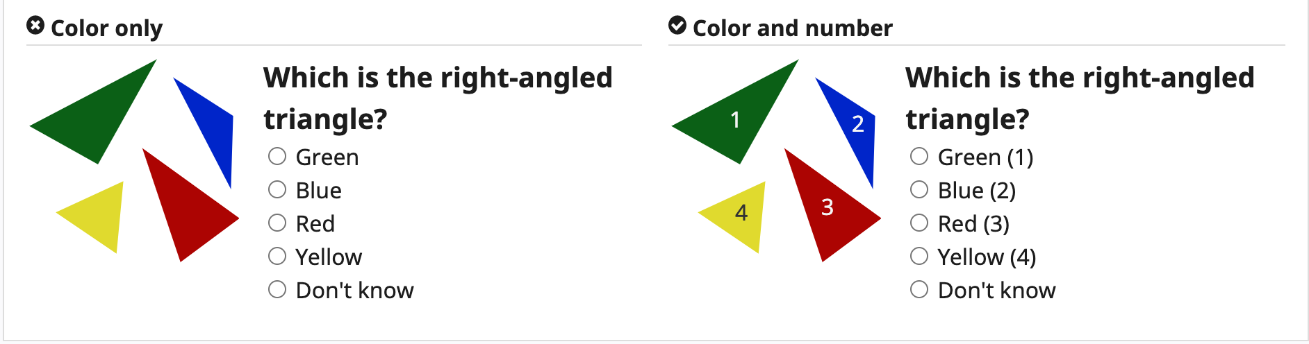
Image credit: w3.org
Completing the task in the left-hand example is straightforward for users who can see colour (and who know what a right-angled triangle is…) but even a trigonometry ace couldn’t get the right answer if the image was displayed in monochrome. The addition of numbers is a simple way to solve this problem.
W3.org share a story of a user – Lee – who would be affected by exactly this problem. It’s worth reading it in full here.
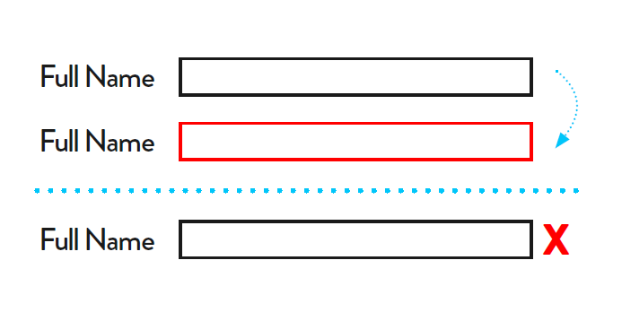
image credit: Digivate
If you couldn’t see red, could you tell what you’d done wrong in the first example? Absolutely not! Adding an ❌ icon, however, shows the error state with a familiar symbol.
Functional forms
Speaking of forms, we come across more and more funky-looking ones these days that aren’t the traditional ‘rectangle with defined boundaries and a label.’
Think of a product with a very slick, minimalistic direction and the temptation to design a form as a single line with placeholder text is very understandable.
However, without a clear visual clue as to where to tap, click or point, can your users easily identify and select where to input their information? Is that still the case if they use a pointing device, or have limited dexterity?
Without a label, users using screen readers or voice commands will find your sleek minimal forms useless. Both types of assistive technology typically identify forms by their labels and will skip any unlabelled areas. Not good!
Forms are one of the most important parts of any digital product, and we’ve just scratched the surface as to their accessibility considerations here. For a deep dive into form UX, we’d recommend this article from heatmap experts Crazy Egg.
Go with the flow - designing onboarding that works
Effective forms are an essential part of onboarding flows that convert ✍️
Intelligent inputs
We shouldn’t make any assumptions about the inputs people are using to access digital products, or that device-specific motions such as tilting or shaking a mobile phone are going to be possible for all users.
If a user doesn’t grip their device, due to motor issues or any other reason, they’re unlikely to be able to complete such tasks as intended.
Similarly, if complex gestures are to be used, it’s vital to also provide a single pointer alternative.
It’s maybe more of a dev than a design point, but it’s certainly worth mentioning that hover states are another huge consideration when we’re thinking about inputs.
Someone who only uses a keyboard to navigate around your product is not going to be able to hover over anything – and nor is someone who uses speech recognition software.
If buttons don’t appear for them, they’ve got no chance of being able to complete secondary actions hidden under hover states.
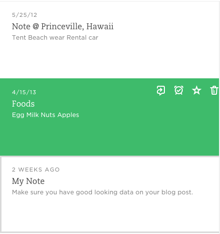
Image credit: Salesforce
In this image from Evernote, the 4 actionable icons in the note highlighted in green appear only when the user hovers over the note.
Conclusion
If you’re serious about creating experiences that work for everyone, designing with accessibility in mind from the off is non-negotiable.
Accessibility is only a problem to design when it’s tacked on at the end as a separate thing or a box-ticking exercise.
Like the blueberries in a muffin, it must be baked in from the start.
Idea to launch
If you want to create a product everyone can enjoy, let’s get started today 🚀
Related Posts
 Article
It’s the start of a new era for Lighthouse as it becomes part of Digital Product People, guided by some familiar faces.
Article
User research is key to ensuring we solve real problems, but how should we tackle sensitive subjects and protect everyone involved?
