

How often have you been able to imagine something but not articulate it?
Explaining something visual in words when it doesn’t even exist yet is a really hard task, and it’s something that even seasoned designers find difficult.
It’s always much easier and more effective to show than tell.
That’s why we often use moodboards in the early phase of our projects.They’re an important means of visual communication when it comes to exploring the possible directions a digital product could take via images, typography, icons and assorted interactions.
However, we’ve encountered a few problems with ‘traditional’ moodboards and getting maximum benefit from them with clients. That’s why we thought it best to share what works for us to overcome issues, and more broadly what we’re trying to achieve when we use them.
What’s the problem?
Moodboards tend to show existing products – either illustrating how competitors are doing things well or just pulling together fantastic examples of certain elements from across the web.
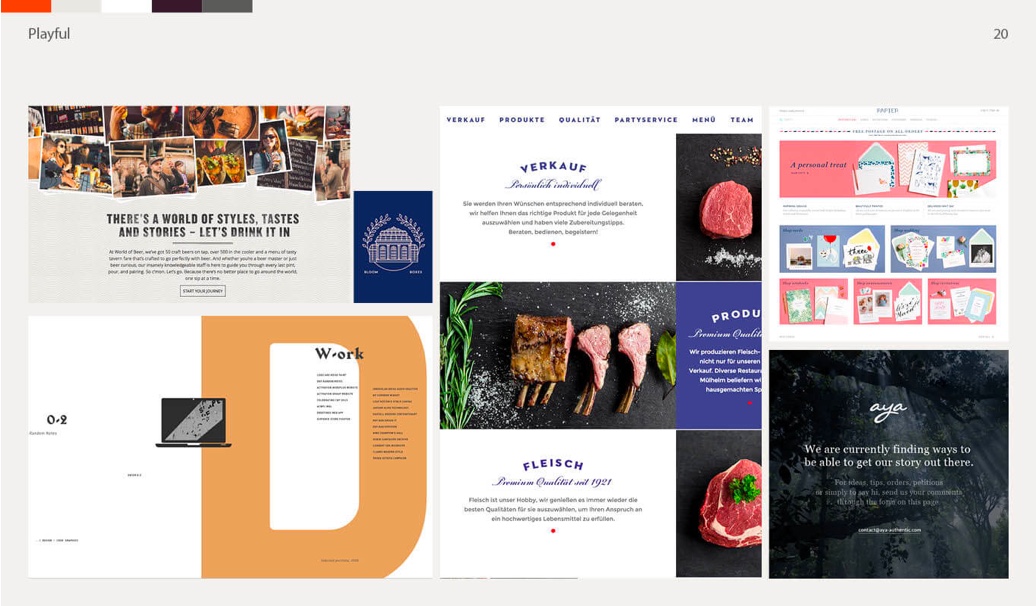
This is great for kicking off some ideas with clients who are struggling to visualise and articulate much in the way of inspiration. However, it can be a double edged sword.
We’ve all heard ‘I don’t know what I want until I see it’ many times and we get it. Thinking in design components isn’t natural for most people!
A designer may include a screen because of a particular element, e.g. rounded icons, but it’s very possible for this to lead to misunderstanding, with clients falling in love with other elements or struggling to separate them from the whole.
Factor in too that moodboards often contain pieces of design work that are wonderful but not practical or appropriate to the application we’re working on. These can actually end up hindering not aiding client communication by causing distractions.
There’s another issue too – It often takes seeing design work in context, with their own brand involved, for clients to articulate strong opinions and to elicit a conversation that’s valuable to the designer’s process.
Design is a collaborative process that is all about communicating effectively to get the best results together. Good design can’t happen otherwise.
How do we solve it?
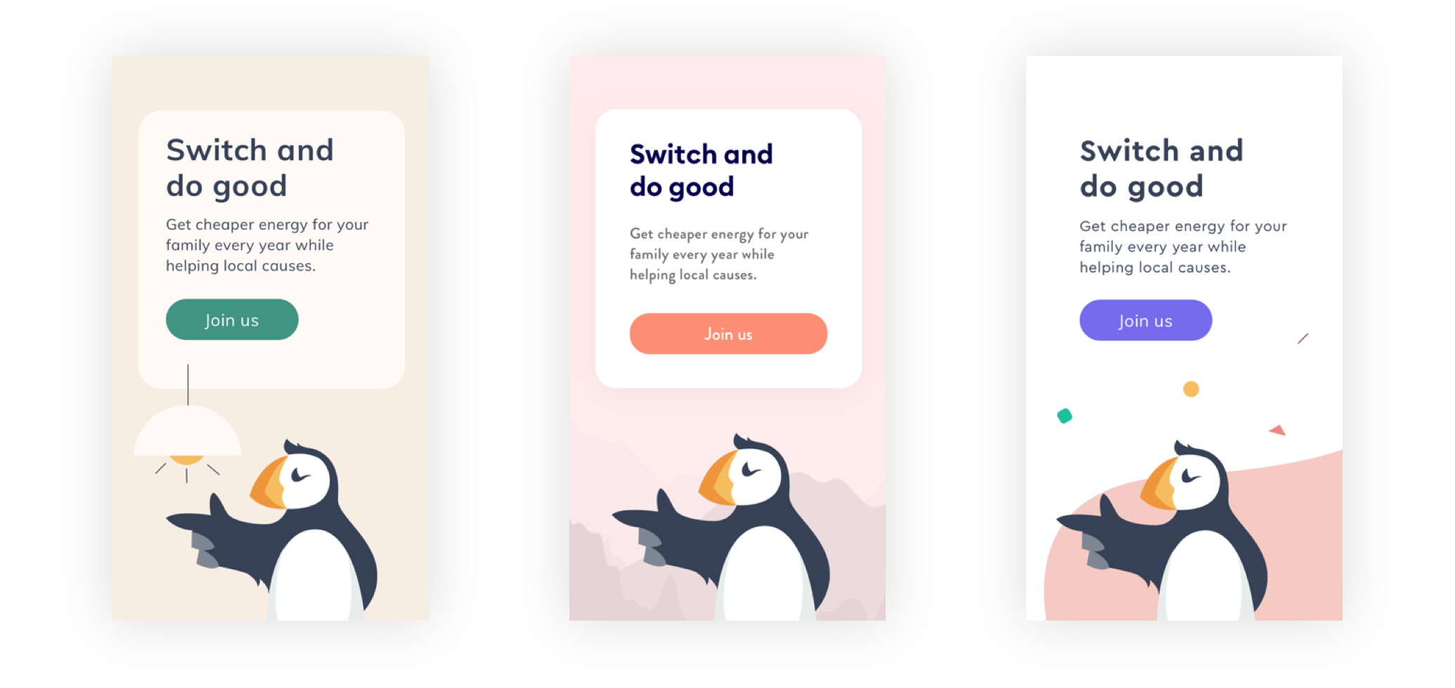
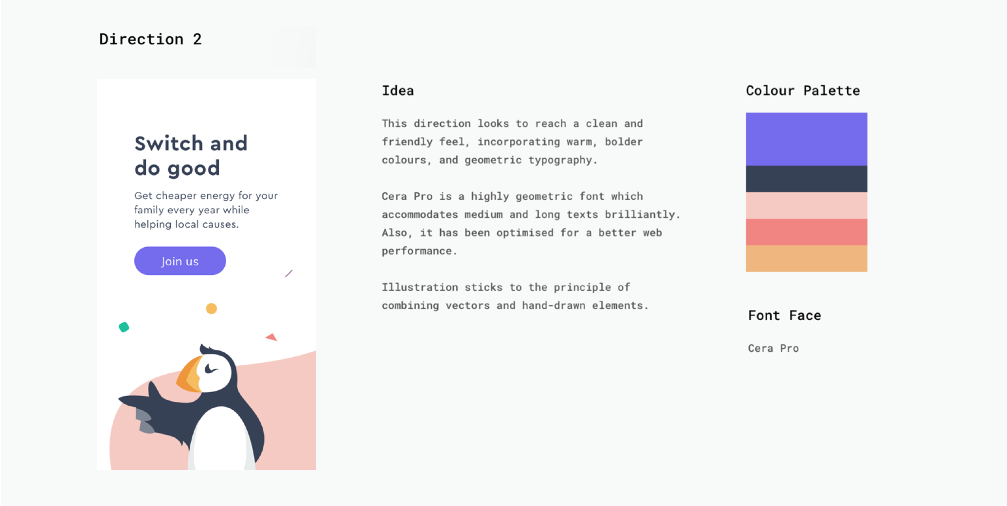
Recently, we’ve had fantastic results from an enhanced form of moodboard. Screens that show colour swatches, typography and a little bit of creative work in context.
Rather than reviewing other people’s designs, we’re quickly creating visual elements based around the client’s brand and content.
Here’s what it looked like when we used them for one recent client, ethical energy switching company Migrate.
Why does this work?
The overwhelming benefit is clarity. Clients are able to give better, clearer feedback on what they like – and just as importantly – what they dislike. This whole process is a tool to help them to articulate.
Hearing that a client hates the directions I’ve come up with isn’t a bad thing – it’s actually way more valuable than ‘we love it all’ as it means I’ve made them think and provoked opinion.
Here are a few more specific benefits we’ve noticed:
Less explanation time
Even though these options may have taken slightly longer to make, the benefit is that clients find them much clearer. It’s much more obvious which elements to focus on, and as a result, comments are more insightful. This saves everyone time in the long run.
Typography emphasis
Typography is a huge part of design, and something it’s important to get right as soon as possible. However, it’s also one of the things that can be hardest for clients to give meaningful early input on.
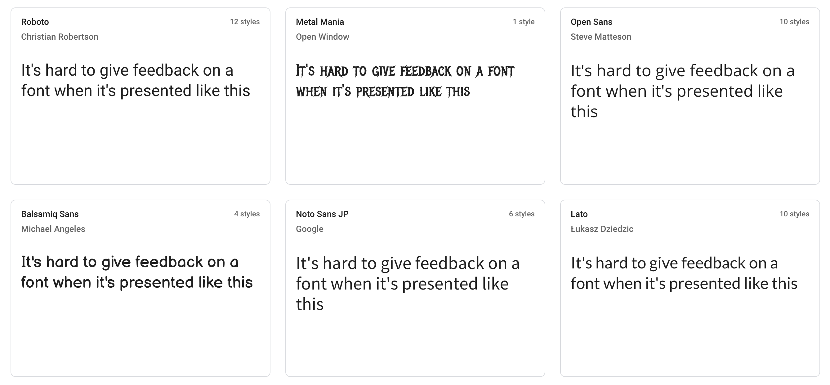
Showing options in context as opposed to just sharing a google fonts page means a strong direction can be established much more easily.
A repeatable framework
We love design systems, so having something that can form a kit to re-use with different elements is always going to get a thumbs up from us.
Moodboards should be something that we can create quickly and throw away, and working from a template is the best way to do this.
What would happen if you hired the world's greatest designer?
How can you ensure a great designer is able to do great work for your organisation?
Related Posts
 Article
User experience design firms help businesses create intuitive, effective digital products. This guide explains what they do, the services they offer, and how to choose the right UX partner.
Article
Most teams think skipping product design saves time. In reality, it creates more problems later. Here’s why design is critical to building products that actually work.