Overcoming the curse of sausage fingers


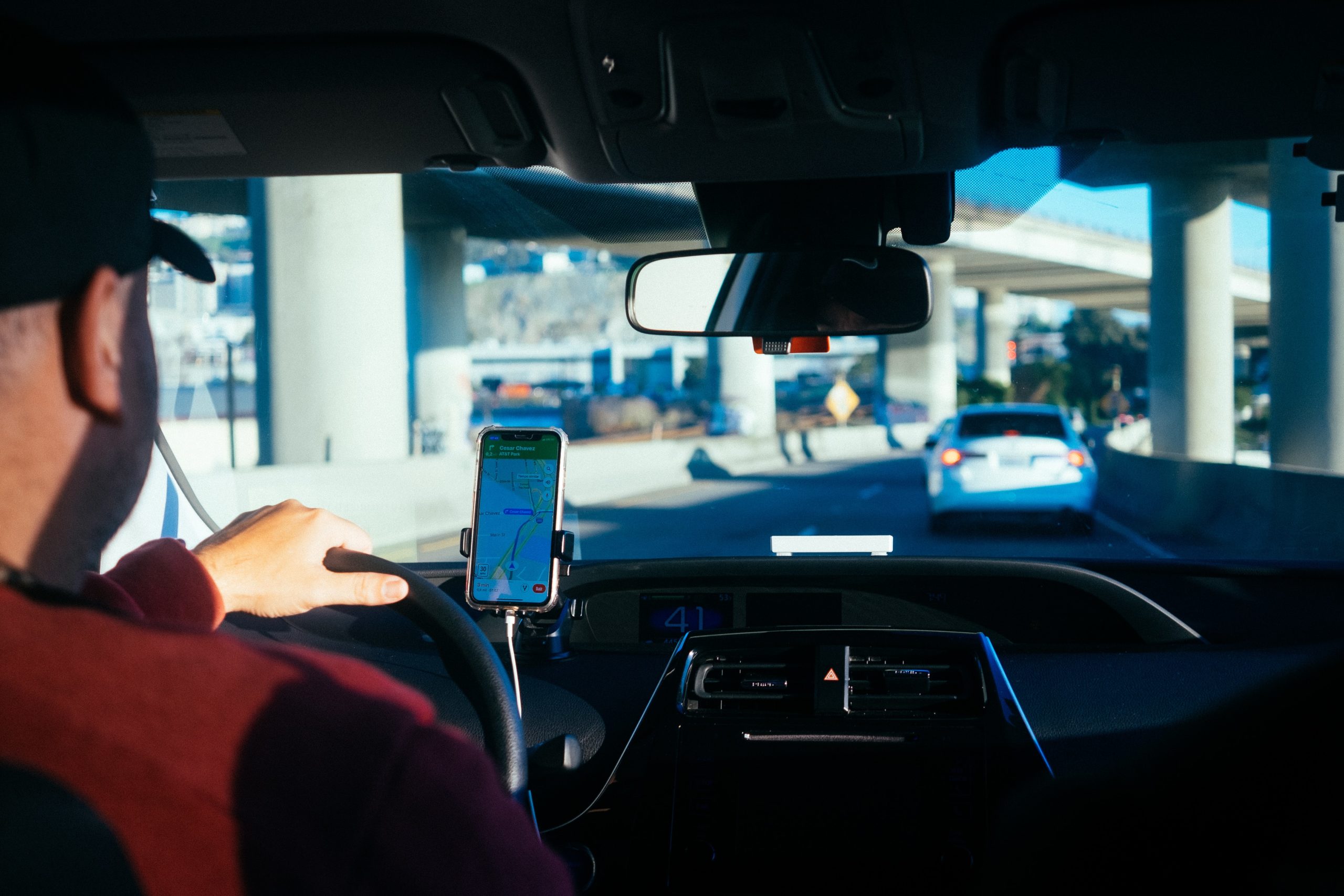
Have you ever tried to read Google Maps when traffic alerts, route updates and WhatsApp messages endlessly ping across your screen? Now, imagine that while driving through a busy city you’ve never visited. The blinding sun is in your eyes.
Oh, and you’re wearing oven gloves.
It sounds distracting at best, deadly at worst, but this is the reality for commercial van and lorry drivers who use their phones to plan, navigate and make their deliveries.
If we could coin a phrase for their everyday challenges, it would undoubtedly be ‘the curse of sausage fingers’, thanks to the finger plumpness of your average pro haulier.
Want to improve your user research? Get out there!
We visited convenience stores to test our revised UI for PayPoint. Lessons were learned, Mars bars were eaten 🍫
How can a UX agency make life easier?
To help overcome this affliction, we needed a meticulous understanding of the unique needs of our very unique users, who often wear thick gloves, driving for long stretches on less-than-familiar roads in less-than-favourable conditions.
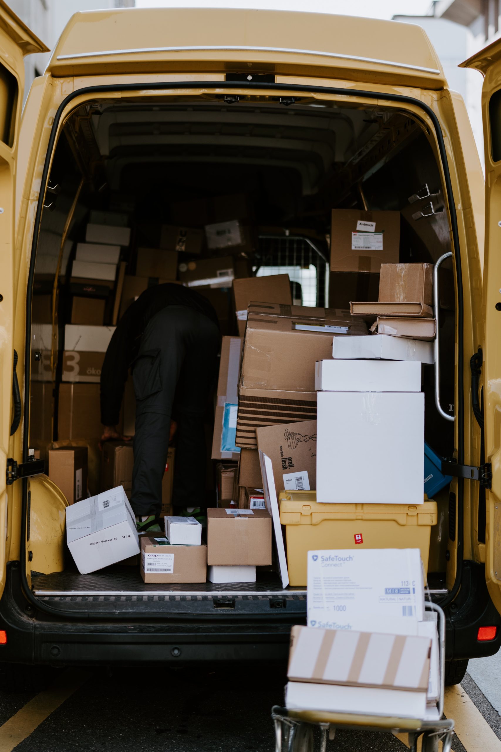
Here are 5 things we learnt creating a sausage finger-friendly digital platform for one of the UK’s biggest freight exchange services (handling over 250,000 shipments every month, think of them as the Uber of cargo lugging).
After reading this, you’ll have a whole new appreciation for the couriers, white van men and lorry drivers who help keep our world trucking.
#1 Unique situations call for bigger touch targets
Small buttons can be tricky to tap on touchscreens, especially when you’re trying to keep your eyes on the road (remember our Google Maps analogy?).
For hauliers with dumpy digits and thick gloves, we found that this challenge becomes even trickier, especially when these users are more confident manoeuvring an articulated lorry than they are manoeuvring around an app.
Unique challenges like these, for specific people in specific situations, should always be considered if we want to provide every single user with the best possible experience.
As author and UX boffin Paul Boag reminds us:
Accessibility is about designing for everybody, not the few. It is not about designing just for the disabled. It is about designing for every one of us.
To make our digital product more accessible and compatible with sausage fingers, we ensured our touch targets (the areas that respond when you tap or swipe them with your thumb or fingertip) were big enough for the user.
According to an MIT Touch Lab study, an average human finger pad is 10-14mm, and an average fingertip 8-10mm. Check out your thumbs and fingers. Now slip a pair of gloves on. It gives you a pretty good idea of why our targets needed to be at least 10mm for hauliers.
Just for good measure, we also made the touch targets bigger than the visual boundaries of the icon or button. This means if you slightly miss your target (we’ve all been there), you still get the desired response.
Access all areas - Designing experiences for everyone
We discuss why accessibility matters so much and how embracing constraints makes for better design 🚀
#2 Too many features make the job difficult
Building a slick, delightfully usable digital platform for commercial van and lorry drivers isn’t just about making things a bit chunkier. If only it was that simple!
Bigger touch targets meant not bunching our interactive elements too close together or including too many on one screen (pro tip: crowded, overly busy screens aren’t something any UX agency should be delivering, regardless).
There’s only one thing more frustrating for users than when your target doesn’t respond, and that’s when you tap the wrong button entirely.
This can be even more frustrating when you’re driving and need to pull over to (literally and figuratively) get back on track.
Our solution? Stripping back all the unnecessary clutter. This ensured essential touch targets had enough space to breathe, and fat fingers enough space to slip and slide.
#3 Endless notifications can be a dangerous distraction
The number of push notifications a user receives from an app has a direct impact on their behaviour. Think about it. If you receive countless notifications in one day, what do you do?
That’s right – either you start to ignore them, or mute or disable the notifications in your app settings.
When it comes to apps and digital platforms designed for drivers, too many push notifications don’t just lead to a poor user experience and high uninstall rates, they can be dangerous too.
Research by THINK! found that drivers are 4x more likely to have an accident when using a mobile phone on the road, so we needed to consider user safety too.
This meant considering when a push notification was absolutely necessary, so drivers didn’t tune out or feel bombarded.
It turns out hauliers need A LOT of notifications, so we devised a way to ensure all the information they receive is crucial and concise, to ensure they can register that info smoothly and (ultimately) safely.
#4 Glare means balancing visibility with aesthetics
Everything from sunlight (yes, even in the UK) to sunglasses (especially polarised lenses) can make phone screens difficult to read when you’re behind the wheel.
While devices with a screen sensitive to light help, a UX agency needs to balance making the product visible with making it look visually lovely.
Colour is a crucial part of achieving both these things on any platform, whether it’s the brand’s logo on the launch screen, or helping users see what touch target to tap.
When it comes to battling glare, bright light is your best bet, so black text on a white background (and vice versa in the night) always works. And colour contrasts, hierarchies and codes (like red for urgent actions, green for less urgent actions) all help the user interact and navigate.
The problem for hauliers is that varying shades of colour are difficult (sometimes impossible) to distinguish when the sun’s searing your retinas and there’s glare and sausage-shaped fingerprints smudging your screen.
And even without glare, it’s also worth considering that some users may be (at least) partially colour blind.
Luckily, alongside high-contrast colour systems, there are other things we can do to make a user interface accessible and intuitive: sound notifications and different font and icon weights for different actions, for example, can all be used to help drivers distinguish between crucial and less crucial tasks.
Smartly-spaced and designed icons are also a great opportunity to add some pizzazz and personality to your digital platform.
Whoever said you need to choose between finesse and functionality? Your platform can (and should) have both.
#5 There are struggles to consider outside the van too
Have you ever had a package delivered to your front door when the courier, holding his touchscreen device, says something like:
“If you can please just sign– oh, bloody machine. Never works when you need it to, does it? Give me one sec. Here we go. Finally. If you can please just sign here, that would be great.”
That’s because businesses (and sometimes a UX agency can be just as guilty!) forget that, for commercial drivers, getting from A to B isn’t even half the battle.
On top of route planning, hauliers need their app to perform a variety of other functions, like automated freight matching (which helps drivers identify the specific ship, vehicle or warehouse they need to deliver their cargo to), shipment tracking, proof of delivery, payment, billing and returns.
Commercial drivers and companies waste untold hours and money trying to manually connect all these dots together.
A digital platform capable of smoothly linking these elements doesn’t just create a great user experience. It could revolutionise the entire haulage industry.
That’s the power of UX, right there. 💪

Industry-first innovation for an automotive giant
What did we learn?
Whether you’re a UX design agency or one of the UK’s biggest freight exchange services, it’s crucial to always put yourself in the shoes (and gloves) of the person using your app or digital platform.
For this project, it was all about using our own experiences with driving apps and talking to hauliers to understand their unique needs.
Next time you’re on the road, don’t forget to tip your (metaphorical) cap and honk your horn for our sausage-fingered friends. We know we will. 👋
Related Posts
 Article
It’s the start of a new era for Lighthouse as it becomes part of Digital Product People, guided by some familiar faces.
Article
User research is key to ensuring we solve real problems, but how should we tackle sensitive subjects and protect everyone involved?