Design goes wire(frame)less – the case for high fidelity first


The received wisdom suggests that wireframing is an established and essential part of the UX design process, and skipping it should be done at your peril. ☠️ Yet, can we truly say that high fidelity wireframes are the only way to achieve design success?
But is wireframing this the only way to achieve design success?
Prepare to be shocked: Sometimes, our designers don’t produce wireframes, and the outcome isn’t one of delayed sign offs, client misunderstandings, confused development partners and bankruptcy on both sides.
Quite the opposite in fact.
What is wireframing?
Chances are if you’ve worked with a design team before you’re familiar with wireframes and what they do, but a quick definition never hurts.
Wireframes are basic visual guides, intended to propose elements, show how possible solutions would flow, and determine concepts to take forward for further exploration.
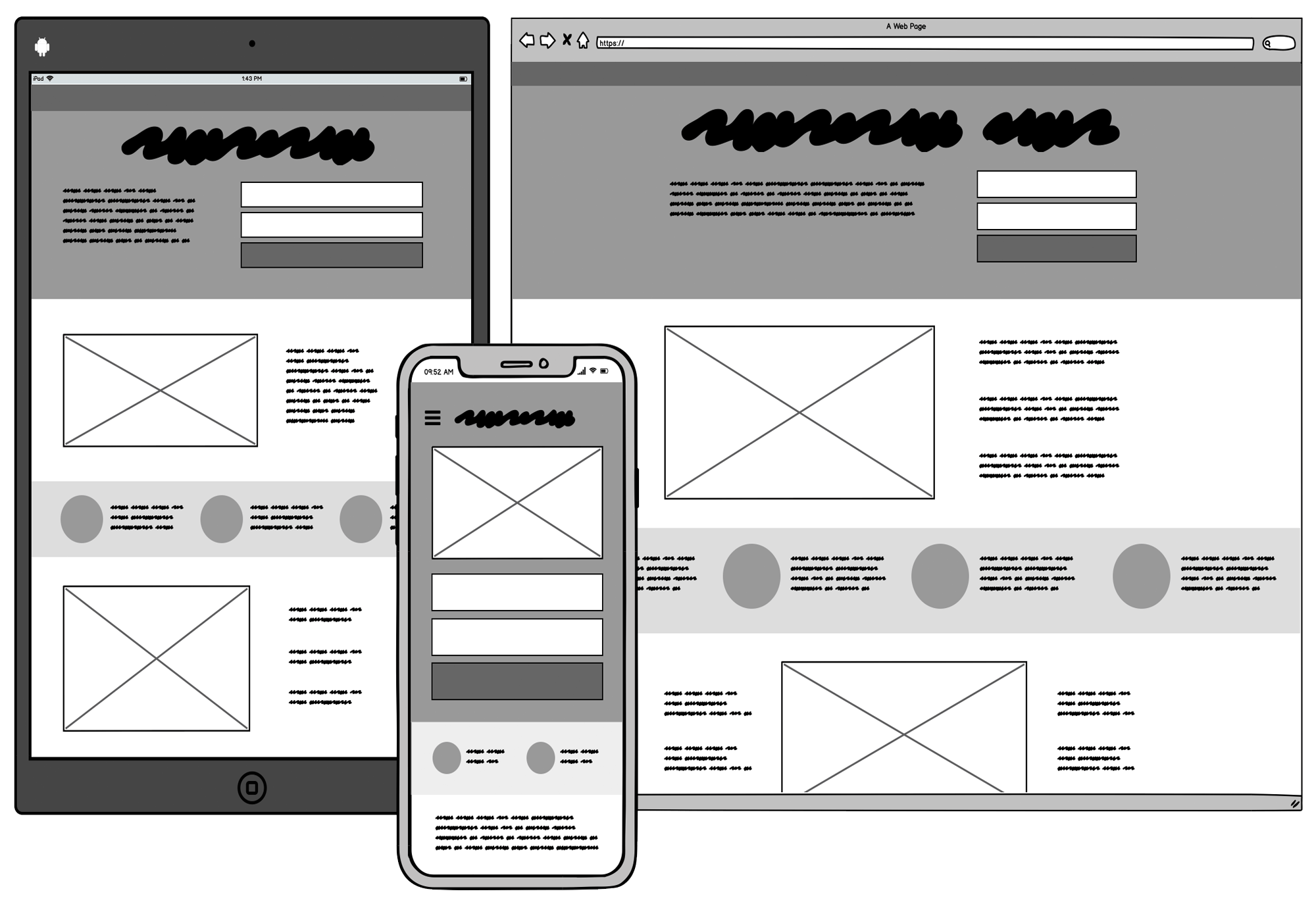
It’s also worth saying that what we’re talking about here are the type of wireframes made with software, and presented to clients as a deliverable. (As shown in this image, with thanks to Balsamiq)
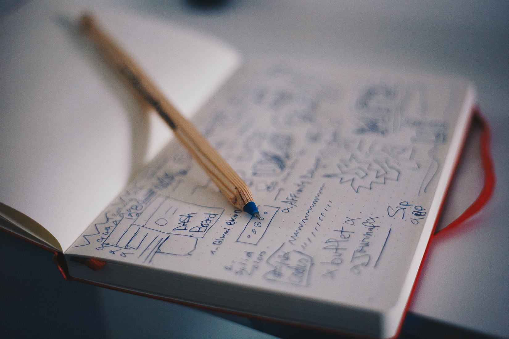
We’d class them as distinct from the super lo-fi scribbles shown below that we would naturally do when forming an idea, in a workshop or sprint.
A wireless example
We recently worked with one of the UK’s biggest freight courier booking companies – a business handing over a quarter of a million shipments every single month.
Our work focused on freshening up the UI of the product, improving usability for drivers in their specific use case and giving it a modern, market-leading look.
Deadlines were tight, with a busy CEO who had little time for back and forth, so keeping the project moving was essential.
The realities of UX research: momentum vs learning
There often can be tension between learning as much as possible and keeping up the pace of a UX project. We explain why this happens and how you might overcome it.
Choosing to forgo a formal wireframing stage wasn’t just about saving time; it enabled us to invest more effort into the first UI screen and create a well-prepared design system with the repeatable elements needed for the full project.
It was a move that enabled us to spend more time on the first UI screen and a really well prepared design system with the repeatable elements the full project would utilise.
We could then show the CEO a more accurate representation of what the final product would look like. This in turn enabled him to give more valuable feedback and us to make changes at pace, pushing a UI system out for user testing sooner.
While this method means it takes more time to come up with the first screen, it also means that the rest of the design process can often move faster – useful when time or budgets are demanding .”
Wireframing worries
Another sticking point we’ve experienced with wireframing is that it can generate more questions than it answers.
The abstract nature of wireframes means that stakeholders don’t always get the bigger picture about the UI, and can get stuck on worries about details like which colour or header image will be used.
To keep things on track, it’s essential to keep wireframes simple, focusing on the core elements that matter most. Starting with low-fidelity wireframes helps clarify the structure, with details added as we gather feedback.
Integrating user insights early in the process is crucial. Real feedback ensures our designs align with user needs rather than assumptions. It’s also easy to get caught up in aesthetics, but prioritising layout and functionality will keep us focused on usability. Consistency is vital too; using a design system or templates can help ensure a cohesive approach across all wireframes.
Let’s not forget accessibility—incorporating guidelines from the start and testing with diverse users makes for a more inclusive design. Finally, documenting our design decisions provides clarity for everyone involved. By recognising and addressing these common pitfalls, we can refine our workflows and enhance collaboration, leading to better user interface
With this type of project, wires can end up holding things up.
Why we're moving beyond moodboards
Rather than reviewing other people’s designs, we’ve switched to quickly creating visual elements based around the client’s brand and content. The results speak for themselves!
Trending wireframes and design tools
As the UX design field evolves, so do our wireframing practices. One notable trend is the increasing use of high-fidelity wireframes, which provide a more detailed and realistic view of the final product. These wireframes incorporate elements like typography and colour schemes, enhancing stakeholder understanding and facilitating more targeted feedback.
Additionally, designers are integrating established design systems into their workflows, ensuring consistency and streamlining the design process. Collaborative tools like Figma are also gaining traction, enabling real-time input from team members and fostering a more inclusive approach.
Overall, embracing these trends allows designers to create more effective and user-friendly interfaces.

Why wireframe?
Ultimately, we view wireframing as just one technique in the designer’s toolbelt. Adapting our process to suit the task at hand is key.
There are cases where the benefit from laying the whole thing out in wires and seeing a ready plan for the full project is immense. Design without wireframing would be the wrong choice.
However, cracking on with the UX and visual side of things with high fidelity wireframes straight after discovery or while preparing for prototyping is an approach that will suit some projects down to the ground.
As we always say, context is key.
High fidelity wireframes FTW?
While traditional wireframing has its benefits, high-fidelity wireframes present a compelling alternative. These detailed representations bridge the gap between initial concepts and final designs, showcasing layout, visual aesthetics, and user interactions. They allow stakeholders to see not just the “what,” but also the “how” of user engagement, making the design intent clearer.
By using high-fidelity wireframes, teams can accelerate stakeholder buy-in with a more realistic view of the product’s functionality. This approach facilitates early feedback and quicker iterations, steering discussions towards usability rather than getting lost in abstract details. The clarity provided by these wireframes helps ensure everyone is aligned and focused on the user experience, reducing the risk of miscommunication.
Moreover, integrating high-fidelity wireframes into the design process fosters collaboration and engagement among team members and stakeholders alike. They become powerful tools for driving conversations forward and refining ideas. When everyone is on the same page, the path to a successful design becomes much smoother.
In conclusion…
It’s important to recognise that low-fidelity wireframes have their own set of advantages and can be incredibly useful in the right contexts. They allow for rapid exploration of ideas without getting caught up in details, making them ideal for early-stage brainstorming.
However, there are certainly instances where high-fidelity wireframes shine, particularly when clear visual representation and stakeholder buy-in are crucial. Ultimately, the choice between low and high fidelity wireframes depends on the specific needs of each project.
As we always say, context is key.
Related Posts
 Article
Ever worked with someone who couldn’t innovate their way out of a paper bag? Or maybe a leader who gets overexcited about the latest trend from a conference, completely detached from what your customers actually need? Or your product roadmap? We’ve been there.

 Article
Wireframes are all about hierarchy. No digital product or website exists without an underlying structure that dictates the importance of every piece of information.
