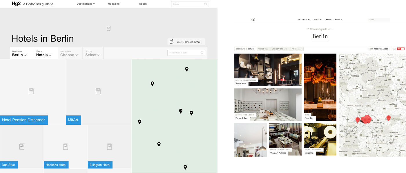
At Lighthouse we have a deep-seated respect for the humble wireframe, which stands as a powerful tool in the pre-design stages of your website. But over the years we’ve found that the importance of this stage can be misunderstood, so let’s have a run through some of the real gems.
What is a wireframe actually showing me?
For me, wireframes are all about hierarchy. No website in the world exists without an index of importance attached to every bit of information. When we’re looking at a single wireframe, we demonstrate hierarchy through the use of space, typographic properties, read order and sometimes an interaction (like showing and hiding things).
When we discuss a series of wireframes we’ll also be able to demonstrate how everything ties together. Here we can focus on navigation, user journeys and how easy it is to find different content across the site.
What is a wireframe not showing me?
Even though some of that hierarchy stuff sounds a lot like design, a wireframe is never to be taken as any reflection of aesthetics. This is why wireframes are almost always made in greyscale with as little decoration as we can get away with – with the exception of a few colourful buttons to help draw your attention.
We also try to use boring or plain typefaces, as at this stage font choices are yet to be made.

What forms do wireframes come in?
The lo-fi form of a wireframe is a sketch, where we can even just use labelled boxes as placeholders for content. ‘Logos of partners’ for example, might be all we need to help us decide on where some content will sit in a layout, instead of drawing logos and names.
Most commonly we’ll use software to draw wireframes, as these are the most easily shared (with a URL) and annotatable for client feedback. Most of these tools allow us to set up animations and other cleverness so we can let people click through the various wireframes and experience the user journey.
Real content makes an astronomical difference
Seeing as we’re developing layouts, we really need to know what we’re going to be communicating. Guessing content can cause us problems down the line, like putting in placeholders for images you may never have, or providing a ‘technical specifications’ section which we find out your suppliers won’t send you.
Don’t worry, we don’t need all of your content to produce wireframes, just an example of each content type we’ll wireframe for, like ‘Product’, ‘Article’, ‘Review’.
What’s next in wireframes?
With the web having lost its static roots, our tools are becoming inefficient at expressing layouts across multiple screen sizes (as we’ve discussed before). The ability to create layouts at multiple sizes is becoming crucial. Tools like Macaw, Webflow, UXPin are attempting to solve this. Macaw holds a tough learning curve, whereas Webflow and UXPin just create static breakpoints where really we need fluidity (just like the real world!).
Not only are static tools becoming obsolete, so too are tools that aren’t clickable or can’t demonstrate animation. Motion design is creeping in as another expectation of the web industry and those interactions and animations can require early demonstration. Tools like Invision and Marvel allow you to toggle between screenshots with fun transitions and gathering feedback from users and clients, but no one has quite yet built the tool that ticks all of the boxes.