Branding a new product is never easy, but it’s especially challenging when that product is created for an existing company.
- Should it be branded as part of the parent?
- Should it be totally separate?
- Should it be some sort of hybrid of both?
The brand you create will not only contribute to the visual identity of the product, but will also play a huge part in how the product is perceived and ultimately trusted (or not) by its users.
Simple changes to visuals, names and photos can all have an effect on this, often in surprising ways, as we found out when creating a new platform for Action for Children.
It was essential for this new platform to exude trust, as its main function is to provide impartial, reliable advice for parents who often feel overloaded with information of varying quality. Doctors, well-meaning friends, the entire internet. It’s a minefield.
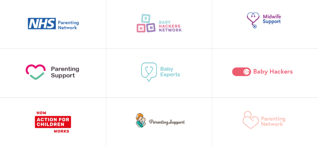
Rather than guess at what might work (never a good way to design! 🙊) we decided to put together some brand visuals and use them to gauge the reactions of our audience.

In the bunch we had the NHS, something we assumed would be highly trustworthy, as well as the Action For Children logo. This was the one we were most interested in measuring the trust-factor of.
We also included other made-up products featuring multiple words we wanted to know their reactions to – baby hackers (not popular, scary connotations 👶 🔪 ), parenting support (more popular) – and so on.
By asking people to pick out the ones that they felt most inclined to trust, we could start to build up a feel for which visuals and names were working and use it to inform the design and branding work we were doing.
If you’re trying to find out public opinion on something, it’s always better to show than tell.