Research on the road – Why did we send our designers out for a drive?


We’ve been working with a major electric vehicle charging brand since 2017, so naturally we now know our connectors from our charge points and can tell you more about niche subjects like Open Charge Point Protocol than the average UX agency.
We also know the business’s products incredibly well from the inside, having helped to shape them and the teams behind them for so long.
But what about the other side, the real life act of using a mobile app to find and use public charging stations?
We’ve written quite a bit in the past about our fondness for immersive research.
From putting a rucksack on Russ’s head (classic workplace bullying) to visiting nurseries and lugging a mac around convenience stores, we’re nothing if not committed to understanding the full, contextual picture.
A lot can be learned from talking to knowledgeable stakeholders and analysing user behaviour, but nothing beats seeing for yourself.
Want to improve your user research? Get out there!
We tested our revised UI for PayPoint in local shops to fully understand the context of use. Lessons were learned, Mars bars were eaten. 🍫
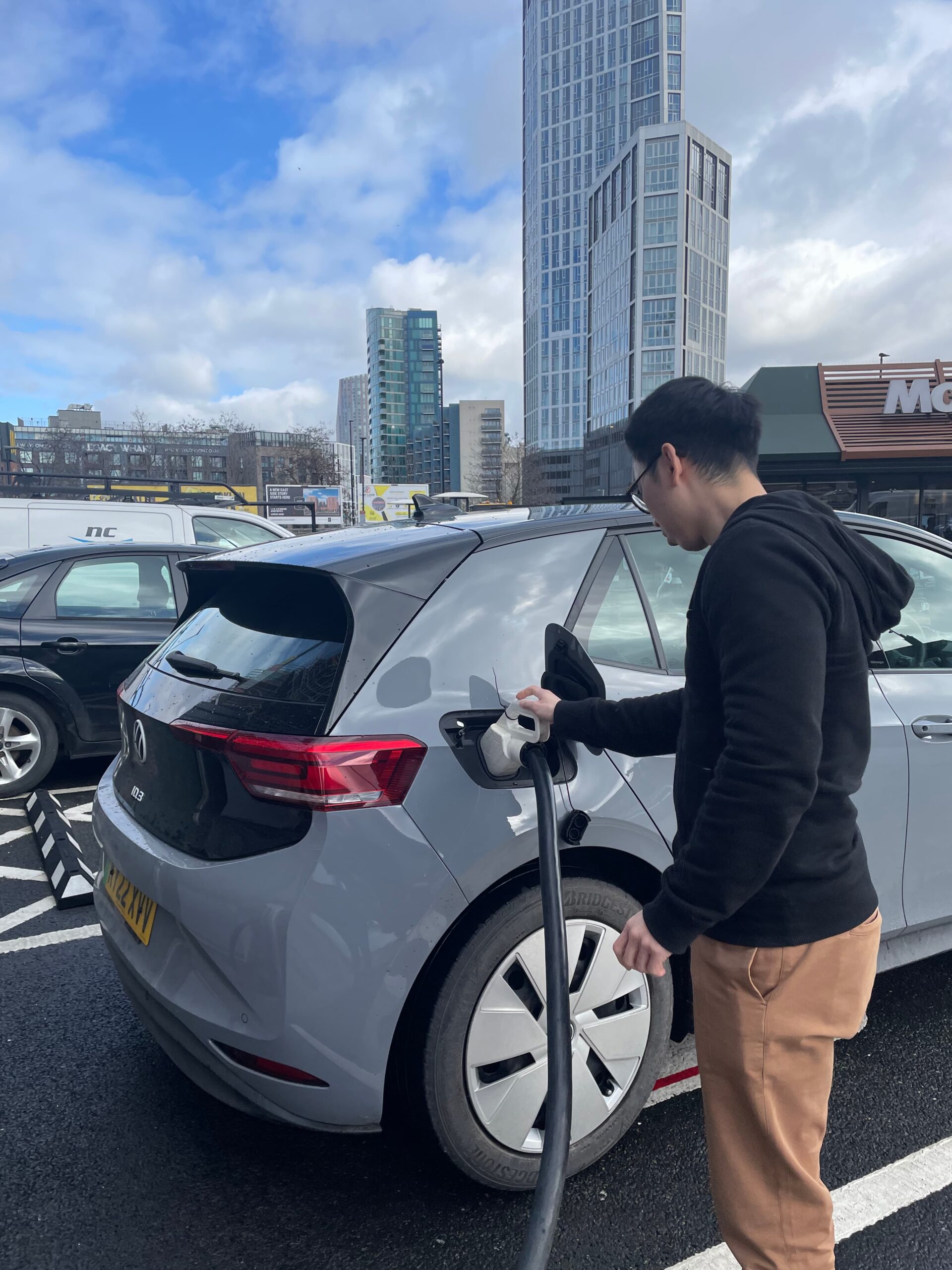
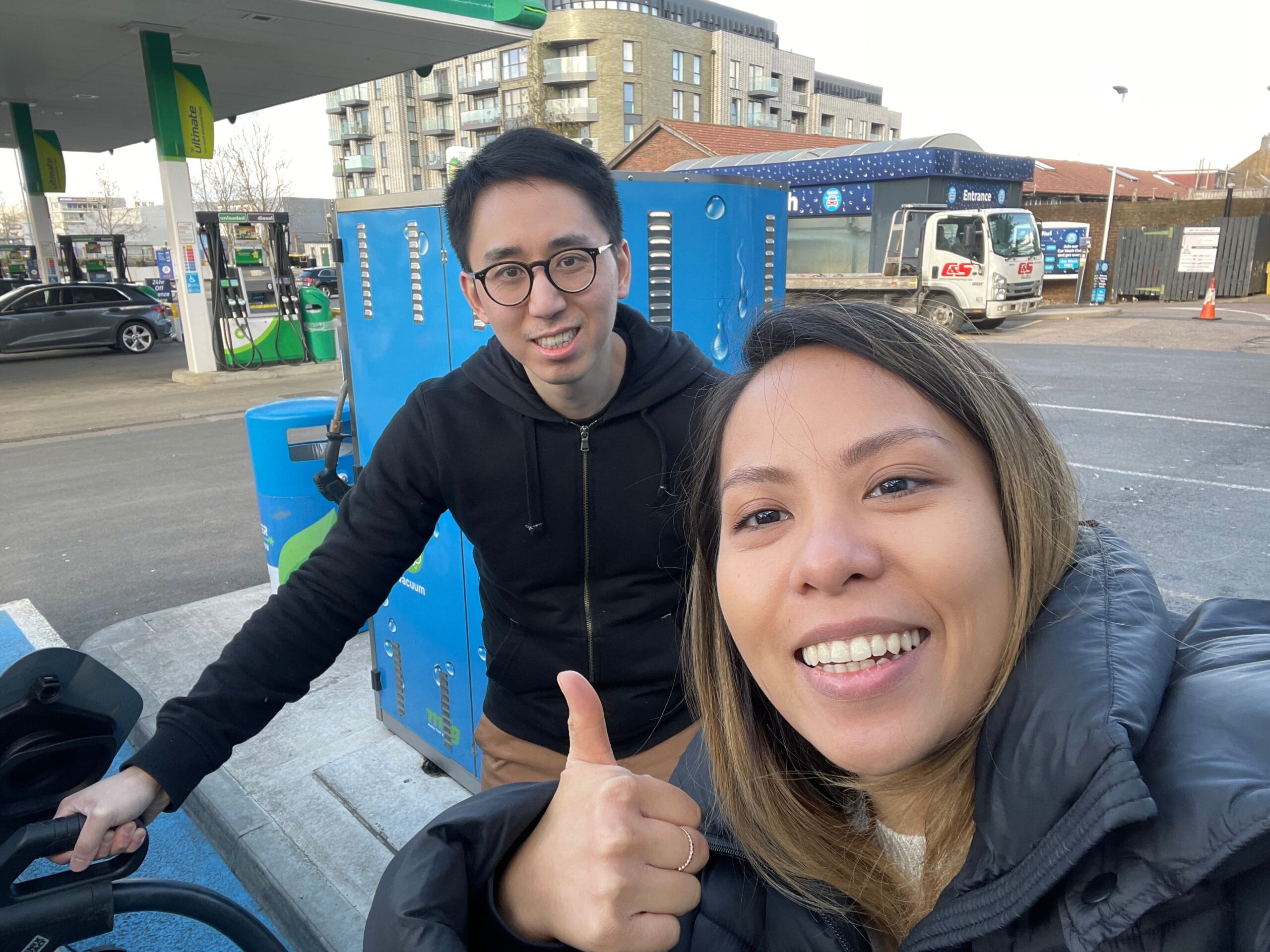
When designers Elvin and Danielle were keen to find out how the mobile product they work on measures up in the marketplace, they decided to hit the road. 🚗
Sadly, budgets didn’t quite stretch to hiring a Tesla.
What did they want to find out?
Our intrepid duo set out with a few goals, centred around key features they’d identified as important.
We’d always encourage anyone heading off for a bit of IRL fact-finding (or in fact, any type of user research) to give themselves parameters like this – without knowing what you’re aiming to uncover, you set yourself up to find out very little in particular.
As well as testing out a couple of different methods to start the charging process and noting any pains or gains that cropped up with competitor apps, Elvin and Danielle wanted to learn more about…
- in- app support options
- explanations of costs
- explanations of the vehicle charging process
- use of push notifications
Four ways to win at user research
Find out which user research methods we rate, and when to use them. 🔎
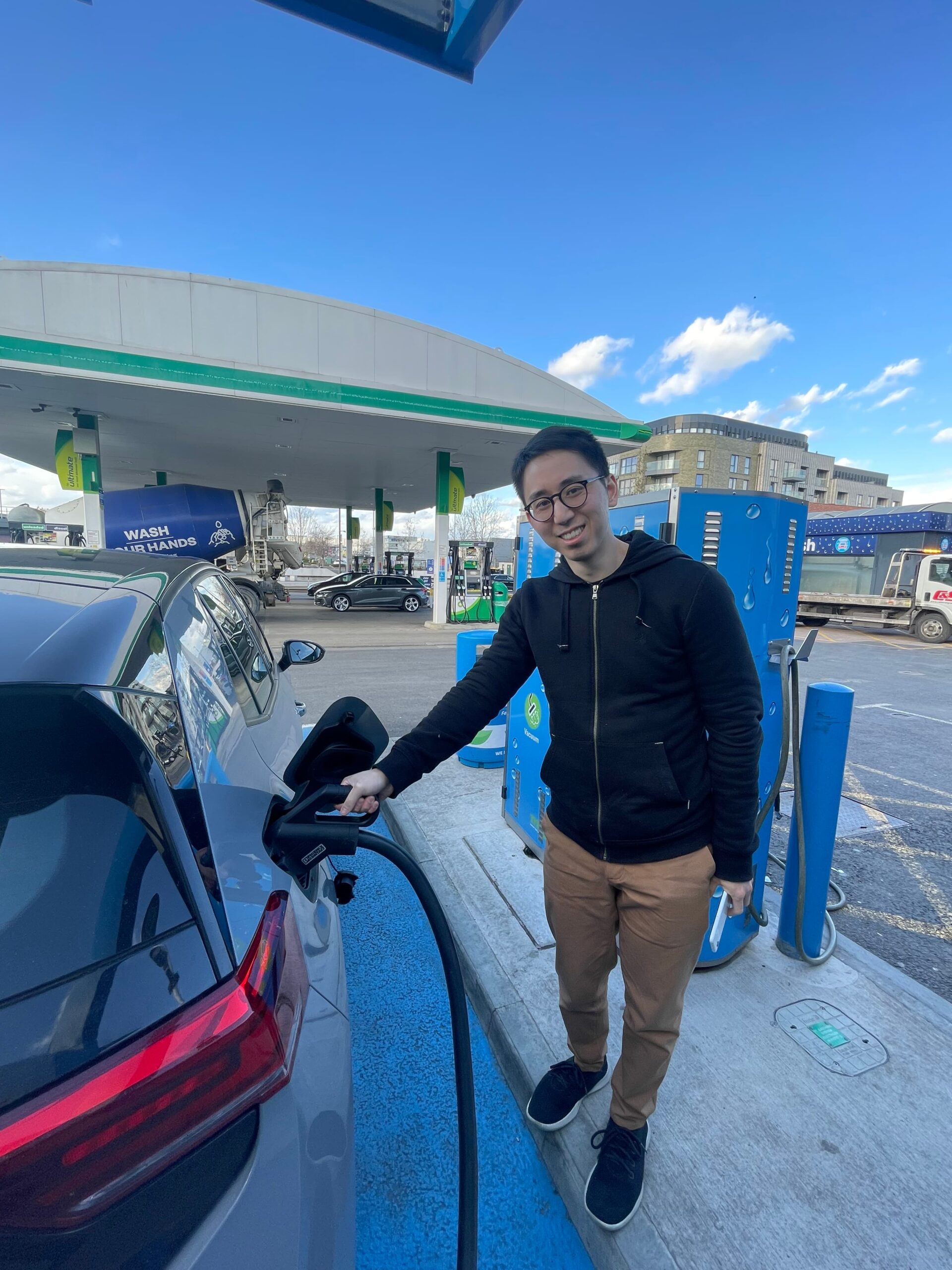
A bumpy ride
Tootling around East London on a warm Spring day sounds pretty relaxing, right?
Wrong! For starters, running the battery down enough to need charging was an unplanned challenge in itself, as Danielle explains…
When we picked the car up it was 100% charged. How could we deplete the battery enough to be able to start our tests? By running the heaters at full blast of course. 🥵
As the day went on, the pair noticed some pretty major electric vehicle UX problems.
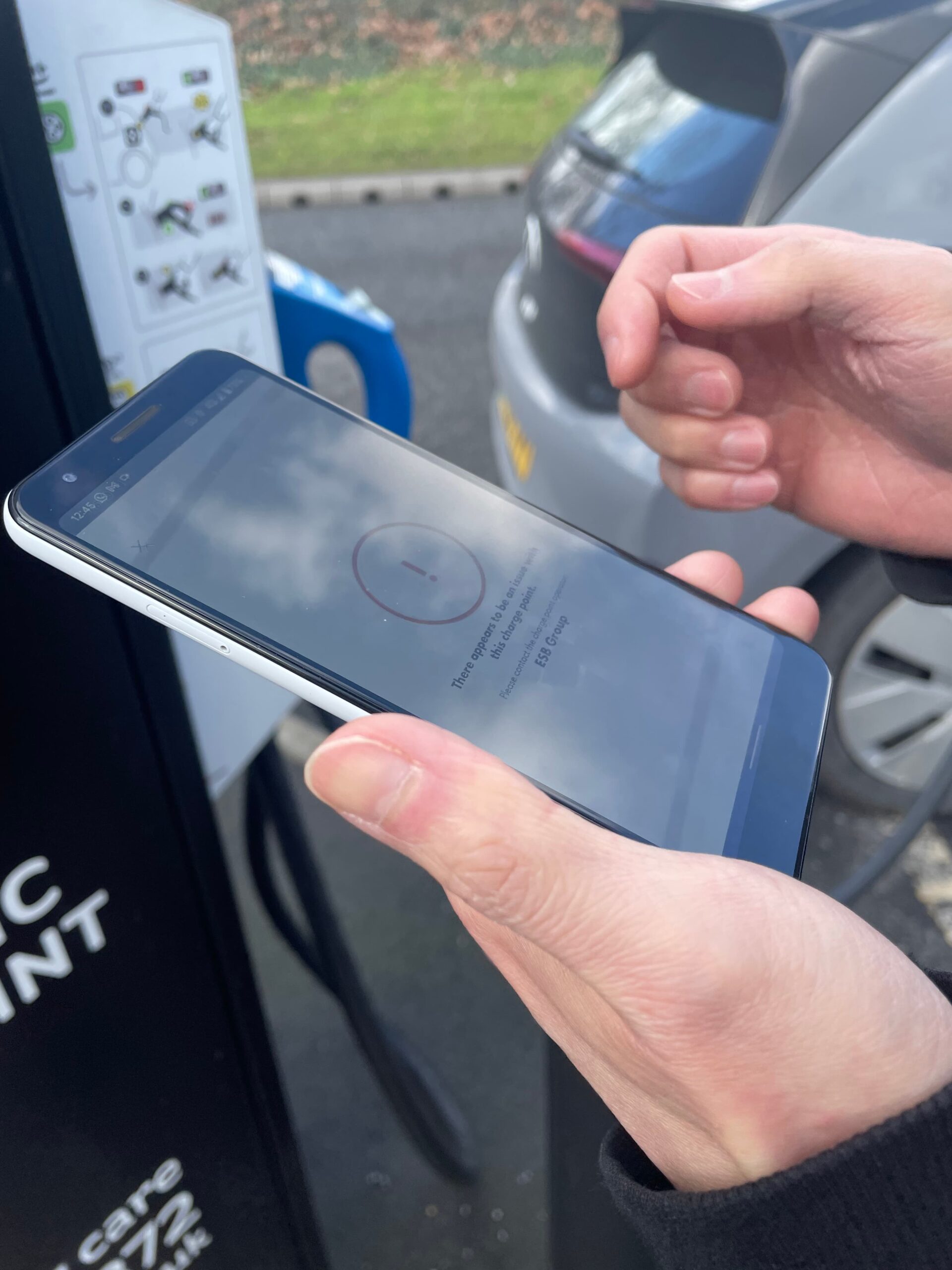
Problem #1 🛑 Sometimes, apps didn’t register when charging started, displaying an error message even when the charge point indicated the car was being charged.
Which device should users trust?
Was anything actually happening or was the app correct and the cable was just dangling there uselessly?
Problem #2 👀 Often, charge point numbers aren’t visible on the stations themselves.
How should users know which of the string of numbers presented in an app corresponds to the thing they’re standing next to?
Working this out by trial and error wouldn’t be too much fun in the rain.
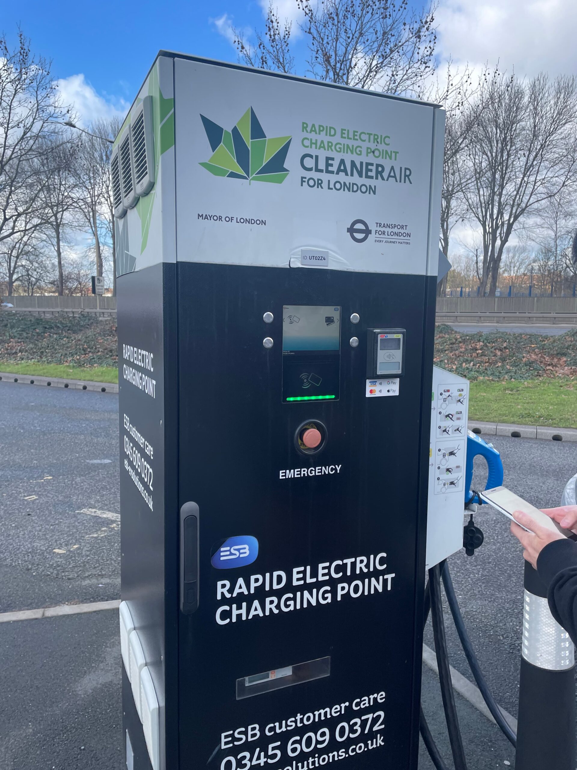
Problem #3 📵 Not one of the charge points our team visited had a QR code that worked for them. Not a single one.
Confused by how they could all be broken, Elvin did a bit of digging and discovered these QR codes relate to the charge point operator (CPO), for example BP Pulse, who build and maintain the physical sites.
They’ll only work with that particular CPO’s app, and will show an error message.
Anyone hoping to get going quickly and easily is bound to get frustrated by this as it’s natural to just see a QR code and assume scanning it will do something.
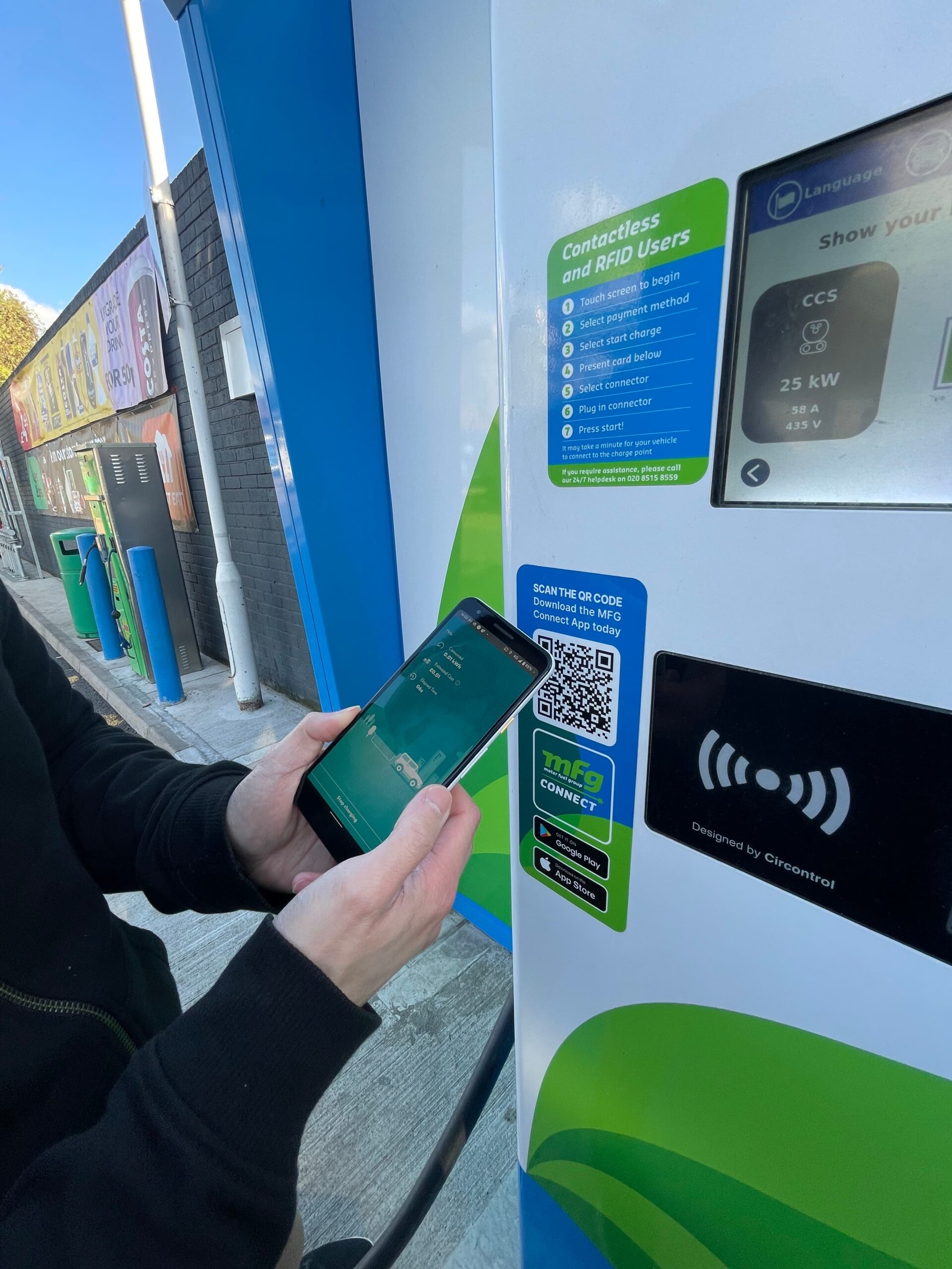
Problem #4 🚗 Most apps take a long time to update availability status, marking charge points as ‘in use’ after sessions were finished.
Trusting the accuracy of maps becomes difficult once users have experienced this – if outlets which aren’t in use can be labelled as unavailable, what’s to say the one they’re pulling up to that’s marked as free actually is?
From a testing point of view, this phenomenon made things tricky for Danielle and Elvin to switch between trying different apps on the same charge point – they found that they were unintentionally blocking themselves from accessing it.
I also had to do a 3-point turn in a one way street to get a cable to reach – that wasn’t a great experience! 😱
It sounds obvious, but there are things that you just can’t know until you encounter them in real life.
These issues Elvin and Danielle encountered brought home the need for careful consideration of user behaviour and context when we design.
Their road trip uncovered electric vehicle UX potholes that may never have cropped up in any amount of insight from stakeholders, user interviews and desk based-comparison of app features.
When people use a product in the real world, it pays to get out there and experience it too.
Need a team to take your product to the next level?
Talk to us about how we can support you through research, design and testing to make sure you’re engaging with your users in the right way 🤘
Related Posts
 Article
Most teams think skipping product design saves time. In reality, it creates more problems later. Here’s why design is critical to building products that actually work.
Article
It comes naturally for product teams to think about users, but forward thinking organisations should be sure to instil user-centric thinking in other areas too.
