When designing you must always consider context. It plays a huge role in how people use your product, especially if your target user has a unique need.
When we built Up All Hours there was a very distinct use case: Parents of young children up in the night looking after restless kids. Not much fun.
They were tired, frustrated, emotionally drained and in need of something better to do.
We had the content but designing for the context was very important. How do you work out how to design for this situation?
The first answer is research. Ask users what they do and they’ll tell you.
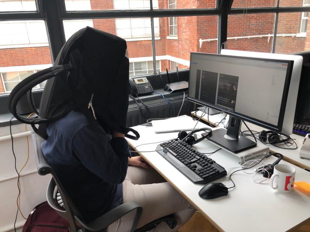
The second is simulating the experience, but unfortunately we didn’t have any babies on hand and don’t tend to work at 3am.
So we put bags over our heads and tried to read on our phones.

What did we find?
A few simple but useful features came out that allowed us to design a better experience.
- Low level mode for night time – bright screens are a problem in a dark room 💡
- Self-scroll for one-handed reading – leaving the other hand to hold a baby 👶
- Typography focus for legibility – it’s hard to read when you’re half asleep 😴
- Mobile only direction – do you use a laptop at 4am? 📱
Many of the tools we work on have varied and sometimes not immediately obvious contextual intricacies. We’re always trying to figure these out when we talk to our users and run our discovery phase.
Context is king.