Company
£90m+
800+ employees
Insurance
B2B/B2C
London, UK
Team
1
UX/UI strategist
2
UX/UI designers
Aston Lark is one of the UK’s largest independent insurance brokers, with over 75 offices across the UK and a wide range of brands for both B2B and B2C markets.
Their range of insurance products is immense, covering aviation to fine wine and everything in between.
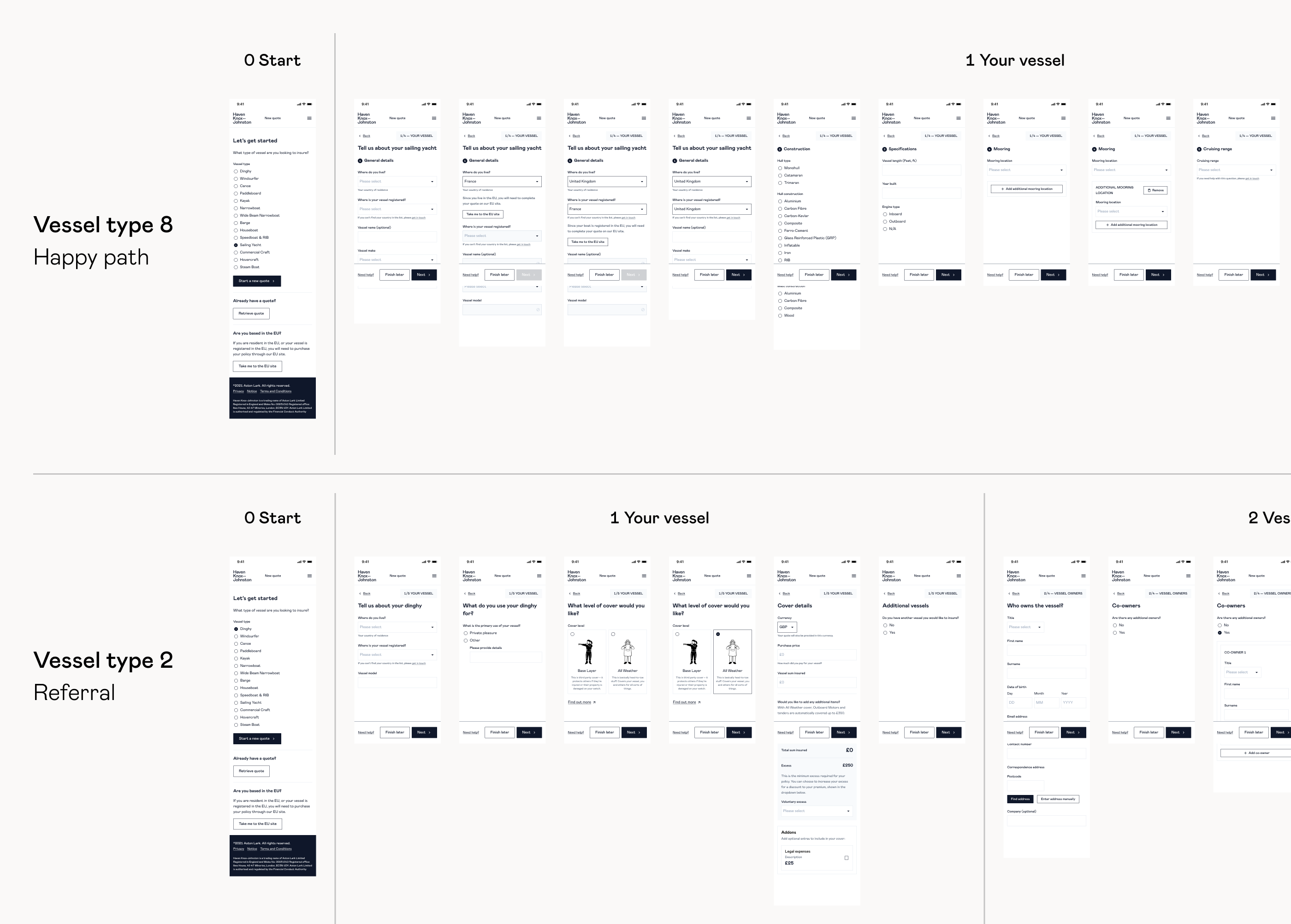
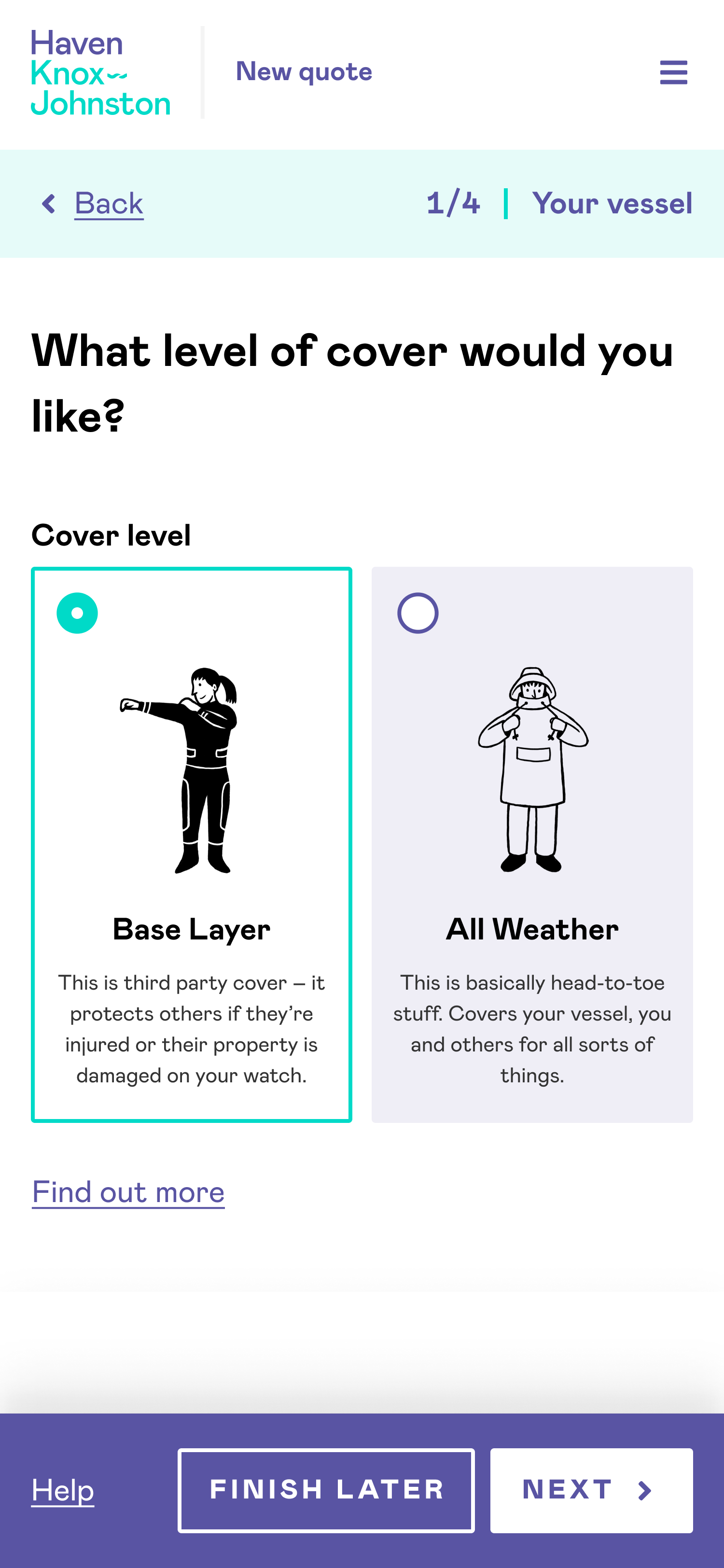
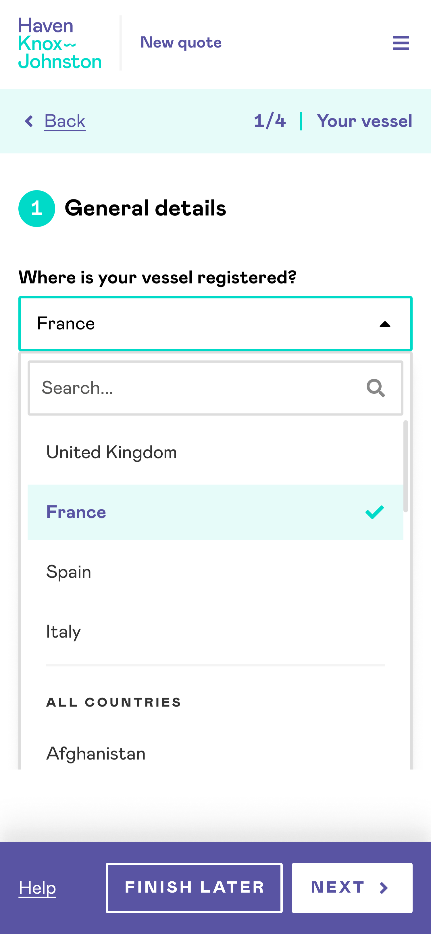
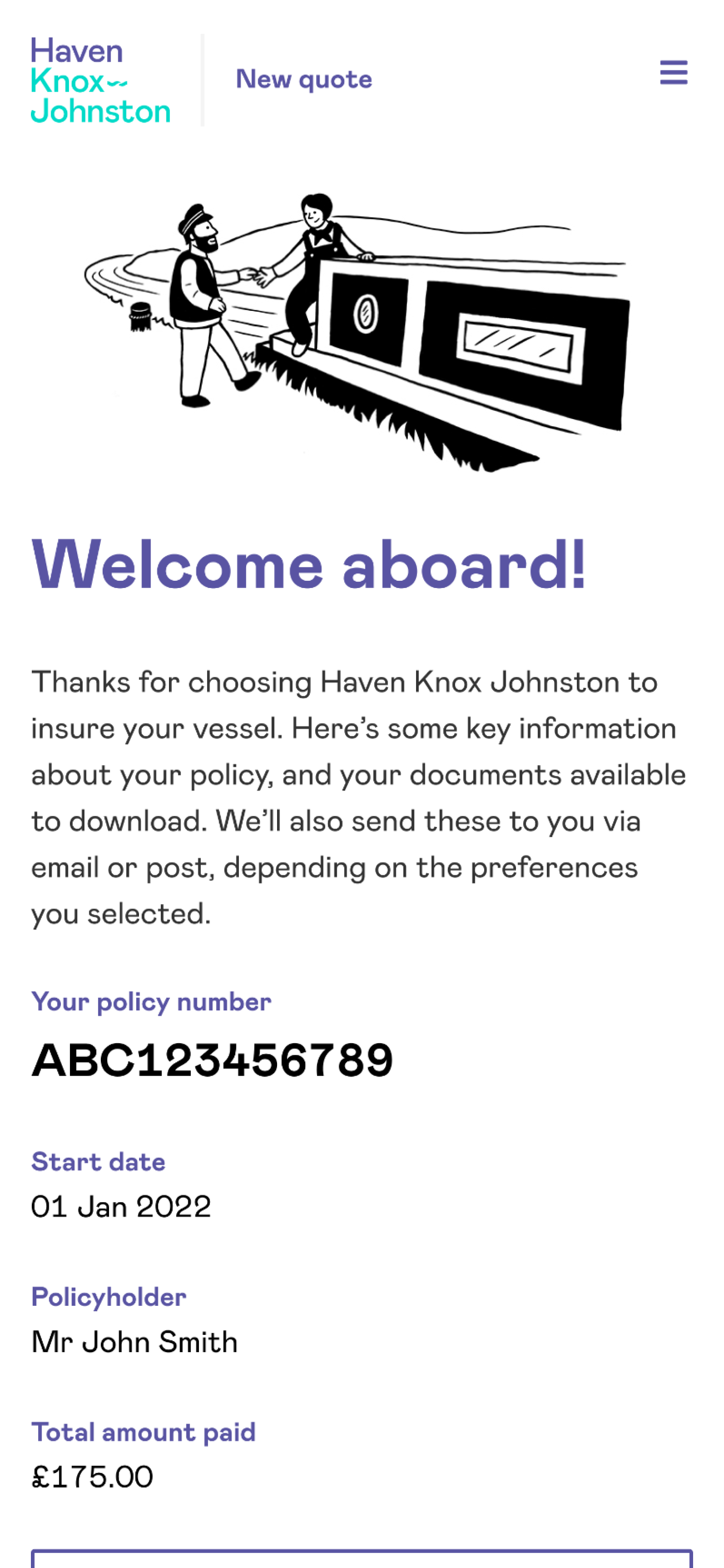
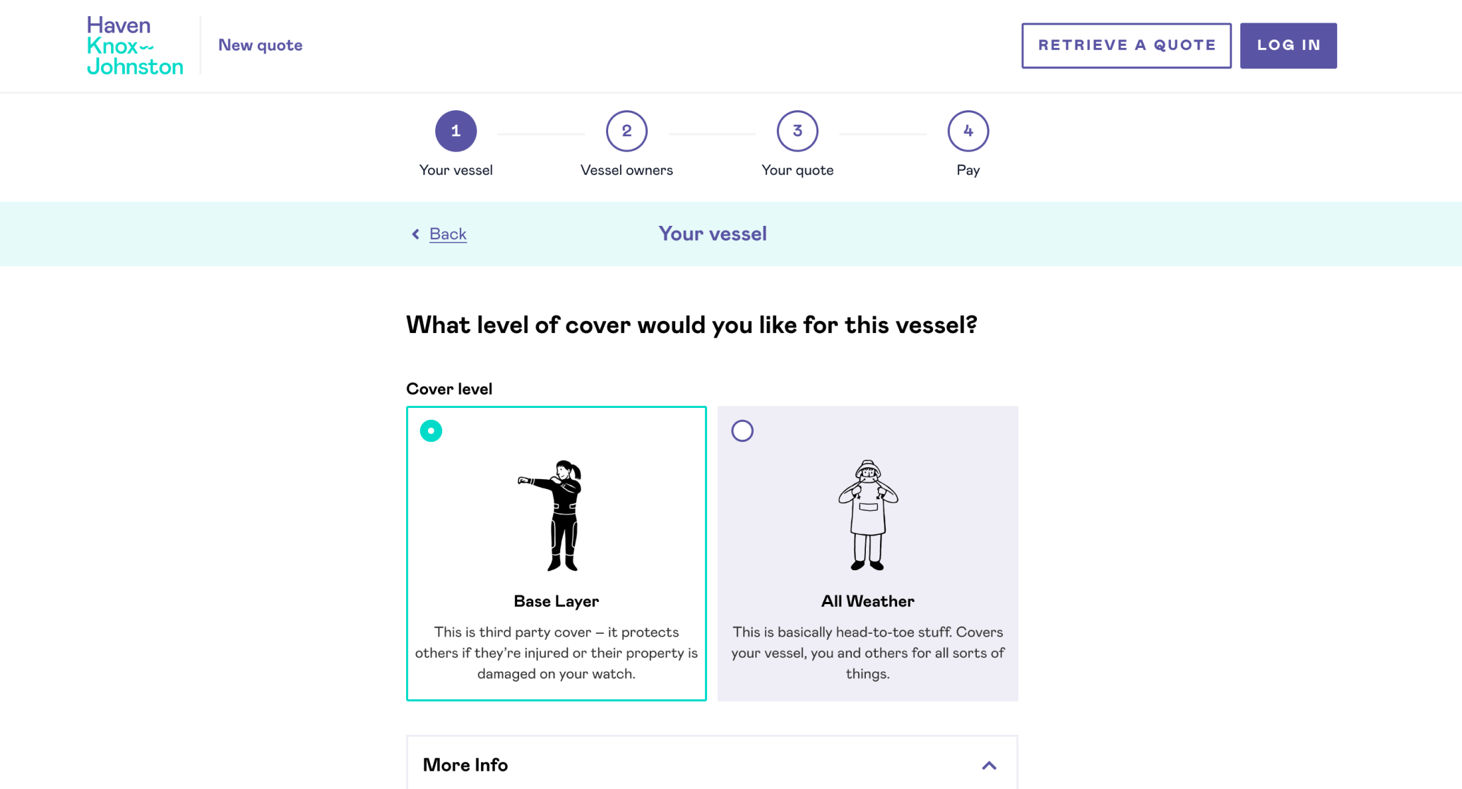
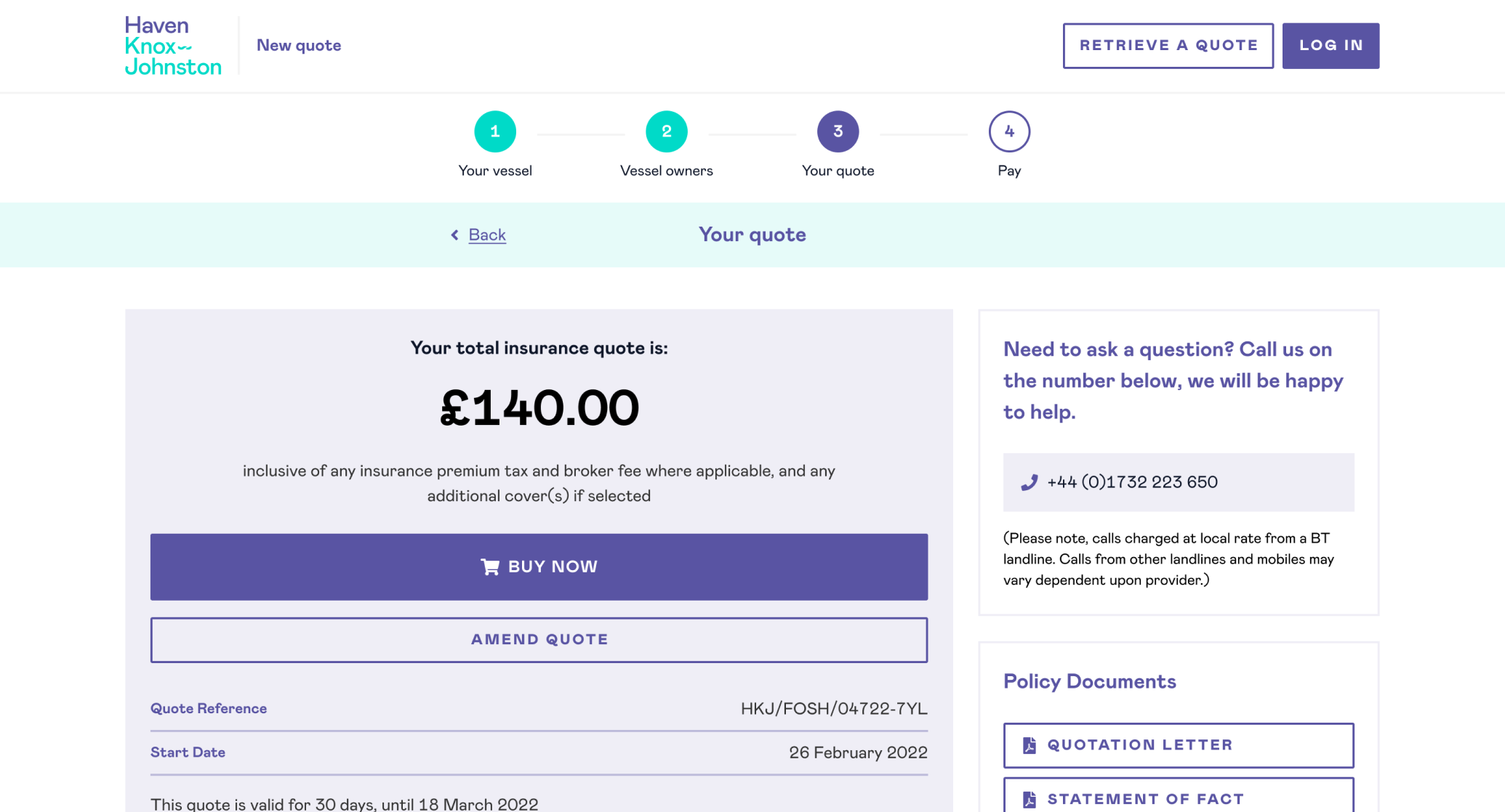
We came aboard initially to work with Haven Knox-Johnston, Aston Lark’s boat insurance brand. Our task was to create a smooth, self-service insurance UX flow for people to purchase insurance for their vessel in a series of simple steps.
This would replace the existing ‘get a quote’ process of phone calls, form filling and waiting for emails.
Not ideal for a modern business and a hindrance to increasing conversion rates.

Just a few of the brands in the Aston Lark family
An extensible onboarding process
The bigger picture was that this process would be a breeze to adapt and roll out across Aston Lark’s other existing brands, as well as future acquisitions as required.
The company’s existing brands use a mix of manual phone based quotations like HKJ and various online forms, but the longer term plan is to roll out a centralised common tech platform across the entire suite.
Whilst the insurance products themselves differ, the flows are likely to have much in common.
Go with the flow - designing onboarding that works
Three common onboarding flows and our advice on how to ace them 🚀
Insurance UX research
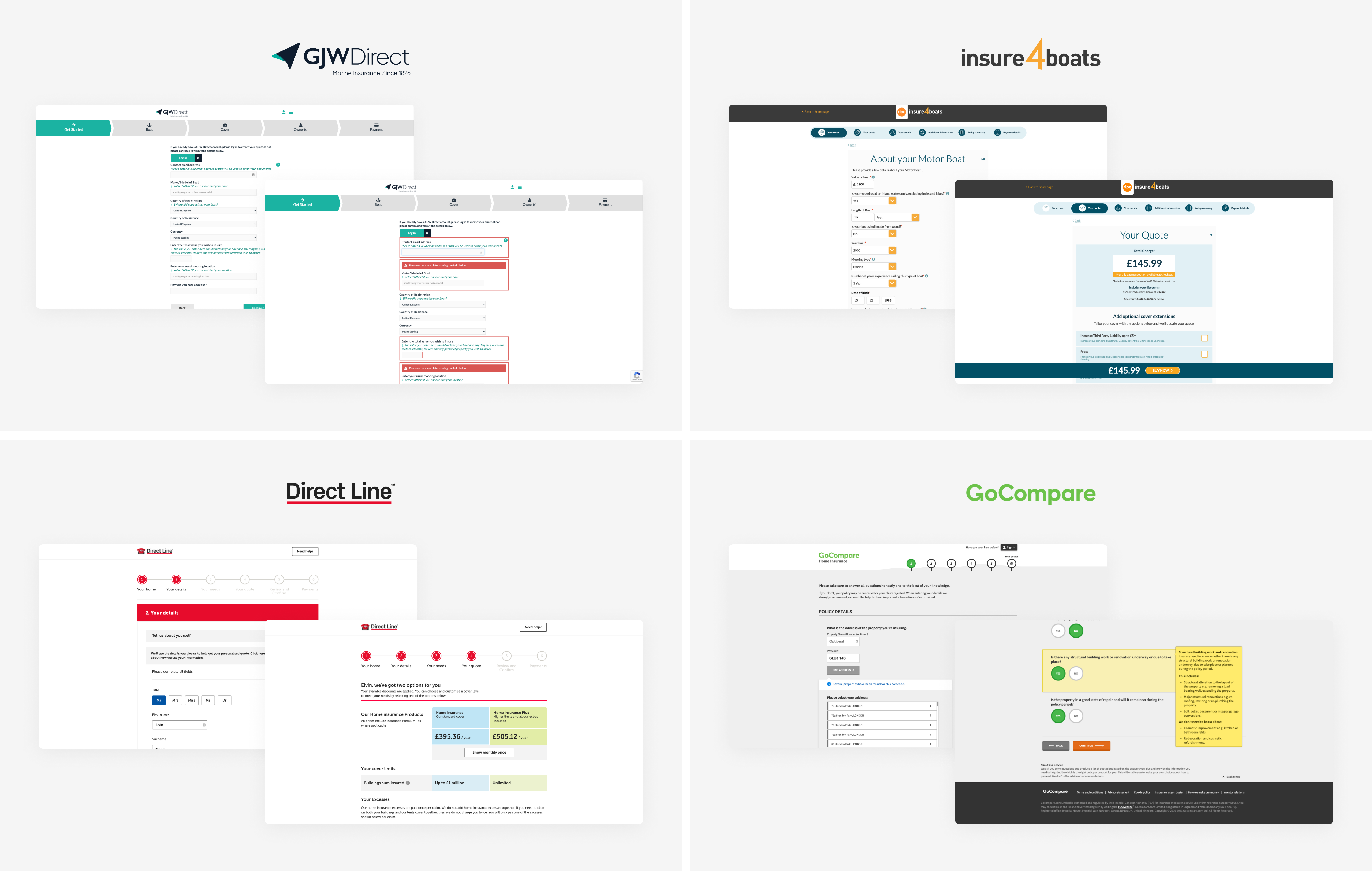
Our first task was to understand the boat insurance marketplace – surprisingly enough, it’s not something any of our team have had occasion to buy before!
Running through the end-to-end process with other products allowed us to see what HKJ’s competitors do well and not so well.
Getting this direct experience of how the companies achieving growth in the sector manage their onboarding was a powerful learning experience.
I got quite attached to my imaginary boat as I gathered various quotes for insuring it ⛵️
We also gained insight about customer goals by leveraging the extensive knowledge and experience of HKJ’s internal team.
This insight enabled us to focus on a journey that reassured and motivated users as well as allowing the platform to painlessly gather the necessary information from them.
Insurance UX planning
Boat insurance is more complicated than you might first imagine.
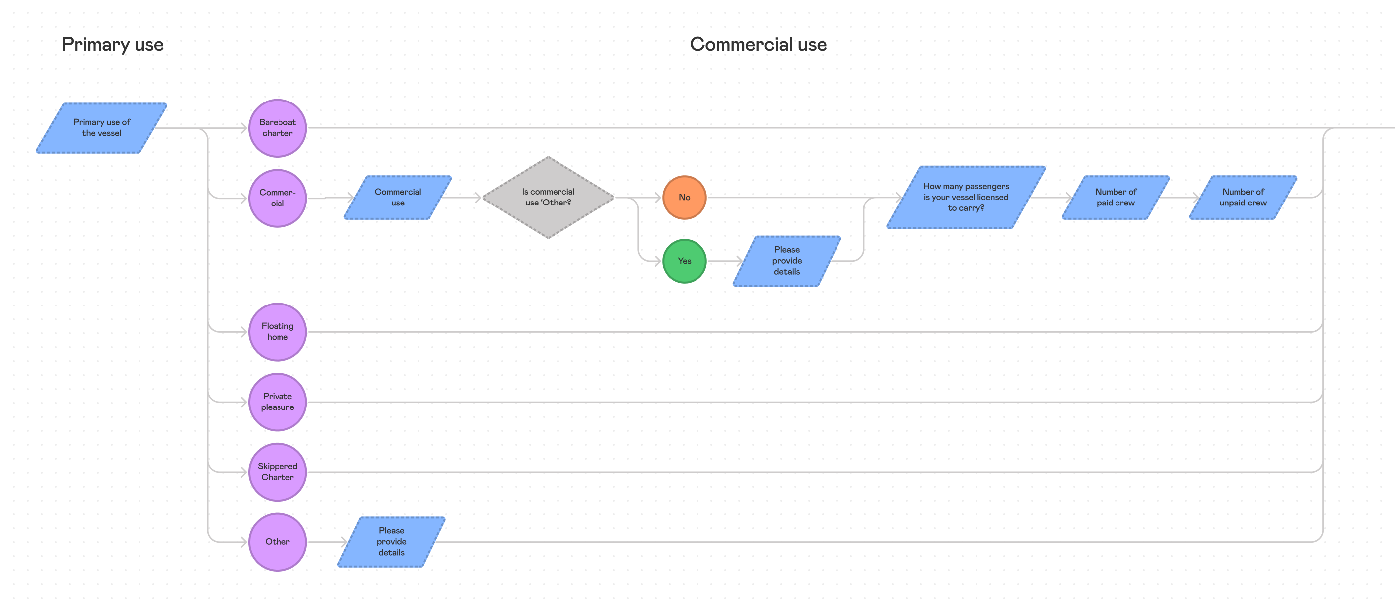
There are lot of interweaving factors which go into calculating a quote, and insurers need to undertake what’s known as a ‘risk capture.’
We first created a process flow chart mapping out all the questions that form the risk capture, including all conditionalities and inter-dependencies. This allowed us to structure the questions in the most efficient and effective way possible for the user.
