Company

£40m investment

50+ employees

Automotive

B2C

UK
Team
1
UX/UI strategist
1
Senior UX/UI designer
UX improvements
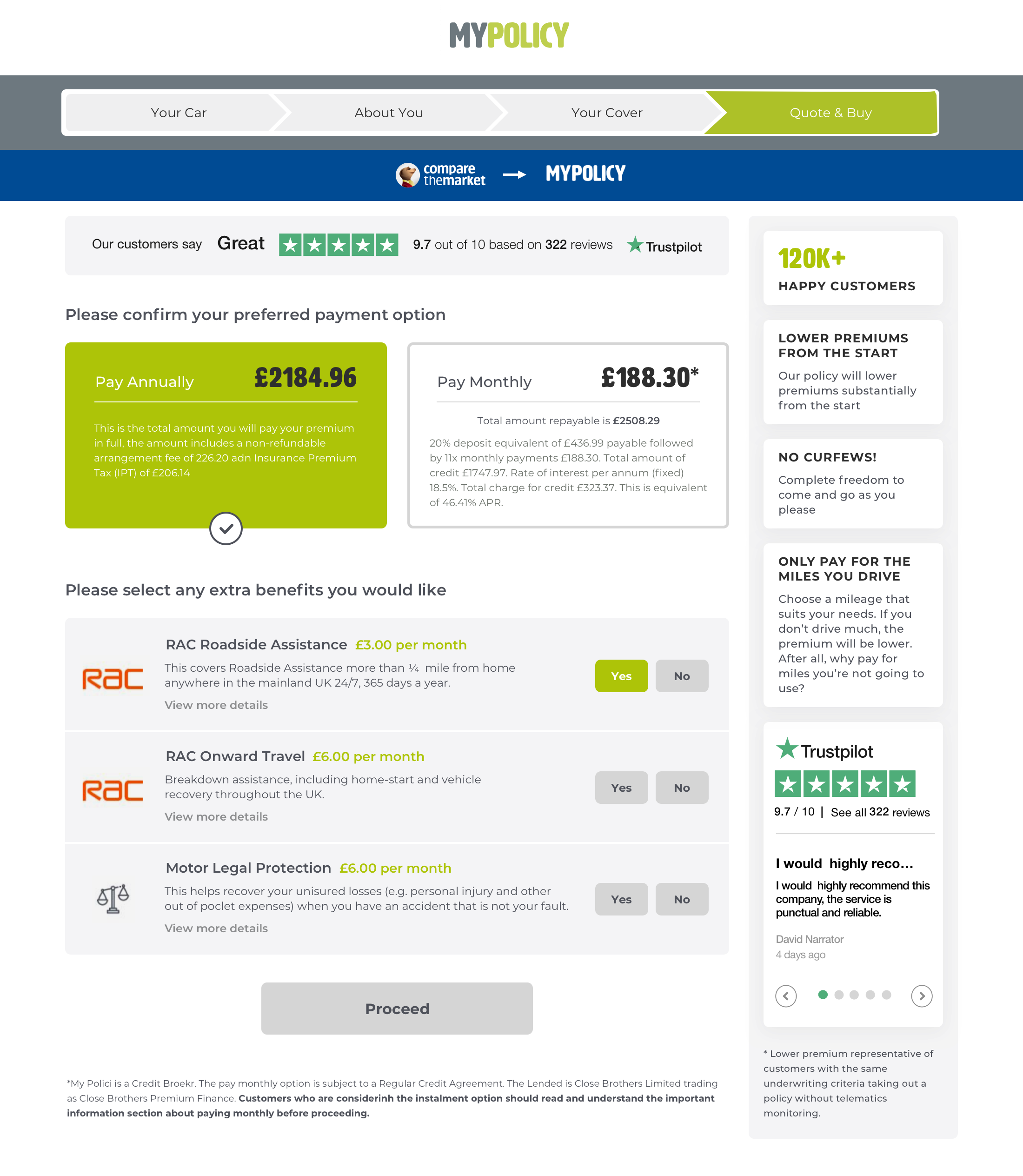
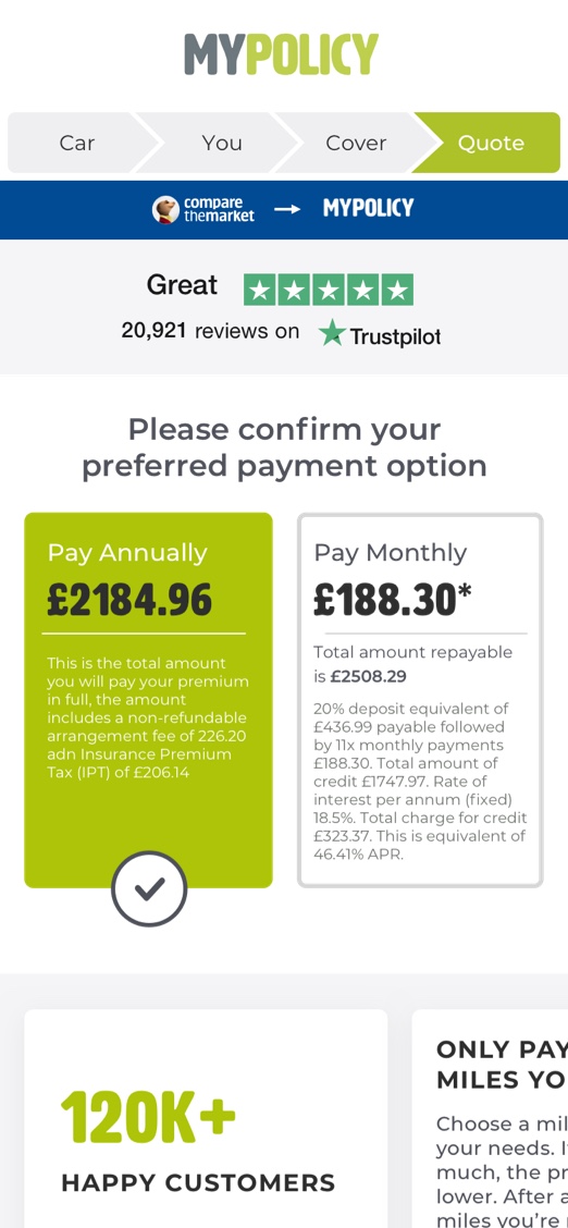
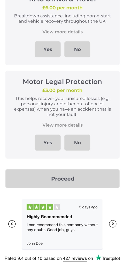
MyPolicy offers niche car insurance to younger drivers.
The vast majority of their customers come from price comparison websites like CompareTheMarket, where users have already filled out a good deal of information and are ready to buy.
However they were failing to take the final step. The signup flow on MyPolicy’s site was yielding below average conversions, and it was clear that some tweaks were needed.
We came onboard to quickly deliver a mix of improvements to UX and message and design refreshes ready for user testing.
User research
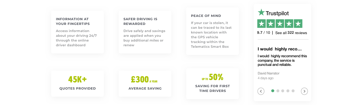
MyPolicy offer telematics insurance, where a box is fitted in the car that monitors how, when and where it’s driven. Good motoring is rewarded by lower premiums.
Not unsurprisingly, it’s a service often taken up by parents who are paying for their kids’ insurance just after they’ve passed their test.
There were questions around what users needed to see to understand the service was right for them. Did we need to show trust, explain telematics in more detail or show the company’s great reviews?