Input types and the sweet spot between design and development


Have you ever been asked to type your email address into a form on your mobile and had to go searching for the @ symbol?
How about being asked to input a number and having to press the shift key and switch keyboard?
Of course you have, and chances are it was a bit annoying.
Ok, so on the annoyance scale it’s hardly ‘blind rage’ level, but it’s also hardly a good user experience, and it can really hurt a digital product’s bottom line.
Remember, more than 67% of users will abandon a form forever if they encounter any complications.
However, when design and development teams are aligned, issues of this type can and should be avoided. Let’s look a little deeper into input types and find out where problems can crop up.
Why you should care about form design
Form design isn’t anyone’s idea of excitement, but it has a massive effect on product success 📝
Understanding input types
As anyone who knows their coding languages will tell you, the input element is the backbone of allowing users to enter data into a product.
How this element should function is dictated by the type attribute, so for example <input type="text"> specifies that the thing the user will be entering at this point will be – you guessed it- text.
These different types have had documented definitions since time began (or at least since HTML was invented, which is more or less the same thing, right? 😉) and they’ve been evolving and growing ever since.
For example, new devices and ways of interacting with digital products brought about the need for a ton of cool new features in HTML5 to help users input data.
But why does this matter to a product team and what does it have to do with the annoying situation we’ve discussed above?
Well, because it’s really important for product teams creating a form to think about the type of data you intend it to recieve, and to document types of content for development teams so they’re able to totally understand what’s required.
Working together for the user is the aim of the game!
What input types are available?
Quick answer: loads! There are probably more than you think available, to handle multiple types of data.
Running through the lot wouldn’t make the most exciting article though, so here are the ones you’re most likely to encounter and a super-quick overview of what they do:
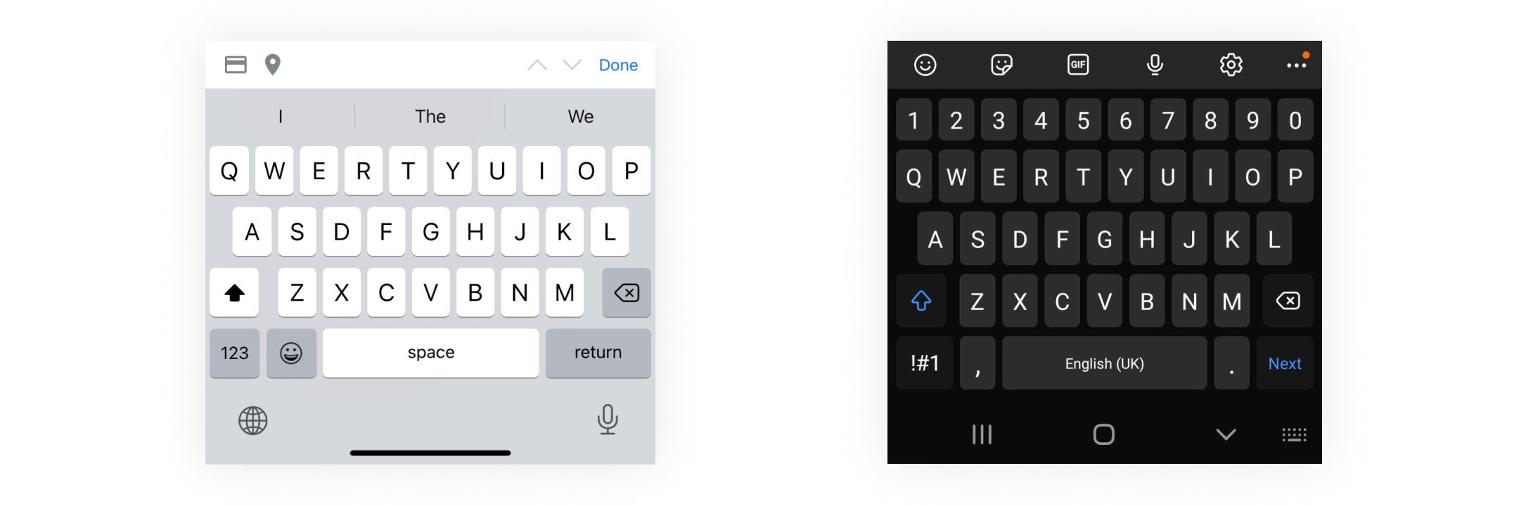
Text
The most commonly used input type and the one that is misused the most 😉. It just means that what you’re inputting is a text string and will bring up the default keyboard.

More text here, but crucially this type gives the user easy access to the @ symbol, to ‘.com’ as a single button, and updates validation parameters (e.g ‘is the text entered here formulated ‘someone@somwhere.something’).
It’s a super handy one and there are no excuses not to use it.
Password
A user would be right to run screaming from any product that used ‘text’ to collect sensitive information!
This is an essential input type for any form which asks users to set or enter their credentials. Content is hidden by default for security purposes. For obvious reasons, we don’t have an image to show you for this one. 🔐
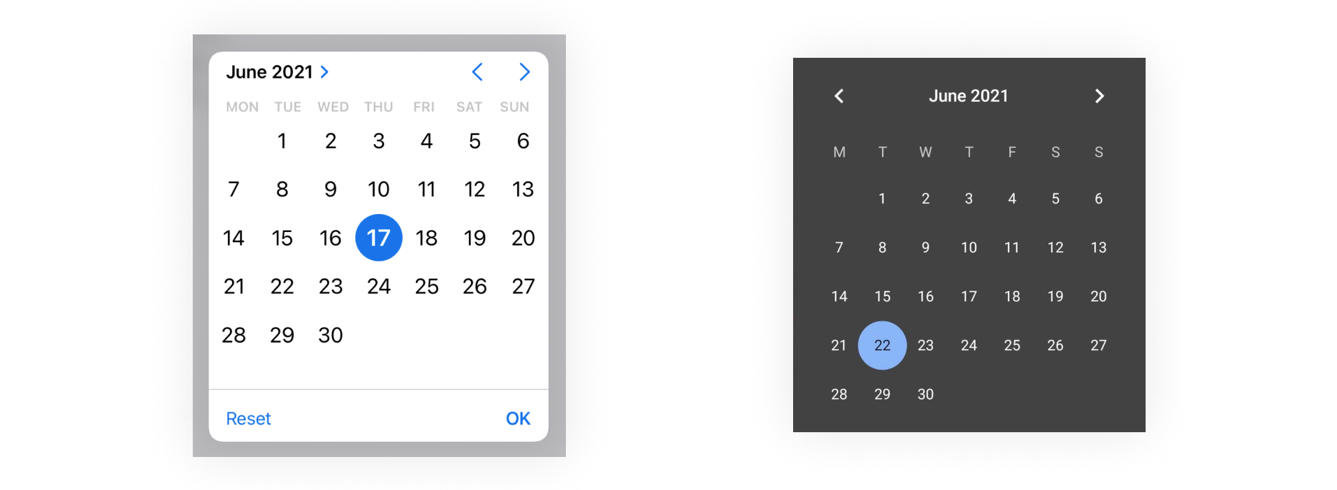
Date
Gathering date and time values has historically been a head-scratcher for developers. If left up to users, times and dates can be expressed in multiple different formats and this is a pain to parse.
Providing a calendar selection UI which lets users select dates without switching to a dedicated calendar application is definitely preferable, and that’s where the date picker input type comes into its own.
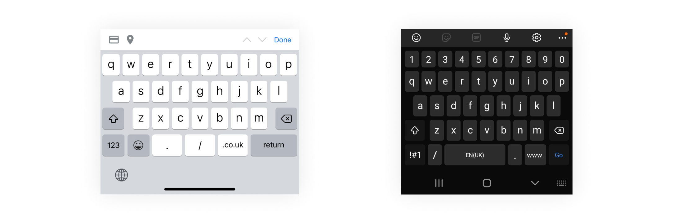
URL
Criminally underused in our opinion.
It works just like the email field type and brings up the punctuation needed to correctly formulate a URL (i.e. . / :). It also doesn’t try to annoyingly capitalise your first character.
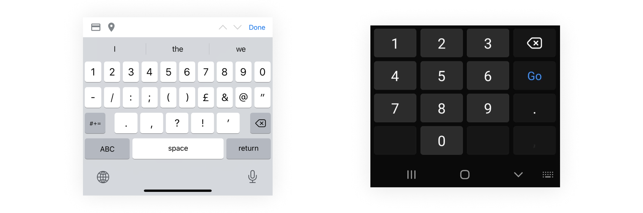
Number
The amount of times we’ve seen text used over number is still a surprise. This type either brings up a numeric keypad or a text keyboard with the number line visible and is essentially for any input where the only answer can be a number.
Whose responsibility are input types?
The reason problems occur is that specifying input types sits in the shadowy area between UX design and development where many important elements cross over.
Designers probably – quite reasonably – assume that developers will know enough about contextual use to make a good decision, and leave them to it.
Developers however may lack the user focus required to make these decisions with any degree of certainty. They may also lack the information to be able to implement the form correctly if designers haven’t kept input types in mind whilst designing.
What’s the solution?
As with most potential issues in this area, it comes down to collaboration and understanding the end goal from both sides.
- Designers need to make sure technical implementation is thought about when handing over design assets. If detail is likely to get lost in translation then it’s down to the design team to create documentation that leaves no guesswork.
- For development teams, bringing thought around the users’ needs and context will always benefit the end product.
A development team that starts to bring UX thinking into their workflow will become more efficient and push out higher quality products.
Related Posts
 Article
Ever worked with someone who couldn’t innovate their way out of a paper bag? Or maybe a leader who gets overexcited about the latest trend from a conference, completely detached from what your customers actually need? Or your product roadmap? We’ve been there.

 Article
Wireframes are all about hierarchy. No digital product or website exists without an underlying structure that dictates the importance of every piece of information.
