Revamping the UX and UI of a business and social video platform

The project

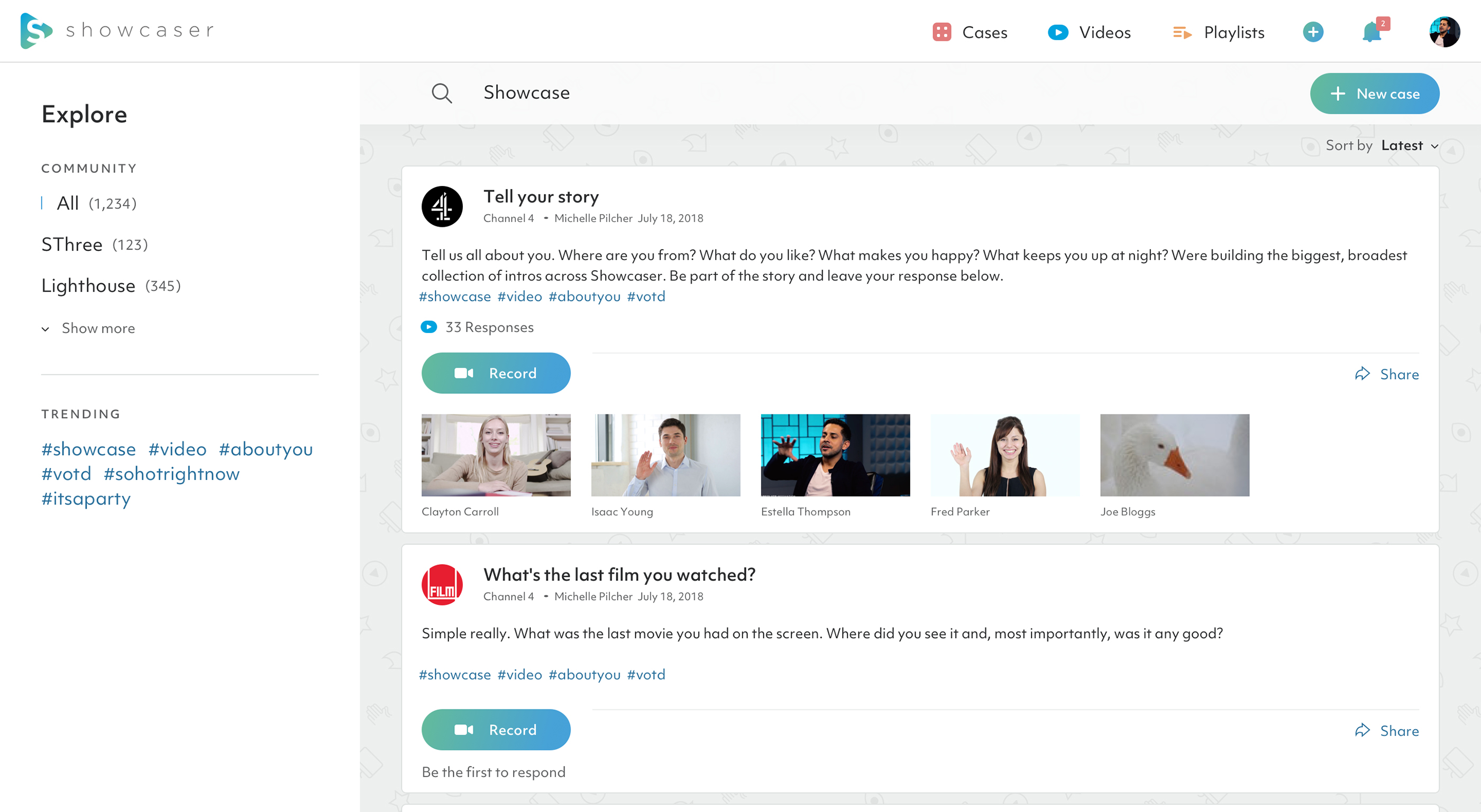
Embedded inside a corporate parent, Showcaser are a startup trying to create an engaging video platform for business and social use. The team had launched an MVP that had all the features they needed but was let down by confusing UX and inconsistent UI design.

The aim of the product was to provide short term use for the parent company but bring in revenue as a standalone business in the longer-term
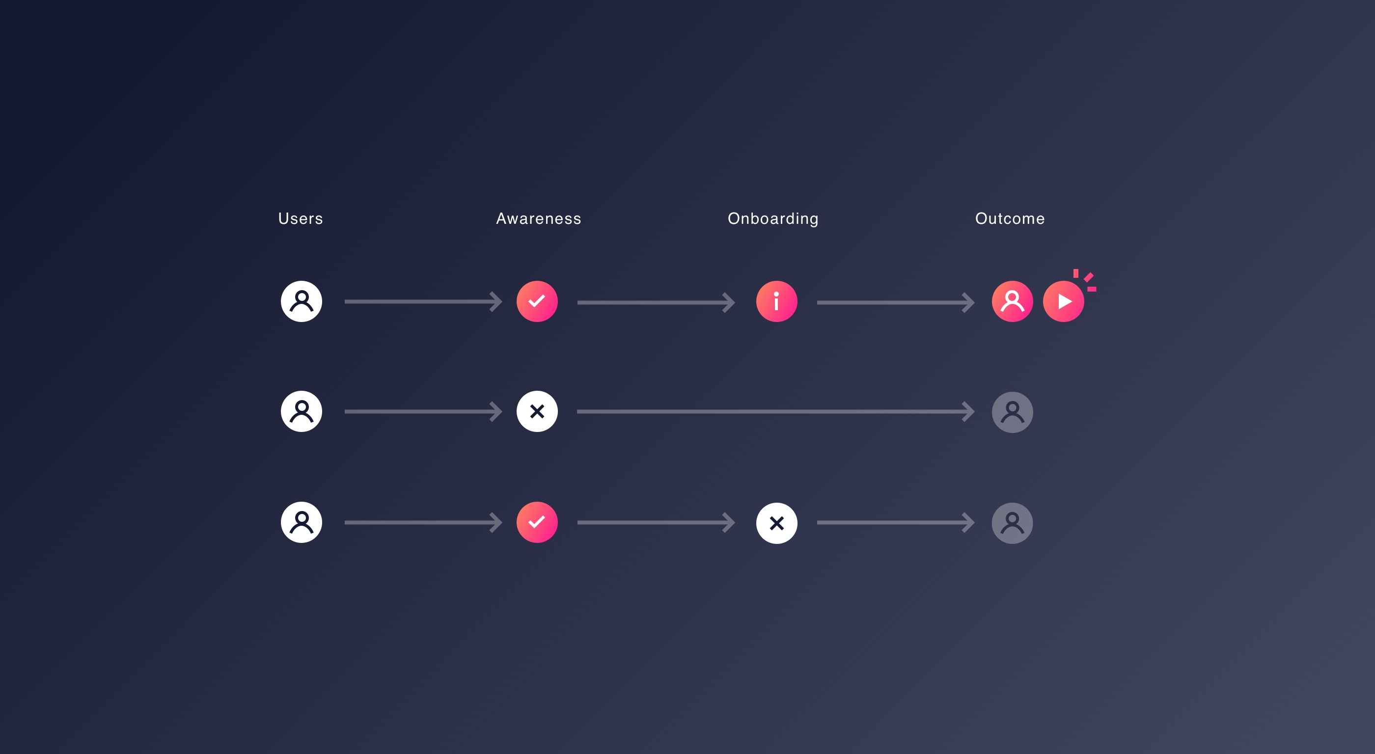
Onboarding

Initial testing had show traction with customers but too much onboarding was required to explain how to use the service. People didn’t understand what they could do and the routes through the product were confusing and unintuitive.

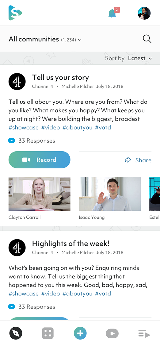
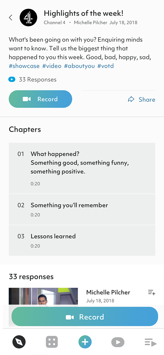
We came on board to rework the design and create a more seamless experience.
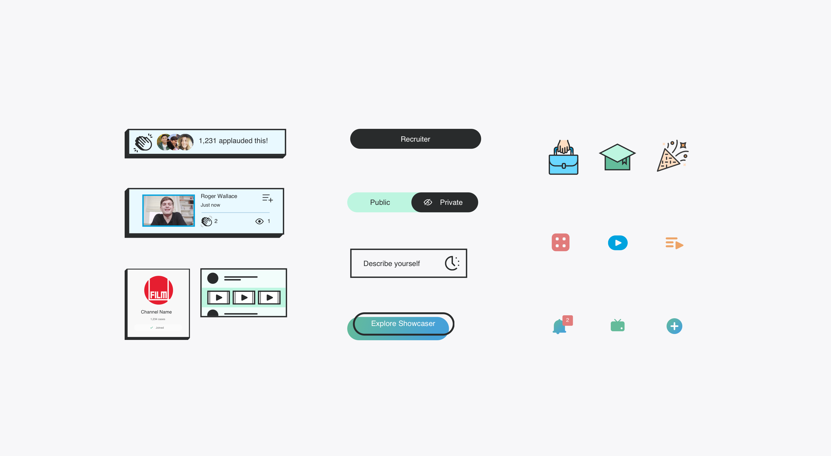
UI design system

We broke the elements into a series of components to redesign giving the development team a tool to expand the product over time. This set of building blocks could be used to create both the current templates and any future additions as the user needs grew.

Lighthouse handled the concept and design in a very collaborative way. They worked to understand our product before making it better and were helpful in pushing back on concepts when they knew a better or more elegant solution.

Michelle Parsons
Co-founder, Showcaser

Messaging and marketing

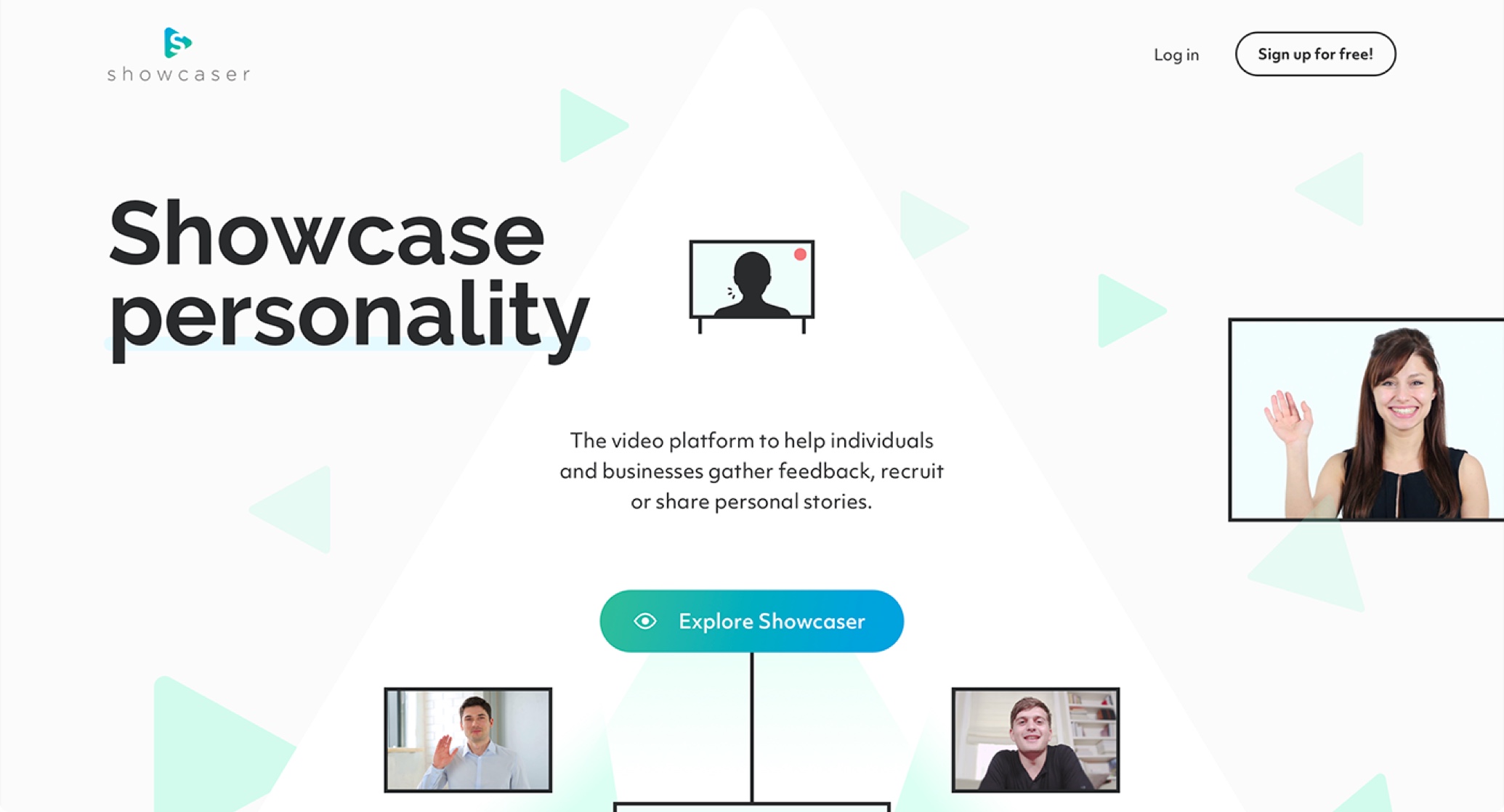
The public facing section also needed work. The old messaging wasn’t landing well and confused more than it excited. Re-working the messaging and telling the story using a series of illustrations allowed us to create a landing page that encouraged sign ups and showed the value of the service.

We’ve been receiving great feedback on the designs. We’re very happy with the outcome.

Michelle Parsons
Co-founder, Showcaser
120 Hours UX and design
2 Months turnaround
5