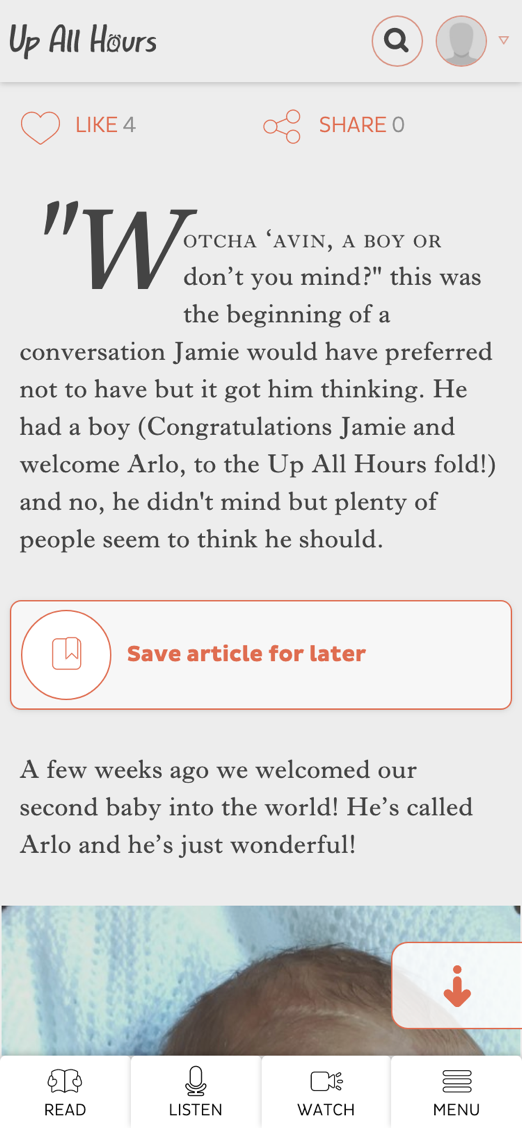
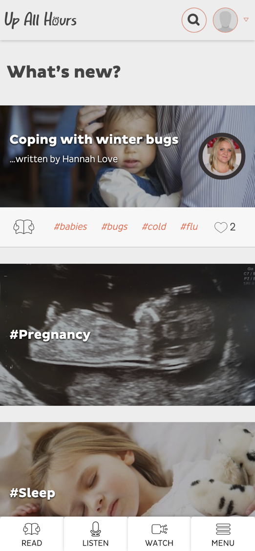
The project
The first few months in a new parent’s life are the toughest. A strange new world filled with tears and unexpected experiences, many of which are faced alone. Up All Hours are there to give a helping hand in the hour of need
…which is usually 3am on a Tuesday.

The problem
They came to us because the original site wasn’t working. Confused UX, design that wasn’t hitting the mark and in dire need of a tune up, we ripped it up and started again. And the best place to start?
The users.
User validation
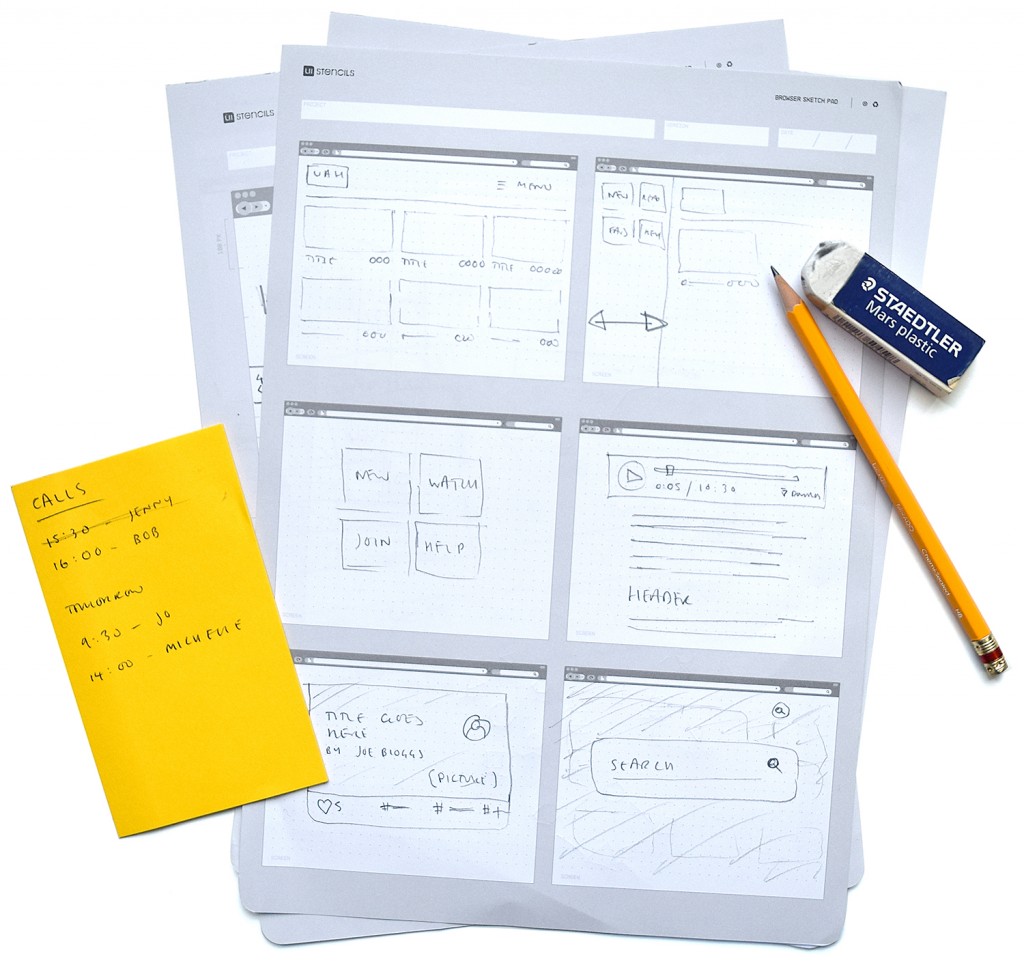
Parents were interviewed, ideas prototyped and decisions made about what was best to build. It turns out that everything was overcomplicated and all people wanted was good content and a pleasurable user experience (when viewing on a phone using only one hand).
People loved the content but just couldn’t find it. Why make something overly flashy when it serves no benefit to the visitors?
