Company

$330m+ revenue

2500+ employees

Finance

B2B

Global
The Airline Analyst is a complex airline data product that allows people to stay on top of their investment portfolio with comprehensive, historical data about airline performance.
Although TAA is a well-established aviation tool and has enjoyed market success for a number of years, UX had not previously been a priority. An outdated interface was blocking new features, holding the platform back from further progress and growth.
Users needed better routes through the wealth of information the product offers.
That’s where we came on board, with our expertise in designing complex data products making us a perfect fit.
UX audit
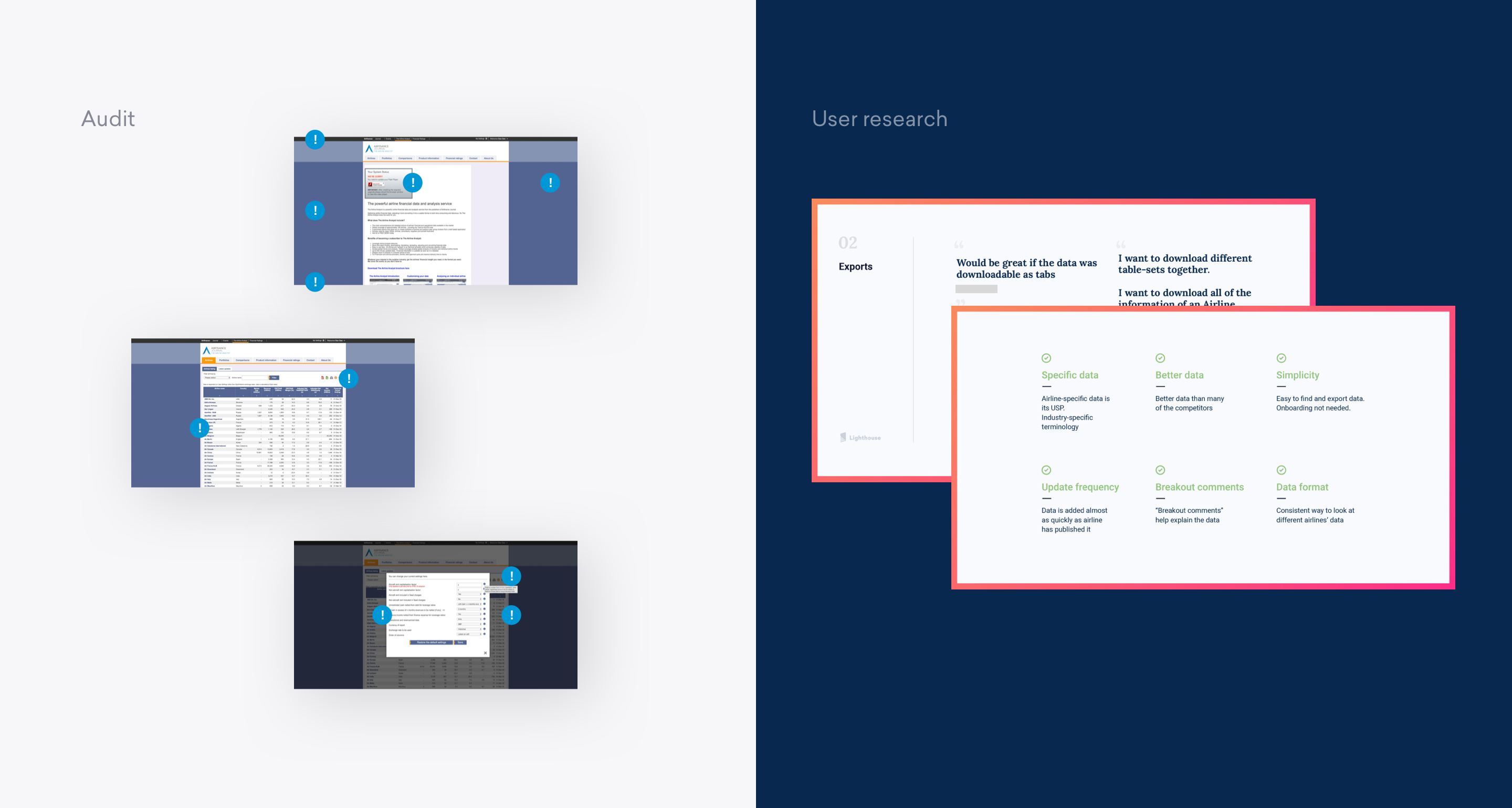
Our first task was to undertake a heuristics audit of the product, finding the main usability blockers and issues while also assessing the UI and noting potential improvements.
We interviewed a variety of customers to understand the main use cases, pains and gains as well as communicating with stakeholders to get their perspective.
From this we discovered that there were very diverse user types, from expert ‘super users’ to casual browsers who barely scratch the surface of the platform’s capabilities.
Our discovery phases aim provide insight that will inform the path our work will take, all validated by thorough exploration with users and stakeholders
Data product UX design
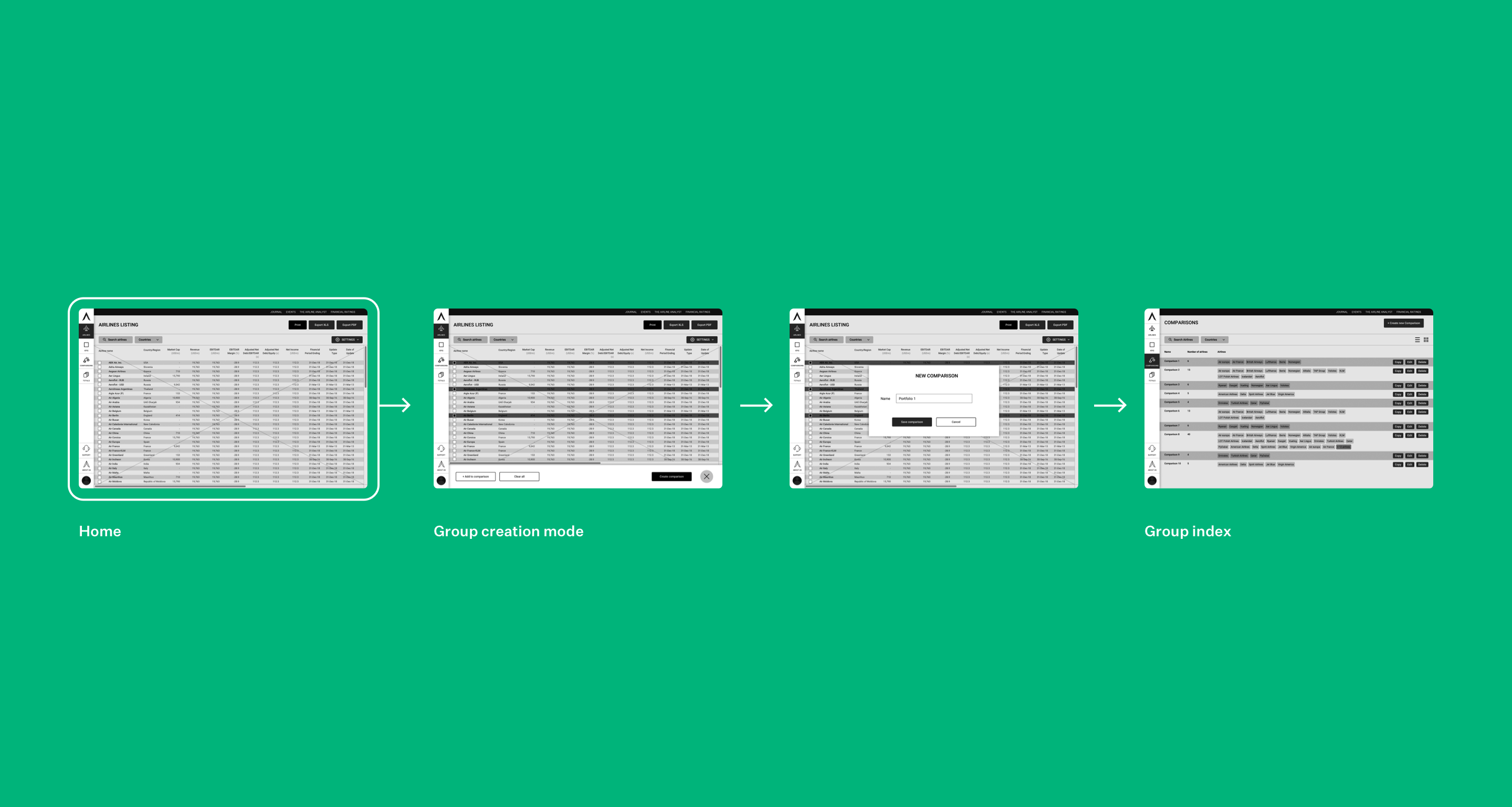
Our first port of call was to remove complex flows that we knew users were struggling with from the application. Replacements to allow users to group and arrange data were created to speed up platform usage.
Information architecture was also reassessed to help users navigate data-heavy screens with ease.
Creating a self-service ecosystem where the data can be retrieved with a minimal number of clicks saves users time and effort.
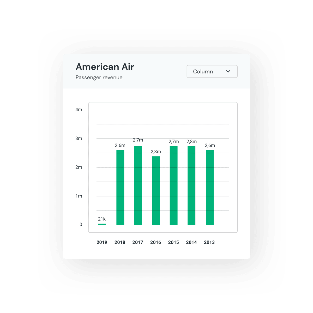
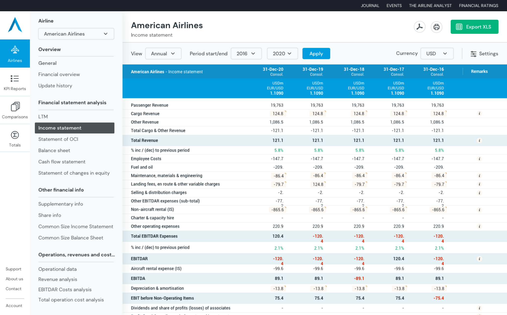
Designing data
The brief from the TAA team was to show as much data as possible all in one go. This approach contrasted with our usual preference for white space and room to breathe.
Opposing opinions aside, the only correct route is the one that the user chooses.
For this reason we created multiple prototypes of interfaces to test how the data tables should be displayed. These actually proved that the client’s direction of ‘as much data as possible’ was preferred by TAA customers.
We never mind being proven wrong by the facts!
By testing, we were able to show objectively what was most suitable for the user and not let personal preference get in the way.
UI library
It was essential that we brought the visual design up-to-date, putting it on a par with the sorts of products that users mentioned they use daily. In order to do this, we crafted a detailed, extensive online design system centered around interaction and behaviour that would power all screens of the tool across all devices.
The design system also makes future additions easy to add in, as all required elements already exist in the toolkit.
This design system allowed for all current screens to be easily put together using a meticulous set of design patterns.
See the Pen TAA loading spinner by burntcustard (@burntcustard) on CodePen.dark
Front-end dev
We coded an extensive front-end templating system, ready for direct integration with the TAA system by their internal back-end development team. Our front-end frameworks are completely modular and give engineers a quick and easy way to create screens across all areas of their application.
The platform is now live and gaining praise for its improved performance and functionality. 🙌