Euromoney Institutional Investor PLC was one of the world’s largest business and financial information companies. It was acquired by private equity investors Astorg and Epiris in November 2022 and rebranded as Delinian in early 2023.
A range of brands now sit under the Epiris wing of the acquisition, many of them SaaS tools used by professionals to dive into complex data sets.
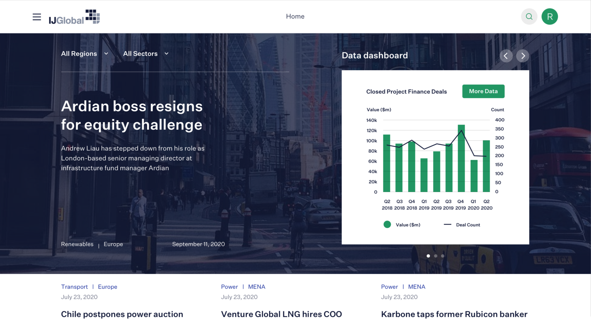
One such product, IJ Global, catalogues a huge amount of data around global infrastructure projects. It’s a well-established platform with a healthy subscriber base.
However, the IJ team found themselves encountering competing SaaS tools in a market where previously there had been none.
Whilst these competitors couldn’t match IJ’s depth of data, they were sleeker and easier to use.
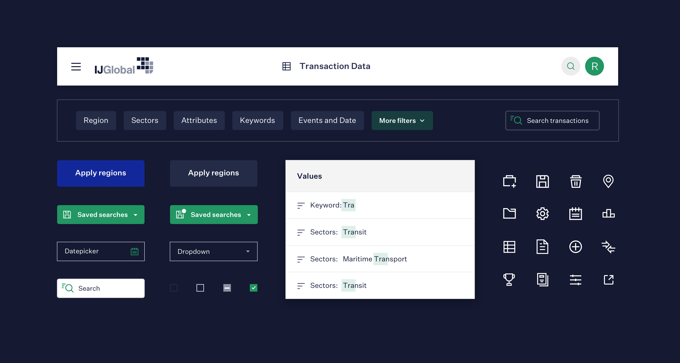
SaaS tool user types
With any data-heavy SaaS tool, it’s common to have two sets of personas: basic users who only run simple queries and advanced users who use the tool to its fullest. The challenge was to come up with a simplified interface for everyone but still retain the extra power and flexibility demanded by the expert users.
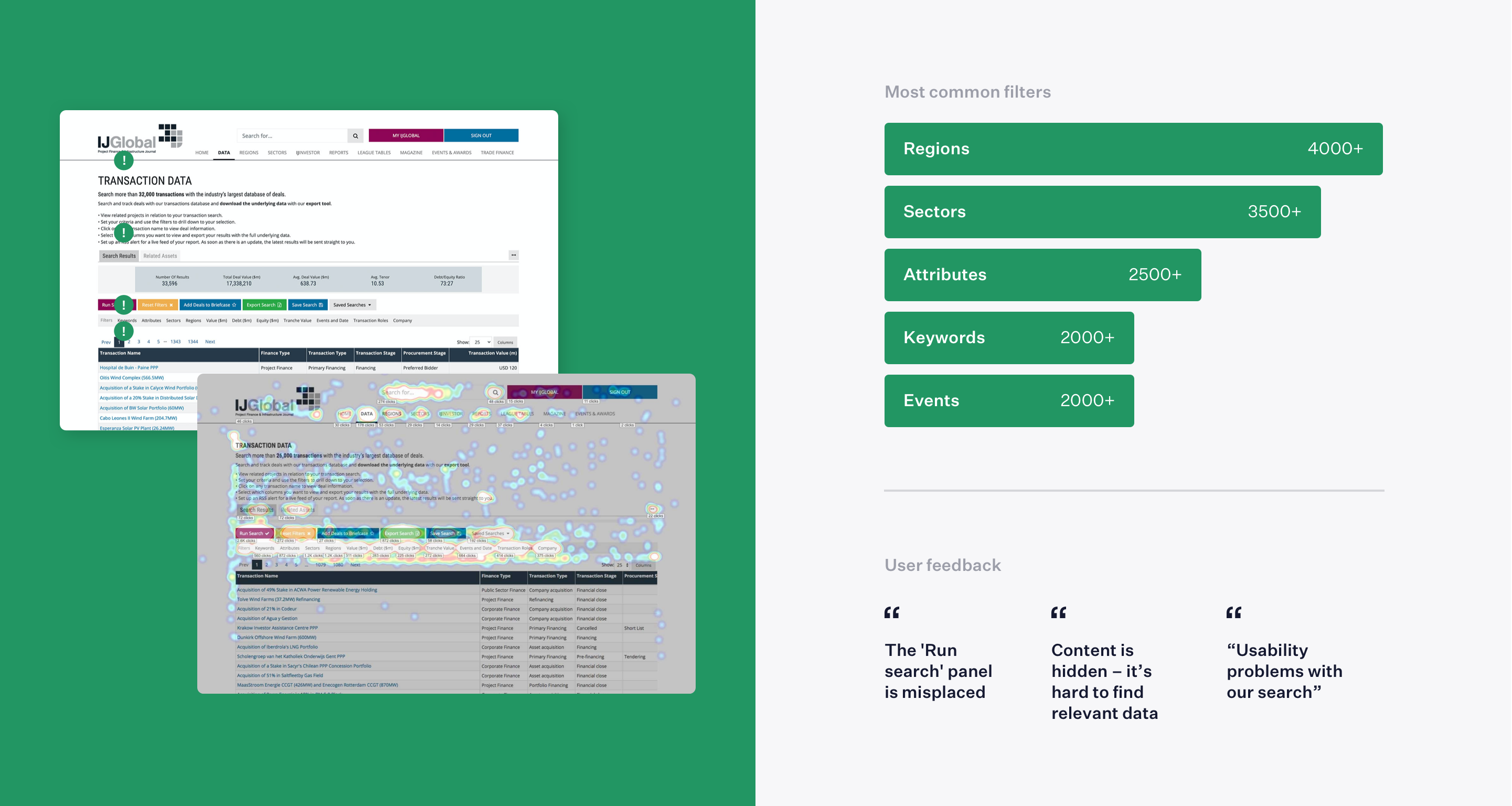
At first, we worked on the assumption that all users need to be able to filter by everything, instantly. A little daunting!
However, a little digging into the platform stats didn’t back this up.
People actually spent the majority of time using only a subset of popular filter types. To get further insight we ran interviews with users to explore how they currently engage with the tool and what they do with the data once they’ve found it.
This sparked ideas for improvement to the interface and outlined places where new opportunities existed.
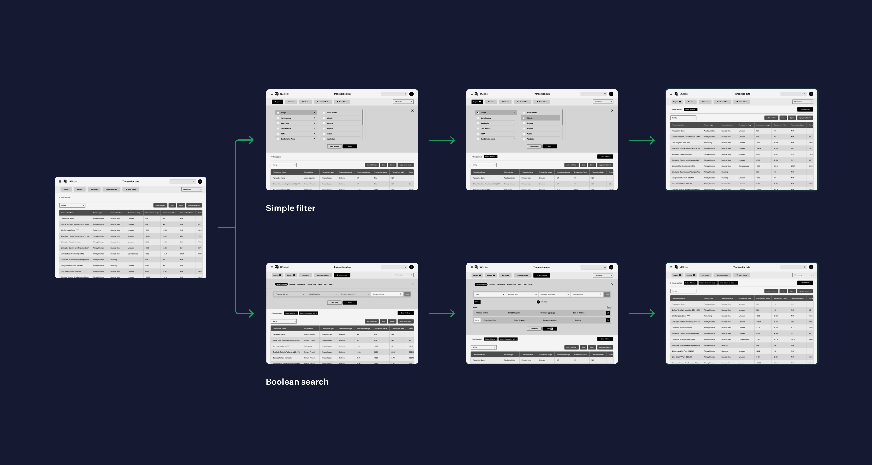
Armed with our user research findings we created clickable, high-fidelity prototypes, demonstrating new ways in which users might search and filter data.
By cataloguing all the different ways in which data could be cut, we were able to develop a set of components that could be called on from any screen to run powerful searches.
These screens could then be taken forward for testing with IJ customers, validating that our new search mechanisms were usable.
Results were universally positive 🎉
Strategy for a SaaS platform
With a move to a gated revenue model on the cards for the platform, we advised on how this should be effectively planned and launched. As this was uncharted territory for most of the team, attention had to be given to how this could be effectively planned and launched.
We helped the team explore the different models for displaying free content and what a compelling sign-up offer might look like.
As with any drastic pivot in a business model, there were many opinions internally and ideas were plentiful.
Using workshops, research, and competitor analysis we were able to create a central vision and design a front-end experience that spoke to this.
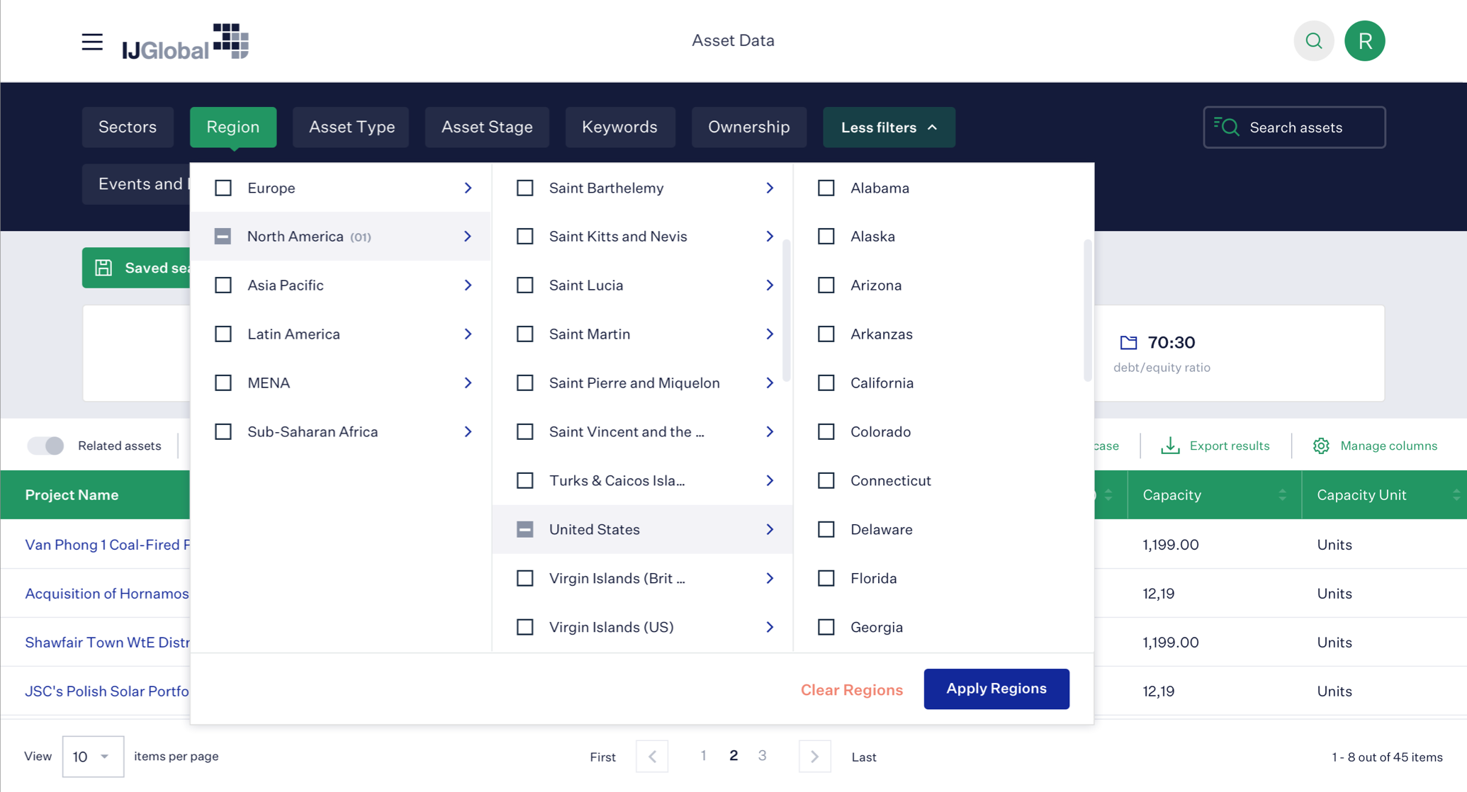
UI design system
Bringing the visual design up-to-date was important to bring it in line with the type of SaaS tool that users mentioned that they use on a day-to-day basis. We created an extensive design system of components with a huge level of detail around interaction and behaviour that would power all screens of the tool across all devices.
With a design system in place, all current screens could easily be put together using a strict set of design patterns, and no guesswork.
Future additions would also be easier as all the elements required would already exist in the toolkit.
Front-end framework
To assist the internal engineering team, we created an extensive front-end templating system ready for direct integration into the new IJ SaaS tool.
The result was a completely modular and flexible framework that directly correlated with the structure and naming conventions of the UI design system.
With all of the front-end code checked in to a shared repository and code examples available at the click of a button, integration and template creation became a cinch for the IJ engineers.
This was a tricky project to navigate, between all the data and financials, but Lighthouse came up with an engaging result. Their designs were very strong.
UX and UI design that leads the market
Maintain your SaaS tool’s place at the top with world-class product design.