

Imagine a world without icons.
- Blank doors on public toilets lead to confusion and embarrassment, “oops, wrong room!”
- Crossing the road without a green man is treacherous
- Horror of horrors – the apps we use become more or less useless unless a whole load of text is quickly subbed in.
We certainly wouldn’t relish designing user interfaces if everything was text-only. 😲
Icons are simply everywhere in our world, and many have become ingrained over the years to the point where we can’t imagine any different.
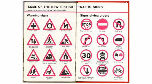
Jock Kinneir and Margaret Calvert’s 1960s designs
For example, the first true wayfinding system, ‘ The Manual on Uniform Traffic Control Devices’ (a surprisingly thrilling read!) standardised the shapes and colours used on US roads almost 90 years ago. The UK followed suit surprisingly recently in 1965, and change since then has been iteration not re-invention.
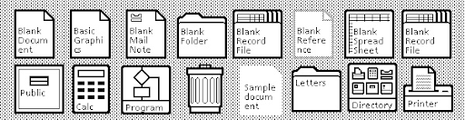
Similarly, despite being an astronomically expensive creation for research labs, the Xerox Alto gave the digital world its first GUI back in 1973.
Its icon set was then used for their consumer release, the Star model, in turn paving the way for Apple who stole the idea were inspired by it in the creation of the Lisa.
We’ve got Xerox to thank for the fact we keep our ‘files’ in ‘folders’ to this very day. The initial design for ‘document’ and ‘trash’ icons are instantly recognisable too.
None of us remember learning their meaning; they’ve always just been there.
Image credit: ‘Know Your Icons, Part 1: A Brief History of Computer Icons’ by Envato
The human brain and icon design
As we mentioned in our previous article about consistent product design, humans are wired for consistency and seek it to reduce cognitive load and even for physical health.
Consistent product design: there's more than meets the eye
Ready to encounter some unexpected controversy about consistency?
We’re also visually driven, with incredibly good image processing capabilities – even when the images are abstract. It’s sort of in our makeup, given that our primitive brains started working with images long before words were even thought of.
The upshot is that the average human can perceive an icon way faster than they can read the equivalent text.
That doesn’t mean they’ll correctly interpret its meaning though, of course…
UI icon design
As we can see from their very first application by Xerox and the facts about visual perception above, the icon design used in digital products should quickly communicate a concept.
The first and foremost purpose of an icon has to be meaning – conveying an instant message as regards what action it describes.
There are obviously a ton of advantages to using icons over text labels when it comes to saving space on a small screen, making good touch targets and just being downright aesthetically pleasing, but meaning tops them all.
The most tappable, beautiful icons come to nothing if the intended action behind them is lost.
Good icons are more akin to road signs rather than illustrations, and ideally should present an idea in a clear, concise, and memorable way.
Universal icon design
Some icons are what we’d consider ‘universal.’ Again, Xerox’s trash can and its colleagues are good examples here, as well as an envelope for ‘email’ or a house for ‘home.’
Provided they’re used as expected, we understand their intended function no matter what language we speak and whether we can read or not.
Their original analogies may be on their way to being lost (how many young digital natives have ever sent a physical letter?), but they’re sufficiently embedded that all users can understand the action they convey.
Common icons aren’t necessarily universal icons, though.
There’s a bit of debate around how many truly universal icons exist – somewhere in the region of 16 to 25 depending on whose list you go by, and we’d tend to err on the lower side.
To illustrate an icon that’s super common but surprisingly complex, consider the seemingly simple act of liking or saving an item or piece of content.
We’re all familiar with the heart icon, but its usage is by no means standard.
- On Twitter we regularly ‘heart’ a tweet to express our support or agreement, with the secondary effect of saving it to our ‘liked’ tweets. A list of ‘likes’ are visible to anyone who visits a public profile, not just its owner – hence digitally naive politicians semi-regularly getting themselves in a pickle by giving out inappropriate hearts. 🙈
- On Instagram, a ‘heart’ given to a nice landscape or someone’s fancy dinner doesn’t save the image publicly or privately, it merely shows a presumed approval.
- However on Airbnb or eBay we ‘heart’ a property or item to save it for later, additionally breaking the loose rule that hearts are for public reactions and a private bookmark should use a star icon instead.
Who said this stuff was simple?! There’s a lot to it and we’re just scratching the surface here!
What about conceptual icon design?
As with most things in product design, testing with real users is non-negotiable.
Typically icon testing looks to find out about recognisability, i.e. what people perceive the icons as being – ‘is it a rubbish bin or a letterbox?’ and comprehensibility, i.e. what they understand the icon as doing- ‘if it’s in the bin, is it gone forever or can I take it back out?’
This type of testing is especially important when icons are required to represent a concept rather than being a simplified picture of a physical thing.
The type of data-heavy, complex product we work with means conceptual icons are something we encounter often.
A couple of our team recently tested a clickable prototype for a product with a brand identity that’s all about ‘finding the way.’
To communicate the concept of ‘navigation’, they hit upon a compass icon which would take people to their personalised plan.
In testing, however, it was discovered that users assumed this was where they navigated the site, or even that it led them off to search the web.
I guess we have Safari to thank for our users’ confusion! Back to the drawing board…
Unexpected icon usage
Interestingly, we’ve subsequently discovered that in China a compass is regularly used to mean ‘more options’. 🤯
This got us wondering about other situations where icons represent different actions in different cultures, and where unexpected confusion might occur, and scouting out some more examples.
Did you know that in Iran and surrounding countries, a cheery thumbs up 👍 traditionally means something akin to ‘up yours’? 🤬It’s used in roughly the same way as the western ‘middle finger’.🖕
A platform that provided this icon for a middle eastern audience would be inviting them to show their dislike for a piece of content by pressing it rather than expressing approval!
When Amazon launched in India (fairly recently, in late 2018), they couldn’t understand why almost nobody was using the ‘search’ function. When research was conducted, it transpired that the magnifying glass icon didn’t resonate with Indian users.
In fact, people referred to it as ‘the ping pong paddle’ – not something they expected to mean ‘search.’
The bottom line in icon design
The humble icon is not to be underestimated.
Missing the mark can have a huge negative impact on product success, not to mention cause real life blushes if we think back to the toilet doors we mentioned earlier.
When icon design is undertaken thoughtfully and with users and their intended action in mind, it’s a positive and powerful part of any product experience.
When icons are unclear, merely aesthetic or lead to unexpected places, users won’t stick around to try and interpret them correctly.
Clarity, consistency – with accepted usage as well as internally – and rigorous user testing will stack the odds in your favour when it comes to creating digital icons that might even stick around as long as Xerox’s.
Further reading and resources
A comprehensive guide to testing your icons Usability Hub
25 universal icons UX Planet
Icons as part of great user experience Nick Babich, Smashing Magazine
Material icons guide Material Design
Bad icons: How to identify and improve them N/N group
Related Posts
 Article
It’s the start of a new era for Lighthouse as it becomes part of Digital Product People, guided by some familiar faces.
Article
User research is key to ensuring we solve real problems, but how should we tackle sensitive subjects and protect everyone involved?
